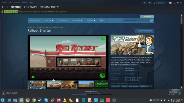
Note: This is an article by Bruce Byfield; I’m temporarily posting in his name due to a technical reason (sometimes you eat the logistics, sometimes the logistics eat you).
My expectations for Keyboardio’s Model 01 were high. I pre-ordered the keyboard during its 2015 crowdfunding campaign, and waited for over two years with increasing frustration as one delay in manufacturing followed another. Then, in 2017, the first Model 01s shipped — but not mine. By the time mine arrived in February 2018, my expectations were so high that I was sure that the reality could not possibly match my expectations.
I was dead right.
Reality exceeded my expectations, and by more than I could possibly imagine. The Model 01 is not the first programmable keyboard. Nor is it the first open source keyboard, the first keyboard with mechanical switches, or the first ergonomic keyboard. However, so far as I’m aware, no other keyboard has combined all these features at once. Combining aesthetics, ergonomics, hardware customization, and software customization, Keyboardio’s Model 01 is a keyboard in a class of its own.
Aesthetics
Except for outliers like Datamancer’s cyperpunk devices, keyboards have been more about function than beauty. That has always seemed strange to me, considering how many hours each day that many of us spend at a keyboard, yet it is as true of proprietary keyboards as open source ones, and of membrane keyboards as mechanical ones.
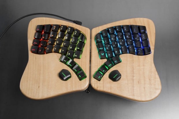
The Model 01 is different. Each of its two halves is mounted on a 2.5 centimeter thick piece of light maple, finished so that the grain shows. Both the maple mounts and the banks of keys are in graceful curves, resulting in a restrained elegance. Only the stands for each half of the keyboard have an ugly utilitarianism — which is no great matter, since only the ends of the stands’ legs are visible when the keyboard is in use.
Forced to choose, I would opt for functionality over aesthetics. But having both is a pleasant bonus. Fifteen days after I started using my Model 01, it still catches my eye from across the room, and I find that such an elegant device relaxes me as I work.
Ergonomics
The Model 01 is more than a pleasing design. It’s also an ergonomic keyboard. Each half consists of thirty-two keys, with the number pad and function keys accessed by pressing a key, just as upper case letters are accessed by pressing the Shift key on any keyboard. Add the fact that the rows of keys are arranged in curves, and many people’s hands can reach from one end of a keybank to another. Even those with small hands should find that their fingers have to move much less than on a normal keyboard.
Moreover, command keys like Ctrl and Space are arranged in an arc operated by the thumb, making it possible — once you have grown accustomed to the keyboard — to press them without stretching and to use them without looking down at them.
A further reduction in the required finger movement is obtained by arranging the column of keys in straight diagonals, rather than staggering the rows so that each higher row of keys is to the left of the one below it. My understanding is that the usual staggered column was originally intended to prevent keys from jamming on a typewriter, but the Model 01 is a long way from a typewriter, and today the traditional arrangement of keys only requires that fingers reach further than necessary.
In addition to the arrangement of keys, the two halves of the Model 01 can be physically positioned in a number of ways (see below) to reduce the strain on hands and wrists.
These features mean that most users take a few days or weeks to adjust to the Model 01. But, although the temporary reduction in typing speed can be infuriating, the adjustment is worth making. Contrary to my initial skepticism, using the Model 01 has reduced my sometimes crippling repetitive stress injuries to minor twinges that generally disappear in a couple of hours. At the very worst, any lingering stress of twelve hours at the keyboard is gone by the next morning. And, as my fingers grow more accustomed, the recovery time is decreasing.
Hardware Customization
Open source is all about customization, and the Model 01 is no exception. Keycaps are easily removed, and can be positioned for different key layouts. The black keycaps that are shipped will soon be replaceable at extra cost by white or blank keys. The Model 01 can also be ordered with quiet or loud mechanical keys, while pressing the led key toggles a dozen pre-installed sequences for backlights.
The two halves can also be arranged in several different ways. They can be tethered tightly together by a short RJ45 cable connecting their Arduino microcontrollers, or positioned widely apart with a longer cable. In addition, the halves can be positioned flat, or at different angles with their stands. If the correct centerplate holds the halves together, they can also be tented, forming an inverted V. However, Keyboardio warns that tenting the halves without the stands might crack them and that arranging the halves with the outer edges higher is unergonomic.
Software Customization
The Model 01’s keybindings are stored in its firmware. That means that changing the arrangement of characters is the same process as flashing an update from the company. The Arduino IDE and default Keyboario firmware must be installed, then the microcontrollers flashed with the command make flash and the prog key depressed at the right moment to bypass the microcontrollers’ bootloader. Should any problems arise, the firmware can be restored from a backup.
Keybindings and macros can be added directly to the firmware’s .ino file, or Sketch, either in the Arduino IDE or the text editor of your choice. Keys are defined in a text map, and arranged in layers. For example, besides the default keybindings, the Model 01 ships with a layer turned on by the fn key that provides function keys, curly and square brackets, and mouse controls, and a third layer that activates arrow keys and a numberpad. Users can add additional layers for other key layouts such as Dvorak or Coleman, or for macros for their favorite games or productivity applications. Keybindings, macros, and plugins can be created by you, or downloaded from the growing number available online. The Keyboardio community board is probably the best place to learn about third party offerings.
The Model 01’s software customization is handicapped by the lack of a single source for instructions, and by the fact that its graphical interface has not yet reached general release. However, once you track down the necessary links, the procedure is no harder than, say, installing a package from a tarball. If you choose, you can avoid software customization altogether, at least for the first while.
But, sooner or later, the temptation to tweak the firmware may be irresistible. Many users, for example, find that their first modifications are based on the mistakes they make while adjusting to the new keyboard.
Reinventing the Keyboard
The only question mark hanging over the Model 01 is how long it will last. At $326US plus custom duties for non-US residents, it is not a cheap device. However, in theory, both the mechanical keyswitches and microcontrollers can be replaced. My guess is that the worst result will be that the Model 01 will outlive any number of cheap keyboards given ordinary circumstances. Meanwhile, the Model 01 is everything I had hoped for and more. It is an example of just how outstanding open hardware can be when accompanied by uncompromisingly high standards. Keyboardio has entered a saturated market, and now promises to reinvent it. And if I seem to gush, try one and you will soon know why.
The quest for the ultimate desktop environment continues. In the last few months, we have looked at a range of Qt-based desktops, starting with Ze Papa, Plasma, and then looked at several other new and not so new players, the bold and the beautiful, the less successful and the more rad. The list covers the likes of LXQt, Liri, Nomad, and recently, Lumina, as well.
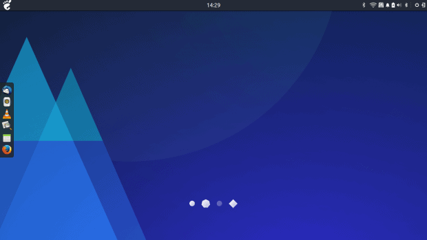
Today, we will explore Budgie. Now, this is a rather interesting one. First, we had a taste of it way back when. In the day, it was quite slow, buggy and not very appealing. But then, through my Solus OS testing in the past year or so, I’ve come across Budgie again, and I was rather intrigued by the look & feel and the obvious progress. While my endeavors with Solus were less glamorous, Budgie did impress me as something worth a deeper consideration. For the moment, it’s Gtk and heavily interwoven with Gnome. Moving forward, it will also be using the Qt technology, starting with the upcoming release 11. Let’s have a look.
Setup
I decided not to use Solus, because it did not cooperate well with my test hardware, and also because it would be offering a more tailored and thus skewed picture of the product. This isn’t bad, but then, it’s also important to see how well Budgie works on other distributions. The obvious popular choices include Arch Linux and Ubuntu Budgie, with the software available in a range of repos elsewhere.
My first choice was Fedora 25, and indeed, I tried two different COPR sources, including linkdupont and alunux – there are several more, to make it bit more confusing. The former installed successfully, except the Firefox theme, which threw an error:
The second completed without any problems. However, in both cases, there was no Budgie Desktop option in the login screen. Ah well. My next choice was Xubuntu 17.04 Zesty, and indeed there’s a PPA available. But reading through various sources, I noticed that installing just the meta package budgie-desktop does not satisfy all the necessary dependencies, nor does including the core and welcome packages. I spent a while fiddling until I stitched the full line:
This will grab almost 200 MB worth of data, expand this to 800 MB on the disk, and covers a hefty sum of about 320 packages. But the installation completed without any problems, and I did have Budgie in the login screen, so time to test then!
Budgie Budget
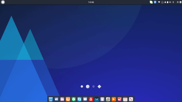
The default look is all right. A simple, clean desktop, a panel on the left. Budgie did not pilfer any configuration from the Xfce desktop, and I like that. It’s very similar to Gnome, but it does have its own behavior and style. In fact, it reminds me more of elementary OS than pure vanilla Gnome, in fact.
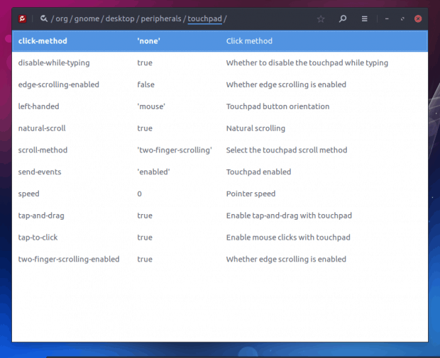
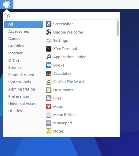
The system menu is reasonable, but the search functionality can be more precise – it seems to be limited to just one level of hierarchy, and it does not search all available strings. For instance, the word touchpad will not return anything, and you need to launch the system settings menu. There, you will discover that there are no appearance customization options available.
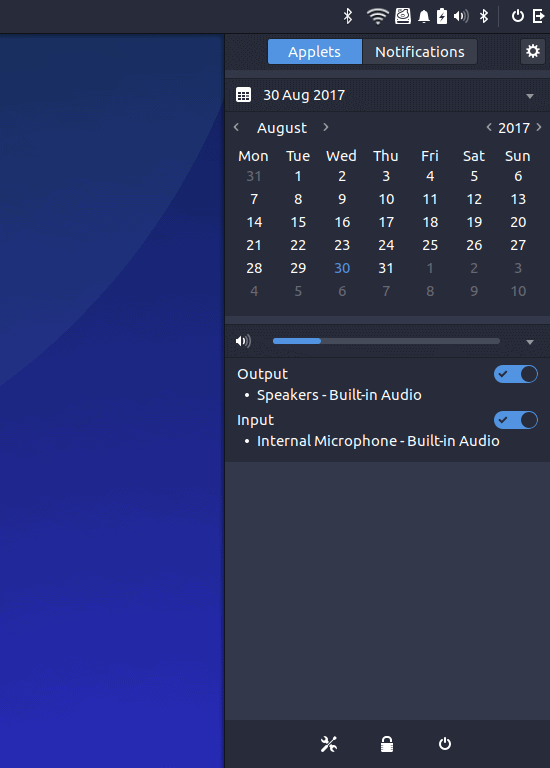
At this point, I recalled the Raven configuration tool – this is the custom Budgie applet, and it resides on the far right side of the menu. It is invoked by clicking on the door exit icon, which is a bit misleading, or the bell icon, which stands for notifications, which is a bit confusing. In a way, it is similar to the deepin settings menu, which also has the vertical sidebar settings tool.
If you get lost or confused, you can try the Budgie Welcome wizard, and it should help guide you in the right direction. It is strange that this useful little program does not pop on its own on your first login, because it’s quite useful and neat. Cinnamon does this, so Budgie can do it as well.
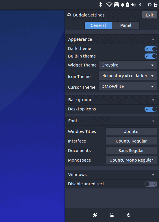
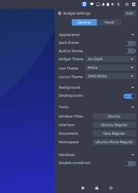
Changing the look & feel of Budgie is quite easy – very similar to running the Gnome Tweak Tool in the namesake desktop and making the desired changes. I tried the Arc and Arc (Darker) themes, as well as Moka icons, and the basic look improved immediately. But. If you toggle built-in theme and default theme switches, you will get some rather odd results. Built-in theme overrides custom selections, so some of the toggling is redundant. Arc is pretty, but the font contrast is not really good, and the Wireless icon is too pale for the light-themed top panel.
Notice there are actually two Bluetooth icons, the tiny one (as it should be) and then the big and ungainly one, which refused to go no matter what I did.
Playing some more, I started noticed small visual inconsistencies – nothing too major but not something you can ignore. Some of the listed widget themes did nothing, possibly because they are only used with Xfce, but they do happen to reside in all the right folders, but then, if they are not supported, they should not be in the list in the first place. Adwaita looks the part, but it also scales up the Raven applet elements until you end up with the lower half of the application space overlapping with the three bottom icons (settings, lock and log out).
It’s a pleasant but incomplete experience. You will not get the best looks as you expect, and there does not seem to be a way to mix & mash different parts of different themes. I found no way to edit the top panel or the spacing between system area icons, for instance. Or a way to use a light theme but with a dark top panel. The Bluetooth icon is also jarringly different from everything else, and it refused to go away, even when I clicked the Exit button in its sub-menu. It’s frozen solid there, and Bluetooth does not even work.
Editing the panel (Plank) is a much more satisfying action. You can easily set all the different tweaks and position the panel as you see fit. For me, the bottom placement looks like the best option. Icons do not always scale hi-res, and I ended up with a fuzzy bar of launchers, which is not the case in stock Gnome, so perhaps, Budgie is using only a specific subset of icons from a given size (like 24px) rather than some of the bigger ones. Maybe.
One of the big gripes in my Budgie testing was the touchpad. There simply was no way to make it work correctly. It was jittery, too sensitive, and the taps were really making me unproductive. I wanted to disable it, but this is not trivial. Well, to be frank, most desktops, even in 2017, still struggle with simple, uniform touchpad control. In Budgie, this turned out to be an impossible task.
The standard settings menu does not have a touchpad option, at all. I installed both Gnome Tweak Tool and dconf-editor, and tried to make changes there. No luck. In GTT, fiddling with different toggles did nothing. Then, in dconf-editor, I changed several Boolean values, but then, they reverted back to the original state.
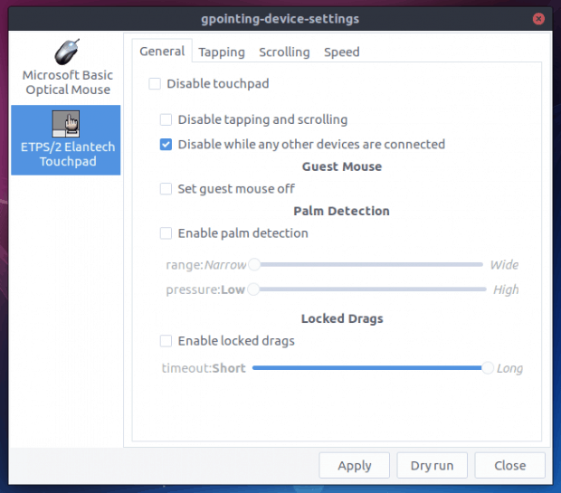
After that, I installed gpointing-device-settings and tried to use this tool to edit the touchpad settings. Seemingly, it worked fine, but when I tried to apply the changes, the program crashed:
In the end, I have not managed to find an easy way to make the desired change. Looking through Solus forums, this seems to be a recurring question. I would expect Budgie to be able to handle this very gracefully, but much like the Bluetooth icon, this didn’t work really.
Fonts
Like most modern desktop environments, Budgie aims toward the young crowd of developers, who are not too picky around aesthetics and fonts and contrast and things like that. Now, mind, Budgie is very pretty, and it scores high on the look & feel front in my book, but the fonts are just bad. It has to do with the Arc theme, which is quite popular, but it’s the wrong choice in its default guise. Luckily, you can solve this, as I’ve outlined in my Fedora font quest and Gnome theme editing articles.
Slowly but surely, I had the desktop looking the part. Small changes, nothing too major, but then, the amount of effort you need to invest is similar to making any Gnome desktop usable. Budgie leads by a nice margin in offering expected usability out of the box – window buttons, app menu, a visible panel with launchers, nice decorations and more, but the end state is similar. And of course, you must appreciate my choice of art and the puns. Budgie, budge, pass, you, shall, not, Gandalf, sweet.
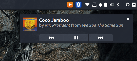
When it comes to enjoying your desktop, Budgie is very similar to Gnome. If you play music, you get notifications, both inside Raven and as desktop popups. Cover art only shows for Rhythmbox but not VLC. I did not find a common denominator what would make certain programs notify or show in the sidebar. Steam or Skype did not join the party. So I guess it’s mostly multimedia.
Performance and responsiveness are in line with Gnome, the desktop is rather stable and you get the necessarily visibility to use it efficiently and smartly. Still, touchpad problems interfered quite a bit, and you do wish for a little bit more customization freedom, like top panel style, more fine-grained tweaking, better fonts, and such.
Other niggles and problems
I noticed you can, in some cases, dock more than one icon for the same application. For some odd reason, when I launched the already-docked text editor, it spawned another icon on the far right, which should belong to undocked applications, and then I also had the option to pin it, ending with two identical launcher for the same program.
Screenshots come with a very wide, transparent border, which captures whatever is underneath, so this makes for cluttered art, should you ever feel the need to take screenshots of your desktop. This does not apply uniformly to all applications, though, and the margins aren’t equal on all sides.
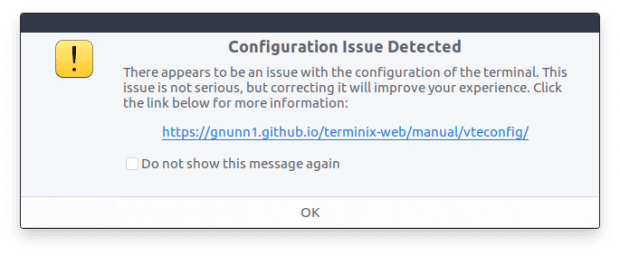
There’s no nice alt-tab functionality. I also could not find a way to tweak startup programs and services. In this regard, Gnome Tweak Tool has an empty list. Speaking of Gnome Tweak Tool, the system search shows the program twice, and in both cases, it would launch the application correctly. Not sure why. The Budgie-specific terminal application Terminix complained about a configuration issues, which should not happen on first launch, as it can be alarming for new, unsuspecting users.
And then, we go back to consistency. Welcome screen, no border. Terminix, take a look above, big border but they are fully transparent and do not show the background (either wallpaper or whatever is behind). Most programs come with a big, thick see-through border with non-symmetrical top-sides-bottom margins. The gpointing-device-settings program comes with thinner and symmetrical borders. Well.
Sanity check
So there we are. Budgie. But then, if we look at its maturity level, it’s pretty high up there. Sure, you have the top tier of the most fully featured desktop environments, like Plasma, Gnome, Unity, Xfce, Cinnamon, and to some extent, MATE. On the other end of the spectrum, we have everything else; desktop environments that are not really primetime-ready, mostly cobbled together in a haphazard fashion, with severe usability problems. Budgie is far above this lot, much closer to the top tier than what’s below. But then, it’s Gnome re-personified, if you will, and you may argue that the difference isn’t that big to warrant special treatment. However, the same can be said of Cinnamon and Unity, too.
And so, despite some rather obvious shortcomings in design, various usability issues, bad ergonomics, and inconsistency in design that will require a lot of work fixing – moving to Budgie 11 and Qt makes perfect sense to trim, improve and polish to perfection – it is still a rather usable desktop. Provided some of the backend stuff is sorted, you can use it. That plus black fonts.
Conclusion
The most impressive thing about Budgie is the quantum leap of progress it has made in the last three years or so, going from something that looked like Xfce 2005 to Gnome 2017, without losing its special touch and identity. The proximity to Gnome is a double-edged sword, and it seems the team is aiming to put some distance in between. Hopefully, they will retain the good parts, maintain the customization that is absolutely necessary to make Gnome practical, and add their own flair and touch.
All that said, Budgie still has a lot to go, but it seems to be on a promising track. Now, the hard part. Fine finishes and subtle changes that the separate amateur rigour from the professional. Then again, sweeping back through the last few months, it’s the best hitter I’ve tested in the lot after Plasma. As a baseline, it’s better than LXQt, and way ahead of the rest. Good looks, bad fonts, good usability, lots of small issues, trouble with hardware applets, nice unique approach and styling. Budgie 11, here we go.
While the technology landscape feels big, complex and colorful, the actual variation in creativity and uniqueness isn’t that huge. Often, ideas build upon other ideas, with small changes and incremental improvements. This is also true of our favorite domain, Linux, with its towering pyramid of distros and forks and still more forks, a whole cutlery division. Lots of stuff but not necessarily variety.
In fact, I even believe there’s a decrease in uniqueness over the years, caused by over-saturation of ideas, the demise (or at least, the decline) of several major projects, and with them, the hope and enthusiasm, and of course, the weariness of the human intellect involved. Having inadequate resources, with teams and projects stretched thin, sure does not help. But that’s the negative side. The good thing is, alongside mediocrity, there have been some really amazing things out there, and I want to give them special attention in this article.
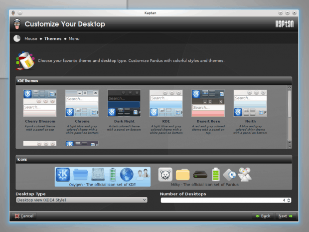
Kaptan
If I’m not mistaken, Kaptan was born, created and adapted for use in the KDE version of Pardus, a Turkish distribution designed mostly for corporate use. And like all systems with some business orientation, like openSUSE or Mageia, it had several phenomenal features, one of which was Kaptan. This was essentially a configuration wizard, allowing you to customize your desktop any which way you want, without having to manually dig through the menus, hunting for options and settings.
Kaptan didn’t really die – and it even inspired similar configuration tools, some GUI, some CLI, in other distributions – but it did sort of fade away, and you don’t see it much lately. My last encounter with it was in KaOS 2017.11 not that long ago. For some reason, it did not catch on, although it makes perfect sense for new users switching from Windows to Linux. Essentially, such tools exist in many modern appliances, like smart TVs, smartphones and such, but the Linux desktop remains bereft of an easy desktop setup.
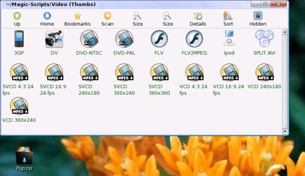
TeenPup Magic Scripts
This is a blast from the past. Back in 2009, I tested a heavily modified Puppy Linux edition called TeenPup, designed to be lean, frugal and yet rich in features and good looks. Well, at 700 MB compared to the standard 100 MB for the original distro, it kind of failed on the leanness front, but it did deliver a fairly pretty desktop, and more importantly, Magic Scripts.
The idea behind Magic Scripts was golden. The scripts were essentially a seemingly innocent collection of icons (scripts), but they would become active if you dragged and dropped multimedia files onto them. Then, depending on the selected script, the multimedia files would be processed and converted. Even in 2009, the scripts included several mobile/touch formats, iPod, you could also split videos, and there were roughly a dozen different options available.
Rather than manually opening media processing tools or using ffmpeg, which is a program for skilled nerds, you could drag ‘n’ drop music and videos clips and watch the magic happen. And it did happen. Again, much like Kaptan, the Magic Scripts seem to have vanished. In fact, worse than Kaptan. This was a true one-hit wonder. Along with this gutsy little distro, the scripts vanished and never came back. But they make a lot of sense, and also emphasize that it is possible to create simple, elegant solutions without going overboard. Alas, not replicated, for now.
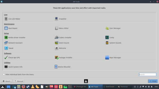
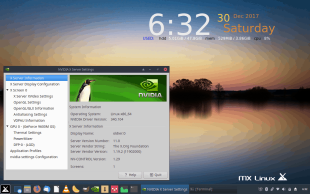
MX Tools
A lightweight distro named MX Linux has been making the headlines recently. Its heritage is quite complex, unless you know what sidux, Mepis, and AntiX are. But never mind that. MX Linux is a resource-spartan distribution, normally cloaked in Xfce, and it has grown and evolved from an unruly second-grade player into a top-notch desktop with a wealth of friendly features for the common desktop user. Speed, consistency and ease of use, along with even more focus on aesthetics, plus a very nice installer that will fully preserve all live session changes and port them into your installed user directory.
However, the cream of the crop is a set of tools called MX Tools, a bundle of utilities unique to this distro, and designed to make your desktop use and maintenance, especially if you’re a newbie, much easier than most rivals. We’ve talked about MX Tools in the past, right here on OCS-Mag, and we will talk about them sometime soon again, but for those short in memory and patience, here’s a brief recap.
Basically, once you have the distro installed, you may struggle at first. Things might look unfamiliar, or you just might not want to fiddle with system configurations. Either way, MX Tools is exactly what you need. The toolbox packages numerous utilities, including system snapshot and bootloader repair, Nvidia drivers setup, media codecs, desktop customization, iPhone (iDevice) mounting, and several other components. The idea is for the common user to be able to master common tasks without resorting to the command line, or having to go online asking for help.
While not the only set available in the wider Linux world, MX Tools are special in that they are a rather complete and comprehensive set covering several crucial elements of everyday desktop usage. To the best of my experience and memory, this is the most advanced implementation of the make-desktop-nice functionality.
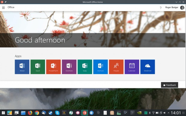
Manjaro Microsoft Office Online
Windows makes for 90% desktop usage – and pretty much 100% of desktop folks have used Microsoft Office at some point in their lives, or will require it. Which put Linux in a precarious position, as it does not have a native answer to this critical need. In the past few years, threatened, or let’s say, encouraged by the rise of the mobile platforms, Microsoft has become more accessible, with Office available on Android, and a free, online, cloud-powered version of the office suite called Office Online available to anyone with a modern browser, Linux people included.
But … there’s no native integration. Or rather, there hasn’t been any. Until very recently. Manjaro 17.1 Hakoila seems to be the very first distribution to try to bridge the gap between the Windows and Linux world, by offering single-page browser wrapper apps for Microsoft Office Online. The basic functionality does not change, but you have the office suite programs almost behave as ordinary applications installed on your computer, complete with the menu search, icon shortcuts and all that.
This being a new technology – based on the JAK framework – there hasn’t been much time or chance for it to propagate to other distributions. And it may yet do so. Or never, remaining isolated to Manjaro. While the proliferation test is still to happen, I do like this concept very much, as it puts this Arch-based distro ahead of the curve, offering something new and fresh that most Linux users didn’t really have. Again, the online access was always there, but for that matter, any which distro has everything, the difference is between hours of manual labor and having everything out of the box, nice and easy.
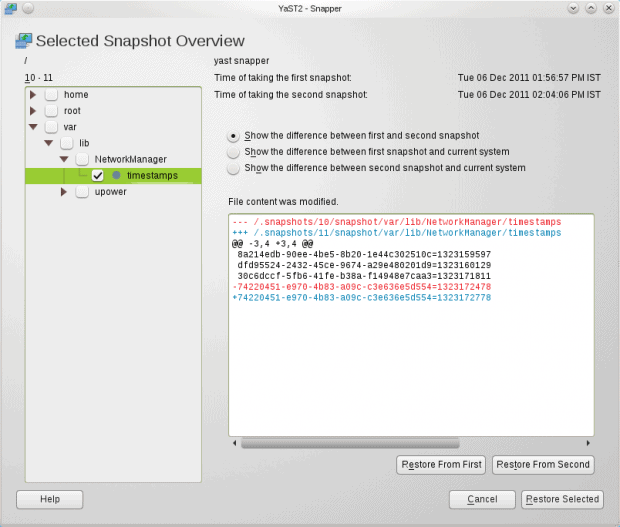
Snapper
Going back to Windows again, a cool thing you could always do, at least since Windows XP, was the ability to roll drivers to a previous version if you decided the current one wasn’t working well enough. In Linux, in general, there’s never been an option to actually roll back system configurations or tools. Technically, the kernel and the drivers are covered, but it’s an all-or-nothing situation. You either hit one line in your bootloader menu, and then everything associated with the particular kernel loads, or you you hit a different line, and a different kernel and a different set of modules loads.
Moreover, the complex dependency between programs and packages creates a difficult situation when you must uninstall an app, or when you realize that there might be a software conflict. Again, without versioning, it’s hard to really do this in a surgical manner. Very often, removing a component, a library of some sort, will affect dozens of other packages.
Linux started solving this – partially – through self-contained applications delivered through application frameworks like Snap or Appimage, but the overall Linux desktop is far from any standard just yet. Meanwhile, for a few years now, openSUSE has offered a very cool framework called Snapper.
Snapper is a frontend for the BTRFS filesystem (once again, apologies for the acronym recursion), which has a built-in snapshot capability, on the filesystem level. The ability to create, mount and dismount subvolumes on a per-file level makes BTRFS a powerful versioning tool of its own, as you can go back and forth between system configurations, drivers or modules on a very granular level.
Few distros use BTRFS – for various stability and performance reasons – and SUSE is probably the only major player that consistently pushes in this direction. Moreover, and not surprisingly, BTRFS management tools are exclusive to SUSE. Snapper makes subvolume and snapshot management easier, with a simple, elegant frontend. It is a remarkably advanced and flexible utility, but it has to yet to find another home apart from the lizardly reachers of the openSUSE continent.
Ubuntu Global Menu & Dash
When Unity was born, Canonical made the Linux world gasp by integrating application menus into the top panel, creating a Mac-like layout and saving vertical space, something that was born in a desire to have Ubuntu run on small-form devices back in the day.
Global menu is not a novel concept per se – but the way Ubuntu introduced it into Linux was. Likewise, Dash is another attempt to make a smart desktop menu, with Scopes acting as narrow-function search qualifiers, allowing users to transform their desktop into a powerful, multi-functional data portal. This was Canonical’s early experiment with what would eventually be its one venture into the mobile space. Often, mobile world ideas work horribly on the desktop, but Dash was good. You could make it behave like an ordinary menu with tiled results, or you could use it to search for music, videos, specific files or articles, other things, offline and online.
Perhaps it is Unity’s complexity and uniqueness that prevented these two ideas from taking root elsewhere. And with Unity being discontinued, the chances of actually seeing this bear fruit are slim. Shame, because Canonical did create a more intelligent system menu than anything else we have today.
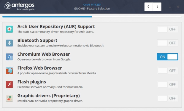
Antergos Feature Selection
Arch Linux normally requires their new users to drink hot goat blood, wear a helmet and have a license from the Ministry of Silly Walking before they are allowed to dabble in its internals. Some of the Arch developers figured this, and decided to make their system more accessible to the masses. And so the likes of Manjaro and Antergos were born. Technically, Arch Made Easy (AME) versions.
I have tested a dozen different versions of Arch-based distros over the years, but my encounter with Antergos 17.9 left me really impressed. The installation wizard actually has a separate section that lets users decide if and how they wish to customize their desktop, with things like additional community repositories, proprietary drivers, browsers, plugins, and more. A far cry from a typical Linux desktop experience where you need to spend 15-20 minutes and 200-300 MB of data installing and configuring things after the first boot.
Again, this is something fairly unique to Antergos – and alongside Manjaro, we see a great deal of creativity from the Arch community, which probably stems from the complexity of the baseline distros. Necessity breeds ingenuity. But this feature selection concept hasn’t really caught on. Bigger, DVD-size distros do offer some level of customization, but it is normally limited to choosing the desktop environment and the core set of packages. You don’t usually get more than that until after the installation.
So what are you trying to say?
Well, you’ve read so far (hopefully, unless you’re the 1-min conclusion skimmer), and you may wonder, okay, apart from Dedoimedo being subjectively (but correctly) impressed by a few interesting tools and projects, what’s the bigger picture? And the answer to that is another question:
What if all these different distros actually worked together?
The one common theme with all these different projects is that they are often done in isolation, and they are almost never adapted by other projects or distributions, unless closely associated with the work at hand. In a way, it smacks of the corporate Not-Invented-Here (NIH) syndrome, except it’s done without Powerpoint presentations and buzzwords. But in essence, the same happens here.
I did talk about the ingredients for the ultimate distro (not the conceptual idea, the practical list) a long, long time ago, we’re talking roughly a decade back. The formula was something like, openSUSE installer, Mint codec management, PCLinuxOS software selection, and so forth. Predictable, impossible. Of course, it was wishful thinking.
The need is still there. No single distro does things perfectly well. Ubuntu almost did it, Mint almost did it, Fuduntu almost did it, lots of small distros are trying, Fedora would be the ideal system, if it had CentOS stability and support and Ubuntu software. CentOS could be perfect, if it were more desktop geared. OpenSUSE could be the chosen one if blended with Ubuntu. There’s an infinite number of possibilities.
These seven projects, which I truly believe are among the most unique and creative concepts born in the past decade, highlight the brilliance and despair and the utter, pointless fragmentation that grips the Linux world.
Conclusion
It is always refreshing finding technology that works ever so slightly differently from the run-of-the-mill churn. It shows that people can think outside their proverbial box, and try to offer their users a better experience. Innovating on the desktop is hard; the concept has been around for 30 years. But it’s doable.
And it would be even more amazing if these lovely projects became global. Recognized, embraced and further developed by the community. The scarcity of resources is often quoted, but it would not be so if the thousands of smart people pooled their intellect and coding skills under one umbrella. Only that’s a different story altogether, and we will discuss that separately. Meanwhile, the hunt and hope for the perfect desktop remains. I’m done writing. Perhaps you might want to comment on the special, unique projects and tools that impressed you?
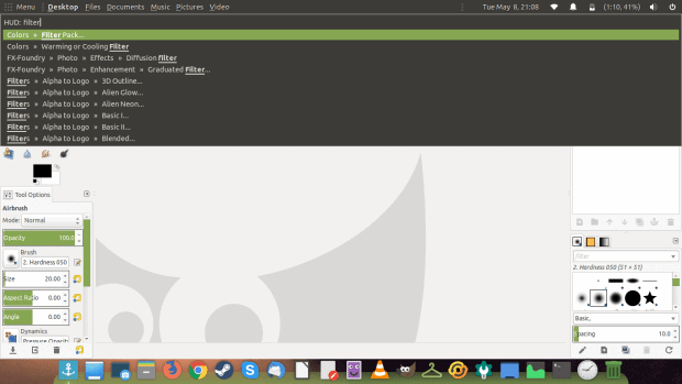
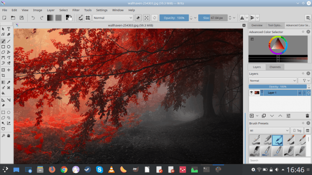
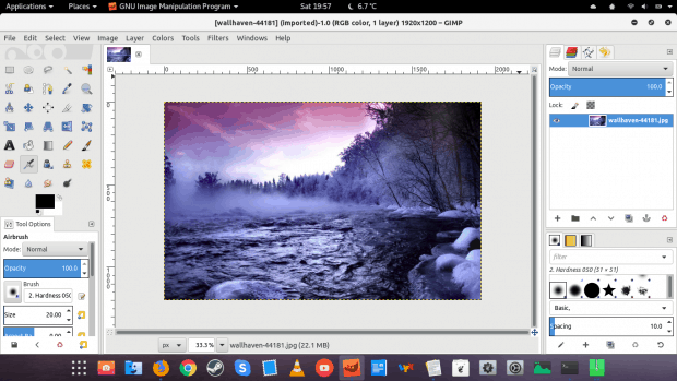
Krita? GIMP? Darmok and Jelad at Tanagra. So, if you are into any kind of image manipulation, you probably have heard of GIMP, a free would-be (!) alternative to Adobe Photoshop, and in its own right a very reasonable and powerful image manipulation and processing suite, hence its acronymy name. But there’s less of a chance that you have heard of Krita, a digital painting program with secondary focus on image work.
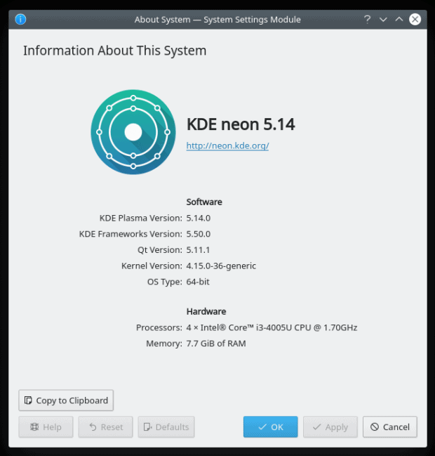
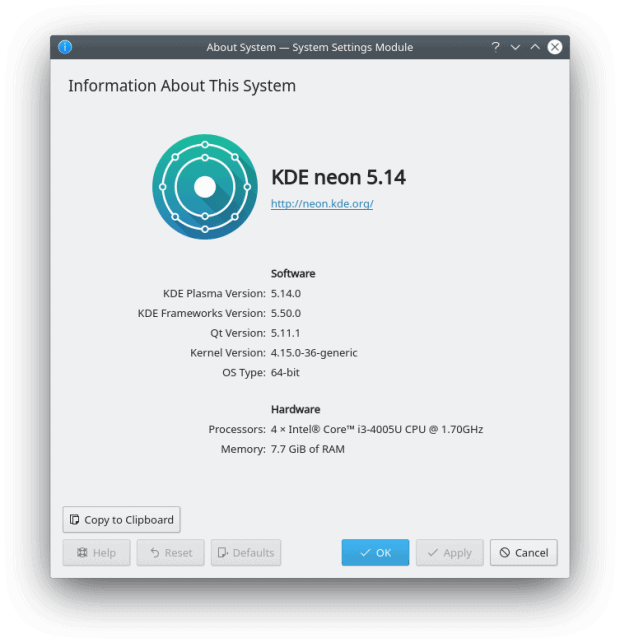
I decided to test Krita, to see what it can offer a semi-casual user, both as a plug-in for GIMP and its own art creation software. To that end, I had it installed in KDE neon with Plasma 5.12.3, the latest edition currently available on the market. And before we begin, do remember that genuine art takes talent, skill and patience, and that’s not achievable in the span of a single review. Let’s roll then.
Getting used to the surroundings
I launched the program and immediately felt assailed by the dark theme used in the program. Not to worry, you can easily change the theme, and there are many available options. Then, I decided to start working without looking up any tutorial or help, just to see how intuitive the things are. And they are. If you’ve used other image-manipulation programs, GIMP in particular, you will feel rather comfortable with Krita. Even the visual layout is similar. Tools on the left, brushes and layers on the right. You start playing, and it works just fine. Effects, transparency, color grading, and whatnot.
Some of the stuff can be a little intimidating, but again, unless you’re a professional, the defaults are okay. You can open multiple documents and control them using a horizontal tab bar, the same feature that was finally added in GIMP 2.8 and the single-window interface.
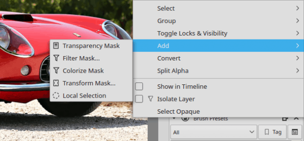
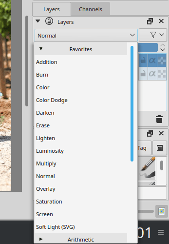
Layer manipulation options are almost identical to GIMP, with the ability to duplicate, merge and flatten layers, convert selections and masks to layers, use layer masks (and they are important indeed), or apply layer modes, like screen, burn, dodge, addition, and others. There are several other features that you don’t see in GIMP.
There was a small visual bug with the layer settings once I changed the theme, and it took a full program restart to get everything in order. Notice that the color palette is missing in the first screenshot, but then I got it back, and everything was happy thereafter.
So far, I’ve mostly focused on the IMP size of things, less so on art creation. Now, the second part of Krita’s mission statement comes in several forms. One, all sorts of shapes and brushes, which do allow for some fancy art work. Two, additional bundles (from previous versions of the program) with their own brushes, gradients and palettes.
Then, I also played a little with these extras, like for instance the caligraphy brush. Very neat. Now, to be fair, you can create brushes in GIMP also very easily, using even existing images as patterns, and there’s a fairly large and colorful repository of additional art work available, some of which is also accessible through the standard distro repositories (for Linux users). This is less obvious with Krita, maybe because it’s designed to be standalone.
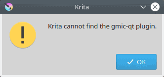
Then, there’s also the GIMC plugin – which is another powerful tool, and you should definitely have it, as it significantly expands the available range of filters and effects you can apply to images. Indeed, GIMP feels nude without it – plus a few other useful extras. I wanted to see how it works in Krita, and got a sad message that gimc-qt plugin was missing. And worse yet, it’s NOT available in the distro repos. You have to manually download and setup the plugin, whereas GIMP has its own version in the standard channels. Why.
I also noticed that several other useful effects – which I believe are part of the standard GIMP offering, like Generic, Artistic, Decor, Distorts, and some more – are missing, and they would definitely make Krita more accessible. I know that the focus is on art creation, but these effects and filters are tiny in essence from the application footprint perspective, and adding them should be trivial.
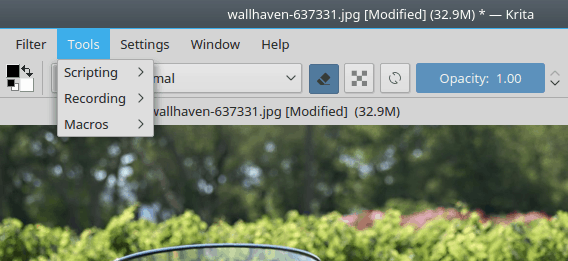
Macros
I was really enthused about the macros. Essentially, you record your actions and then replay them. Makes perfect sense. You do not want to waste time re-doing the same dozen effects on your layer in each different picture, again and again. Well, easier said than done.
I noticed the functionality to be flaky at best. First, when recording, some effects simply didn’t take, eh, effect. The progress percentage remained at either 0% or stuck forever at some random number, but not so with the macros off. Also, the performance of applied effects was also much faster without any macro recording. Then, after recording a macro and saving it, the actual file was not there.
On another occasion, the macro was correctly saved, but when I tried to run it, it didn’t do anything. I opened the macro file in a text editor, and it had an empty and unclosed <RecordedActions/> declaration, and nothing else besides. For some reason, my experiment did not work.
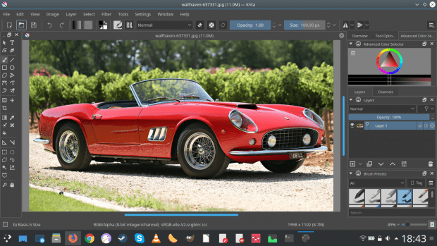
Working with Krita
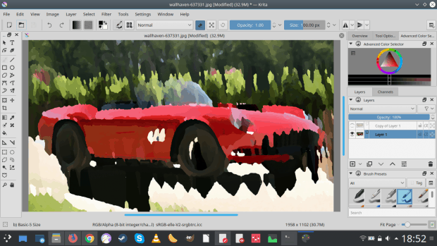
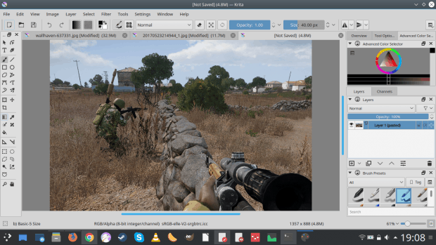
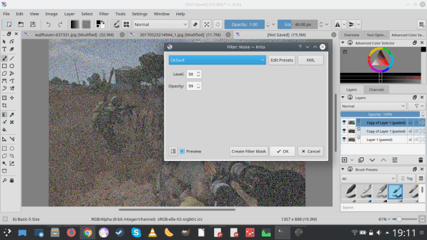
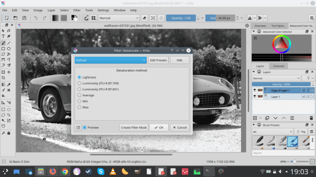
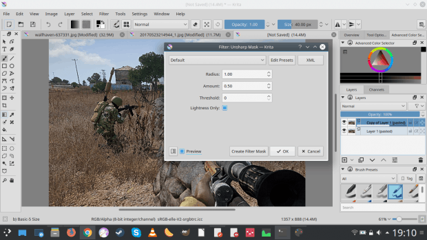
It wasn’t as smooth as I’d hoped. I decided to try to edit a few images – a random wallpaper featuring a classic car, and an in-game screenshot. I wanted to make the latter realistic, which I usually do in GIMP by creating several layers from the original, applying unsharpen mask, video/newspaper effect, grayscale noise, and a bit more.
In Krita, this was decidedly more difficult, and not just because of some subtle interface differences. For example, you don’t have the option to control individual color changes when setting up noise, and there’s no resize on selected rectangle area. I also struggled with editing the color balance to make the image look more kind of grayscale and faded. No fancy effects as I mentioned earlier. Sure, for art creation, this is not the main idea, but then, there’s really no technical reason why Krita ought not to have these little extras.
The preview functionality for applied effects did not work consistently for me – often, the preview would actually flicker, so you only see it “applied” for about one second and then nothing. This is frustrating, as you’re not sure what you’re going to get. Other times, it worked perfectly. Go figure.
In the end, instead of having a decent faux-realistic game screenshot, it looked more like a cheesy poster with the DOS color scheme, and I’m not saying this to disparage Krita. I tried to do the same thing I do in GIMP, and here, I failed to achieve the desired results.
Well, this is a long-term project, so we will see. But then, there’s the cartoon speech bubble test. This is impossibly difficult to do in GIMP. You need a lot of patience and non-intuitive effort to create a simple balloon and then add the little arrow pointing at the (comic strip) character, to indicate it is speaking. I didn’t find Krita any easier in this regard. You still need to free-draw lines and bend them, and then cut your wrists, because this tasks saps life.
Interface settings
Again, like GIMP, you have an almost infinite range of possibilities when it comes to the layout of the main interface. You can dock, undock and float a bewildering range of tools, and this is best done on a huge monitor with lots of pixels to let Krita spread its wings.
My first encounter with Krita has been interesting so far. On one hand, without any tutorial and only my prior knowledge of GIMP, I was able to do about 80% of the stuff that I wanted, and that’s pretty good. Add to that some extra features that GIMP does not have, and you have yourself a reasonable IMP.
But then, on the other hand, there were a lot of frustrations – and that’s even before I got a chance to sit down for a few hours and paint. Macros didn’t work as well as they should, GIMC is missing, and some of the effects and options are clunky. Maybe all of it comes down to habit, but I doubt it. I have a fairly good natural affinity toward software, and if it’s not intuitive, it means it’s not designed right. Krita has some decent features, but then it also has some (let’s call them GIMP-like) quirks that simply make no sense from the workflow perspective. The UI show work with you, not against you.
All in all, Krita is better than what I’d expected. Things also become slightly more complicated when you take into account Karbon, which is another KDE application and part of the Calligra suite, but it also does vector graphics, and perhaps competes or complements Krita. The duality between GIMP and Krita is also intriguing, but also an indication of forking and wasted energy, because there’s 70% common base in both programs that could have been invested making dope effects, like, I don’t know, a comic strip speech bubble, rather than replicating what’s already there. In a way.
Bottom line, I like Krita, and I will explore it some more, trying to master its interface and options, and perhaps even render some original art without shouting at the computer. For me, GIMP is a no-go in this regard, so this will be an interesting comparison experiment. Lastly, I’d like to see more effects, GIMC seamlessly integrated, and the macros must work. Well, there you go. Take care.
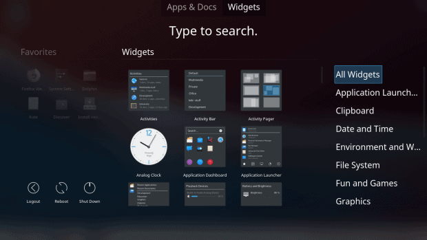
The concept of addons is an interesting one. At some point over the past decade or two, companies developing (successful) software realized that bundling an ever-growing code base into their products in order to meet the spiraling tower of requests from their users would result in unsustainable bloat and complexity that would not warrant the new functionality. And so, the idea of addons was born.
Addons come in many flavors – extensions, plugins, applets, scripts, and of course, widgets. A large number of popular programs have incorporated them, and when done with style, the extra functionality becomes as important as the core application itself. Examples that come to mind: Firefox, Notepad++, VLC, Blender. And then, there’s the Plasma desktop environment. Since inception, KDE has prided itself on offering complete solutions, and the last incarnation of its UI framework is no different. Which begs the question, what, how and why would anyone need Plasma widgets? We explore.
A good meal needs no seasoning
Other than what the chef put in, of course. And that’s largely true. If the desktop environment offers all the necessary functionality, then it really needs no extras, right. Then again, is it even possible to do that? Can you really satisfy the needs of all the users out there without making a horrible, over-complex monster?
Well, Plasma is definitely trying to do so. As I’ve outlined in my Plasma secrets article, there’s a wealth of hidden goodies under the hood, and you just need a bit of curiosity to dig them out and use them. Moreover, the system has been designed in a modular fashion from the start, and you can definitely see that when you use something like Krunner or Dolphin or Clementine. Lots of the functionality that users take for granted comes from plugins, and they are provided with the system. In the worst case, you just need to enable them.
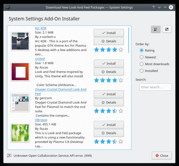
Then, Plasma also allows you to install various aesthetic addons – icons, themes, fonts, decorations. This is done using built-in system wizards. Alas, this part of the desktop framework is rather messy. We’ve seen that in my Plasma 5.12 LTS review. If you want to install a new theme, there’s a 63% chance you will end up with a dud; either it won’t install at all, or it will silently fail after it’s supposedly configured. There does not seem to be any strict convention on packaging, and you need a bit of luck to get around. Still, the important thing is that the desktop provides for an extensible framework that lets you customize the system look & feel without manual work.
Lastly, Plasma itself is also rich in features – sometimes too much, one might say. But it does have a reasonably logical workflow, and you can tweak, change and edit pretty much everything, at the cost of going through many deep menus and clicking lots of little buttons and options. It’s not just the desktop that you can customize – you have activities and workspaces, a whole multi-dimensional cube of features. That in itself creates a sense that system addons are not really required.
So what about widgets?
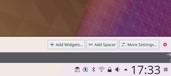
Aha. Well, you have them. Click on the little hamburger menu in the top left or right corner of your desktop, depending on your distro, and surprise surprise, there’s a whole list of options! Among them, widgets. Likewise, click on the hamburger menu in the right corner of the system panel (usually bottom), and it will expand the panel settings. Here too, you have the option to install widgets. So they are quite prominently featured. But do you need them?
Let’s start with a secret: the items you on the panel (system area stuff, the clock, etc) – those are actually widgets. You just don’t necessarily treat them that way because you don’t consider them widgets. But even the show desktop or minimize all widows button that you may have seen (or in fact added) are actually widgets. So they are right there, all around you.
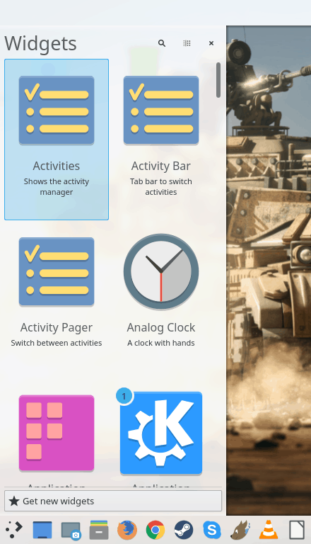
Now, finally, we can delve deeper into our topic. If you want to “extend” your Plasma desktop, beyond the defaults that you get (which already include dozens of extra plugins and extensions in one way or another), are there any good widgets around? I spent a couple of hours playing, installing and removing widgets, trying to see if there were some hidden gems in the non-default list that perhaps should be made a mandatory part of the Plasma desktop environment, or they may have somehow escaped attention, and yet, they are the best thing since turbo-charged fuel-stratified injection became the norm in cars. In other words, can Plasma outdo Plasma?
Familiar faces
We’ve already discussed some of these in the past. For instance, Event Calendar, as a replacement to the standard clock & calendar widget used in Plasma – this was a workaround for when the clock would show at full panel height whereas other icons were smaller and vertically centered. But on its own, Event Calendar has merits, including Google calendar sync, weather updates, timer, and more. We also talked about Show Desktop and Minimize All Windows – with the latter providing the more classic functionality people normally expect. All in all, there are some useful extras, but that’s a trivial answer to the question I asked earlier. Let’s continue.
New kids on the block
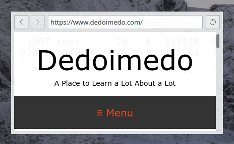
Browser
One of the widgets that comes to mind is a small, permanent, embedded browser window. On its own, it’s not revolutionary, but then, you can have it there, and showing specific content if you need it. This might be useful for developing websites and testing layout. Then, there could be an online portal or service that constantly refreshes and shows information, like say stock prices, and you don’t need to think or worry about opening a browser and keeping it there. The desktop browser widget serves as a sort of dynamic banner. Again, you can achieve the same with multiple browser windows launched the conventional way, but it’s a nice little thing that might be quite useful.
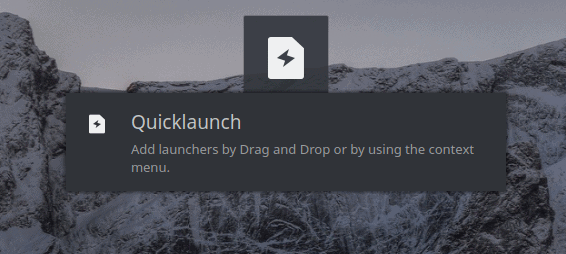
This widget is something like a half-panel or better yet – a quicklaunch area without the rest of the panel stuff. You can place one or more launchers on your desktop, and then drag ‘n’ drop applications onto them. There’s also an element of visual customization. Does this serve any purpose, you may ask, especially since you already have desktop shortcuts, folders, plus panels with icons. Well, not really. In fact, I did find this particular widgets to be slightly clunky. The worrying thing is that it stands prominent among the available choices, and it often features on various popularity lists. That says a lot about Plasma widgets in general.
While the concept is nice that you can save space – the launchers can be extra tiny as opposed to desktop icons or panels, where you might need bigger size for overall clarity – it’s not realized the best way. I did not find a way to rearrange icons. You can play with settings and change spacing, alignment and such, but it was never a fun, smooth exercise.
Well, if you think Plasma does not have enough variety with no less than three different menu layouts, you can also use a Windows 10 like substitute, which gives you a modified classic view. Now, there’s no revolution here, just a somewhat different way how items are presented, grouped and listed. The one thing missing are apps on the right side of the menu (feels nude with so much blank space, it should auto-collapse if there’s nothing there), and it definitely works better with Breeze Dark theme.
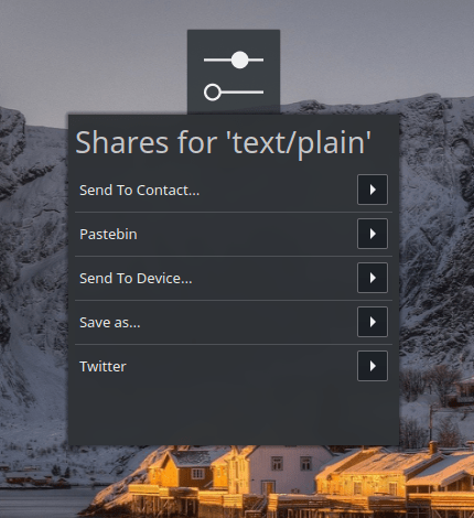
This is a rather powerful yet confusing widget. It allows you to share files in several easy ways, without having to overthink the backend part. Say you want to tweet something, send a file to a device, or just make a bunch of text available online. Share lets you do this, and then some. It has a built-in list of functions, so when you drop a file, it will just do that quickly. Perhaps too quickly.
While playing with the widget, I almost skipped a heart beat when it suddenly, almost without any prior warning, uploaded a ‘file’ to Pastebin, definitely without asking for confirmation. The drag ‘n’ drop turned to online data instantly. Luckily, I had not really copied anything onto the widget, but it still did fire, and showed me the uploaded (empty) entry on Pastebin. You could easily end up accidentally placing important personal data on a public board. This needs more finesse and an extra safeguard or two.
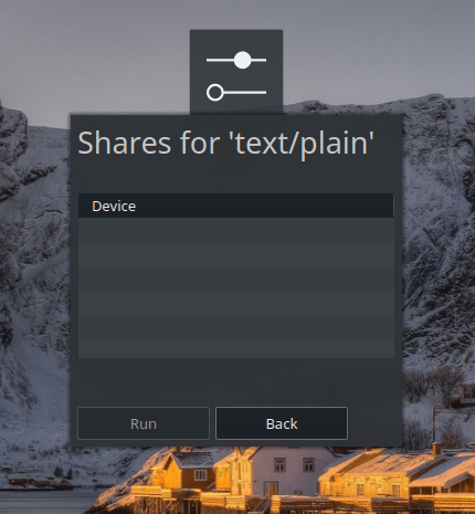
The widget did not detect any devices. I’m not sure what kind of devices we’re talking about – internal partitions, external disks, network shares, filesystems. There isn’t enough information, and you can’t really customize the list. Potentially, this could be a useful asset, but in its current form, it feels raw.
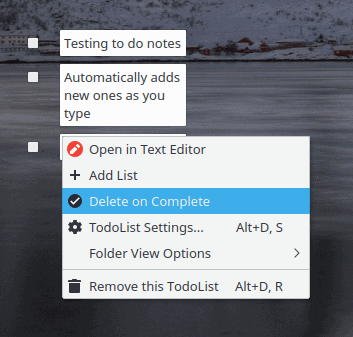
The name is self-explanatory. This widgets allows you to create desktop one-liners, and help you remind of the various tasks and actions you might want to do, and as such, it is a potential replacement for sticky notes we saw in the past, or the good ole text files. The widget is fairly rudimentary, and it does not seem to have any fancy color scheme, highlights, warnings, reminders, or anything similar, nor any sync with calendar entries, say like Event Calendar. Works fine, but then, it does not really introduce anything revolutionary that already isn’t covered by defaults.
I continued testing a little more, and the list covers the usual suspects: various CPU, memory, disk, temperature monitors. On the negative side, the stuff gets pretty repetitious very quickly. On the bright side, every single widget actually installed and worked, regardless of what its functionality might be. There were no ghosts or duds, as we’ve seen with other aspects of the system addons mechanism. In this regard, there might not be that many widgets available, and if you’re looking for a short best-of list, you won’t be awed or amazed or see much that isn’t mentioned above, but then, you won’t be disappointed either. At least the widget installation is foolproof.
Conclusion
A good meal needs no seasoning, indeed. And Plasma is a proof of that, with the widgets the best example. Remarkably, this desktop environment manages to juggle the million different usage needs and create a balanced compromise that offers pretty much everything without over-simplifying the usage in any particular category. It’s a really amazing achievement, because normally, the sum of all requests is a boring, useless muddle.
Plasma’s default showing is rich, layered, complex yet accessible, and consistent. And that means it does not really need any widgets. This shows. The extras are largely redundant, with some brilliant occasional usage models here and there, but nothing drastic or critical that you don’t get out of the box. This makes Plasma different from most other addons-blessed frameworks, as they do significantly benefit from the extras, and in some cases, the extensions and plugins are critical in supplementing the missing basics.
And so, if you wonder, whether you’ll embark on a wonderful journey of discovery and fun with Plasma widgets, the answer is no. Plasma offers 99% of everything you may need right there, and the extras are more to keep people busy rather than give you anything cardinal. After all, if it’s missing, it should be an integral part of the desktop environment, and the KDE folks know this. So if you’re disappointed with this article, don’t be. It means the baseline is solid, and that’s where you journey of wonders and adventure should and will be focused. Take care.
A bunch of days ago, the first stable version of Elisa, a new KDE-oriented music player, was released unto the wild. The program aims to be a simple, nice and flexible player, with good integration as well as cross-platform support. Sub-1.x releases of any which application are always tricky, but I still decided to give it a whirl.
Overall, the Linux world is over-saturated with music players, many of which offer only limited functionality, and just a few consistent programs that have survived the rite of time and steady use. In a way, this proliferation mimics the larger distro world, with hundreds of offerings, some with only minor differences among them, and usually something really cardinal missing. Which is what makes Elisa potentially interesting. Can it outplay the overplayed game?
Setup
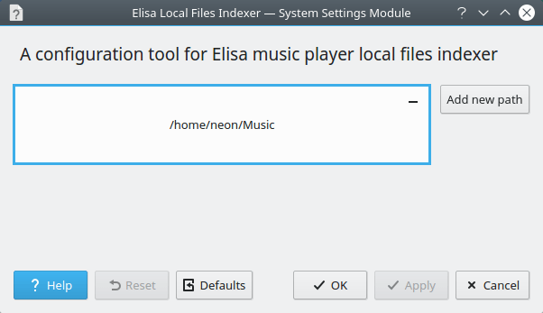
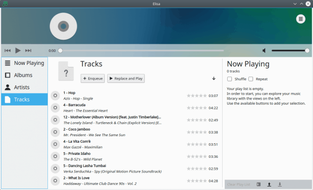
To make sure I’m doing the best I can, I set Elisa up in KDE neon Stable Dev edition, which means lots of software with words like git and almost-current date version numbers. The program is available in the repos, so the configuration is trivial. Furthermore, once installed, Elisa features a separate configuration applet, which can be invoked directly from the system menu, or from within the program’s main interface once launched. The options are identical, and currently, extremely lean. You only get the option to configure new paths for your music auto-discovery or reset the program to defaults. Moreover, the settings menu comes with a rather 19th century adventure novel title – Elisa Local Files Indexer.
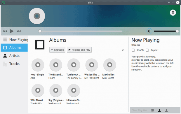
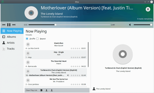
The main interface is simple, elegant and perhaps a bit sterile. It comes with the standard three-pane view that’s common for most music players, especially post-iTunes era, with a sidebar that lets you access different folders, views and such, the main area, and a playlist on the right. Somewhat like Amarok.
The interface does not allow you to resize the panes just yet – and in default mode, it cropped the text Now Playing on the left. This creates a jarring visual effect, and you need to resize the player horizontally by about 10-15% to get the text just right. The entire interface resizes proportionally, so this makes for an extra annoying visual setup. I do believe this will be rectified in future versions, but at the moment, it is what it is.
Looking at the official screenshots, the main interface shows with awesome album covers. No so with my own test. I do not know why the cover art was not shown or discovered, but I only had the generic CD art. I tried sorting the songs by album, name and whatnot, none of that made any difference.
Official screenshot; why don’t I have all these lovely colors?
Playin’
The usage is straightforward – select the songs you want to listen to, hit play. All good. You can shuffle and repeat. You can also upload and download playlists, or clear the existing one. Now what this will do is remove songs from the list – but also stop the playback, which is kind of unexpected.
I was able to check the track metadata, but the star rating did not work – the interface did not respond to my click attempts to rate different songs. There’s no right-click, and no option to change or edit the tracks in any way, like say search for cover art, check lyrics or more. And herein I believe lies part of the problem with Elisa. It is trying to be unique, which means it should not replicate the settings and options available in other music players, but then it offers partial functionality. On the other hand, there’s really no point developing an application that will have the exact same set of options like all other players, because what’s the point.
All in all, it did what it could, but it’s a far cry from what I’d expect from a music player. I’m definitely not an audiophile, but there are things that should be available in every multimedia program, even if you don’t always use them.
Well, cover art. Nothing that lets you source or sync music from remote shares, online services, or external devices, like perhaps smartphones or media players. I’d like to be able to check lyrics too. Not critical, but it’s a nice extra. The settings should also allow some level of customization, and the ability to minimize to system area on close, so that song can resume playing.
I also believe the overall layout isn’t pure KDE. It does feel Plasma, but it is different from most other programs available in the Plasma set, probably because it’s still new and missing lots of the features. It’s not a bad start, but then, first impressions are everything.
Do we need another media player?
So there’s a question for you. First, let’s start with a comparison. VLC, for instance, is a powerful workhorse, which can look and behave simple most of the time, but also do a whole lot of complex stuff when required. The other example that comes to mind is Clementine, a fork of the pre-2.0 Amarok, and it’s a very flexible, colorful and fun media player. It has all the bells and whistles, but you can also use it as nothing more than a shuffle deck of songs, without bothering with art, metadata or alike. The full spectrum of options and capabilities is there, and you can ignore it if you want to.
Then, even if we ignore these two – which pretty much satisfy 99% of all use cases out there – the question is, why does Plasma need a new media player? Is it currently missing one in its stack? Amarok is sort of stalled, true, but Clementine is alive and kicking if not fully Plasma in its spirit and nature. From that perspective, Plasma is missing a native player. But then, apart from the need to have things orderly, that’s not enough justification for adding yet another application of this nature into the Linux arena. The same can be said of other software, like browsers – QupZilla slash Falkon for instance.
I do think desktop environments should be fully and wholly self-contained, and that means a complete app stack. But such applications should be superior – because ultimately, no one will use them. Microsoft Edge on the desktop is a great example. Part of the stack all right, but most people will download and install Chrome or Firefox as their first Windows 10 activity.
Elisa may satisfy a commonality need – but it also needs to be awesome. Then, should the energy be invested in making a new player from scratch, or perhaps integrating or extending existing software so that it fits well into the KDE world. I believe 90% of all open-source projects are redundant, as they duplicate functionality without offering anything new, and that’s something that Elisa needs to avoid if it’s to grow and thrive. What is the actual need behind the development? Is it dev-oriented or user-oriented? Because I don’t think people are missing music players, or even good music players.
That’s something that the project needs to figure out while it’s still in its infancy. The changes will become much more difficult once it hits the 1.X release.
Conclusion
Elisa is an early beginning of something that might one day transpire into a good, meaningful, exciting project. Or become yet another pile of code created without a greater strategic imperative aimed at satisfying a primal need. At the moment, it’s a bit early to tell, but the initial showing is just okay. Reasonable looks, reasonable behavior, some bugs, and simple functionality that is neither here nor there. I would like to see more. Better yet, I’d like to see something new and unique.
In other words, think, what would make you switch? What would make you abandon your current music player and opt for Elisa as your primary choice? And what does it have that we haven’t already seen or tried in dozens of other players? At the moment, not much. True, another effort does not hurt anyone, and why not. But then, why not is not the foundation on which greatness is built. Plasma is taking off, and recently, it’s become more robust, more consistent, more professional. All and every future effort needs to align to this core mission, and Elisa should follow suit. This beginning ain’t bad, but I want more. Worth testing, just don’t expect any miracles. To be continued.
I have to admit, I wasn’t too pleased with my experience with Ubuntu MATE 18.04 so far. I mean, it was all right and all that, but there were too many bugs, too many problems, and even a few application crashes, which are a big no-no for an LTS release. But at the same time, I was quite intrigued by all the features and options that MATE offers. And this is why we’re here.
I want to explore the innovative side of things in the reincarnated Gnome 2 desktop. We touched on some of these things in my MATE 1.20 review, and then in more detail in my article on Mutiny, a Unity-like desktop layout for MATE users, designed to fill in the gap left by the unfortunate demise of Ubuntu’s flagship environment. But that’s only the tip of the iceberg. So with the dichotomy of dissatisfaction and amazement, let’s see what this old-new desktop can do for us.
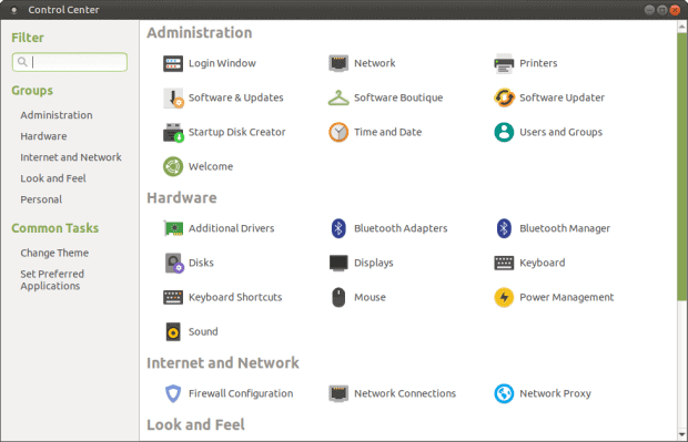
1. Control Center
We start nice and slow like. Back in the day, before software development was all about agile and such, there was more focus on creating complete products. And the Control Center in Gnome 2 – now MATE – was (is) such a product. It’s a one-stop tools & utilities shop, allowing the user to quickly and easily access all and every system maintenance and customization function, with an intuitive interface and clearly legible categories. The looks are less fancy than what you get in various desktop environments, but the functionality is top-notch. While there’s nothing wrong with other tools of this nature, like say the Plasma settings or perhaps Mageia Control Center, MATE’s solution to the problem is this simple and elegant element in the desktop environment. Warming up.
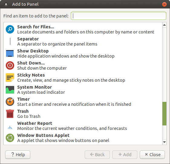
MATE comes with a very high level of granularity – you can play and tweak every little thing. When it comes to panel applets, there’s a whole load of them, a colorful set, and they allow you to enhance your desktop experience.
There are a lot of available items. For instance, the copy dialog is a seemingly innocent but powerful one, with the ability to pause and revert actions. Then, you can add a system monitor, notes, timer, Trash, weather, monitors for your disk, CPU and memory activity, and a lot more.
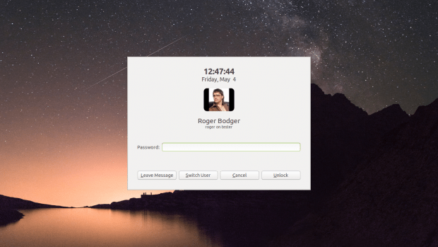
MATE’s lock screen is fairly simple and straightforward – but it also comes with an option to leave a message. Which means if someone comes by your computer, and you don’t mind other people’s greasy fingers touching your keyboard, they can let you know they were there. I can only imagine the prosaic quality of such messages in an office-like environment.
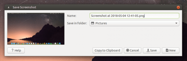
One of the most underdeveloped parts of every Linux desktop is the screenshot facility. In Plasma, Spectacle is clunky and adds unnecessary shadows. Gnome’s tool is simple, but it closes every time you complete an action. Xfce’s one also closes once you’re done, plus it mandates an extra click, as it has sharing options in addition to local save. And there’s still more variety around.
Ubuntu MATE comes with the old, proven Gnome 2 tool – with a nice addition. There’s a new [sic] New button, which allows you to take fresh screenshots without having to close the program. Moreover, if you take a screenshot and you don’t like it (the timer was too short, or you didn’t position the elements as you like), you can now quickly remedy this without starting the utility again and again. Sometimes, little things make so much difference.
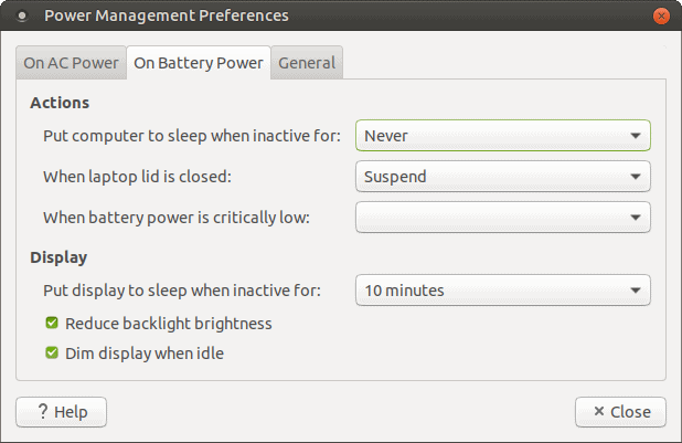
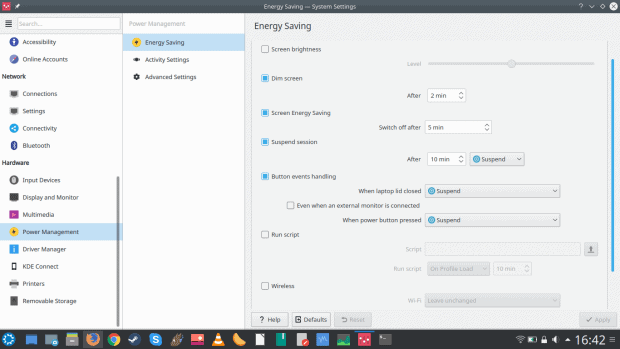
Plasma has always been the king (or queen) of power management, and this is still true in 2018. Other desktops do not offer that much freedom or customization when it comes to power and battery settings. But recently, Xfce and MATE have been making progress, the latter in particular. The power manager in MATE is both more flexible and more powerful than before, and also more aggressive. It will actually modulate the screen brightness as soon as you plug the charger in and out. This is more like Microsoft Windows, more like Plasma, and more like what most people expect from their laptops.
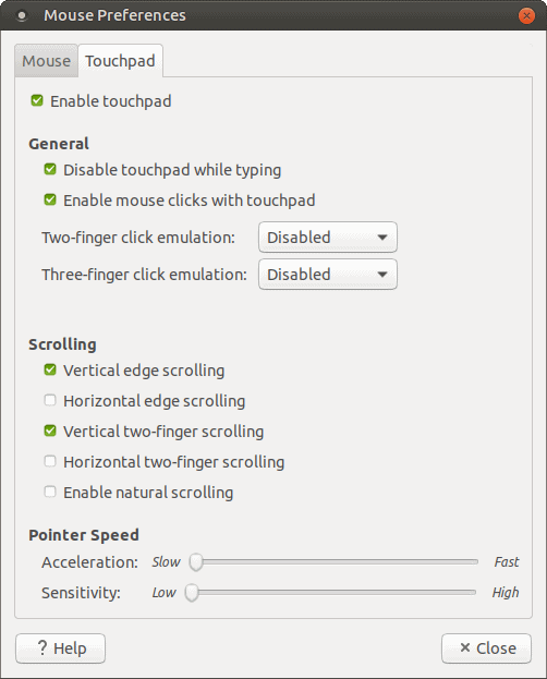
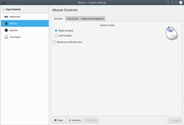
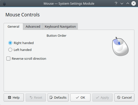
You touch my MATE, you touch my mouse control. Non-Plasma desktops had often had a very rudimentary Touchpad tool. It was effective, but it was quite basic. MATE now offers a fairly mature tool, which allows you to fine-tune the tapping, multi-finger scrolling and mouse emulation actions. If you’re a laptop user, you know how critical (or annoying) Touchpad settings can be, so having the right tool to handle is vital. Ubuntu MATE 18.04 nails it.
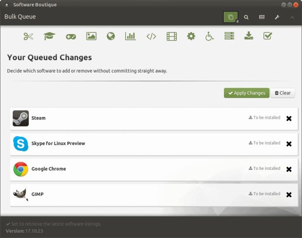
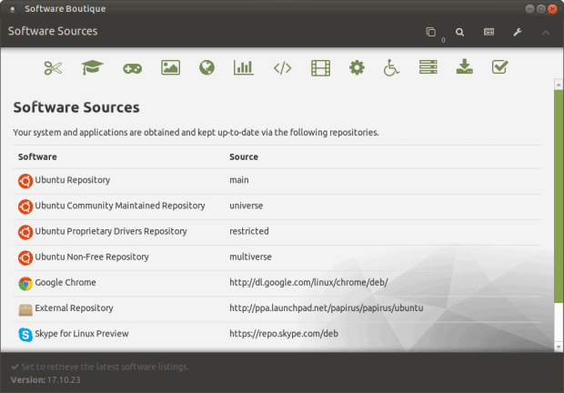
Software Boutique is the new GUI package manager. It’s been around Ubuntu MATE since 17.10, but it’s also here, to serve your LTS needs. Without using too many superlatives, this program is currently the most complete and practical package manager frontend in the Linux market, hands down – if we exclude the slowly dying (old) USC.
Boutique’s got everything. It looks pretty, and it’s easy to use. You can browse for applications by category and use a powerful filter mechanism to narrow down your searches. It supports bulk installations, you can toggle proprietary software on/off, and by default, it will handle not just the usual suspects from the standard repos, but you also get the stuff from the Partner channel (like Steam) as well as Skype and Chrome, which have recently been excluded from most (but not all) non-snap Linux repos.
The program also comes with notification, news, you can edit your software sources and repos, repair a broken package manager index, and still more. The displayed application information is clear, precise, and you also get screenshots. Very neat. A complete article to follow.
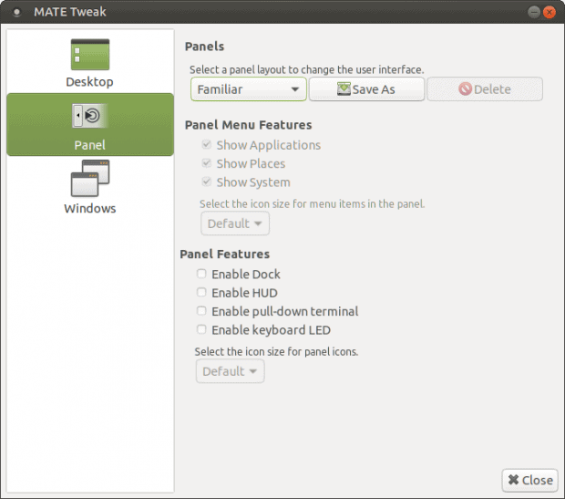
This is a really big one. While MATE has always been a pleasure to tweak and customize – more so than any other desktop environment, allowing you (just like Gnome 2) to cobble different pieces from completely different themes with joy and precision, the new version 1.20 takes this to another level.
MATE Tweak is included with the desktop, so you don’t need to install anything. Furthermore, it gives you full control over your desktop behavior (and icons), window behavior, and lastly, your panels. But this isn’t just a matter of making the panel look this or that way. We’re talking a complete desktop layout + experience.
There are several presets available. You can make your MATE look & behave like the old Gnome 2 (traditional), use the default look & feel (familiar), use Redmond (for a more Windows-like setup), Cupertino (for a MAC-like layout), or perhaps Mutiny, which gives you a Unity-like layout: a top panel with an embedded global menu and window controls for maximized applications, a full-screen app menu, and a vertical dock on the left side. This works quite well, and does a reasonable job of emulating Unity looks. In fact, the closest analogy is the old Unity 2D. However, this is all modern, fancy stuff, with low performance penalty and solid looks.
I mentioned the global menu briefly earlier. Some of the presets come with a global menu, but you can add it to the panel (any which, in fact) if you want. The applet is available in the long list of panel items, and it’s called Global Application Menu (AppMenu). It behaves in a fashion similar to Unity – once you enable it, application window menus will be “moved” from individual windows onto the (default) top panel, saving vertical space. The menu will change based on the currently selected application. There are a lot of nice options available, and you do get a streamlined workflow experience.
But the party does not end there. MATE Tweak comes with several additional options, all nicely integrated. You can toggle a dock (Plank), which lets you host and pin your application shortcuts. The dock will be enabled in some of the panel layout preset (with a slightly different implementation when using Mutiny, hence a separate reference), but you can also activate it manually.
You also have the option to use a drop-down terminal. The default key to activate this is F12 – Tilde would make more sense for all drop-down console users worldwide.
Again, this is a very Unity-like feature. For me, the HUD didn’t always work reliably – and during my Ubuntu Bionic testing, the HUD also crashed once or twice. But the actual functionality is nice. The default hot key is left Alt (press once fast while inside an application that has a menu – won’t necessarily show in the desktop itself), and then you can search through the app settings. Smart, elegant, practical. And you get it in MATE as well.
Very slick, very convenient, and it allows to “skin” your Ubuntu MATE any which way you like. This level of visual transformation is unique to MATE, and no other desktop has achieved a similar ability of flawless UI change. Others do offer varying degrees of artistic freedom, but the Gnome 2 family remains unbeaten, a full decade plus and counting.
We will talk some more about MATE customization in the future.
Conclusion
Ubuntu MATE 18.04 Bionic Beaver will hopefully work around its bugs and problems and present a robust, unified, slick desktop to its users. Regardless, there’s no denying the wealth of innovation and fun that’s gone into this product. For a few years, I thought MATE was sort of simmering quietly, and then, bam, it comes back like a horde of Rohan warriors riding to Gondor. Or something.
If you’re looking for an Ubuntu-like experience, Ubuntu MATE comes as close to the original as possible, and it also gives you phenomenal, unprecedented level of flexibility to customize and change your desktop however you feel like. The understated power of Gnome 2. Of course, it’s not all about Unity. On its own, as a classic desktop, Ubuntu MATE comes loaded with interesting features and options that allow you to use the system however you fancy – a classic look or a modern MAC-like look, dock, panels, global menu, themes, you name it. Shake and bake. Time to explore then. Just beware the bugs.
Two years ago, the Plasma desktop was just another offering in the Linux pool, with a modern but overly complicated interface, bereft of enthusiasm and brimming with problems. Then, suddenly, it changed. Like a primordial being crawling out of a mineral soup, it started morphing into a slick, fast, elegant desktop. And now, it’s become the leading force in the Linux world.
Several months ago, we looked at Plasma 5.12, the LTS release, and I outlined all the different issues and problems surrounding it. The KDE team has its ear(s) to the ground, and there’s been a lot of positive momentum and hard working invested into making Plasma amazing. Sometimes, the mission is set back by regressions in the distro space. If only the emotional rollercoaster wasn’t so swingy. Now, we have another chance to be dazzled – or shocked. Plasma 5.13 is in its last beta stages, and I took an opportunity to check what gives. Not one but TWO tests. After me.
First test: live session
After sampling the savory teaser announcement for Plasma 5.12.90 (essentially 5.13 Beta), I went about getting the necessary live media for testing. I chose the KDE neon Stable dev branch, figuring the User edition might not have what it takes, with the Unstable version being probably too raw for usage and showcasing. It would help highlighting what exactly is included where, so that testers (or users) can more easily narrow down their options.
Look & feel
I fired up the image on my Lenovo G50 laptop, and soon enough, I was logged inside an stylish, pleasing desktop. The familiar DNA is there – Plasma colors, classic desktop layout, a wealth of options and customization hiding just below the surface, never in your face if you don’t want or need it, but there to unleash the full power of Plasma. That alone, however, has never been enough. But recently, there’s much more consistency and determinism in the Plasma UI design.
There are also a lot of papercut fixes. For instance, the panel resize now features the actual pixel value when you drag the panel up or down. The number shows for a second before it disappears once you stop the vertical movement, or once you depress the mouse button. Finally, the OCD brigades can rest at night, safe in the knowledge they can be precise about getting the Plasma panel height just right. A rhyme.
Height set to the most meaningful number of them all.
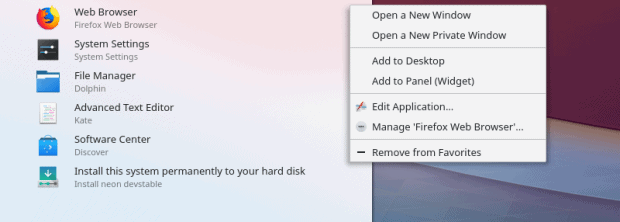
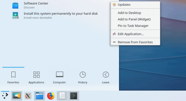
The clock widget is also of normal size, the system area icons are positioned like Austro-Hungarian soldiers, waiting for the parade. The system menu comes with a more powerful right-click context functionality. The actual options will change, depending what icon you choose. For instance, with Firefox, you can edit the entry, add to desktop or panel (and this also changes, depending on what type of task manager you use), or launch ordinary or private windows. With Discover, you can also check for system updates, and so on. Very cool.
The menu also fully cycles (with the middle-mouse button scroll). If you reach the bottom of the list, it goes back to the top, so you don’t need to do any tedious go back, go up, whatever. This is a refreshing and useful little change.
Network-related stuff
Now, the Wireless connection double prompt is STILL there. I had to provide the passphrase for the access point twice. Not nice. If you copy files to a Samba share, the timestamps will be reset, still, and this is a rather annoying thing, because you lose the temporal granularity of your work. For instance, you can’t sort documents based on the time of their modification anymore. On the bright side, possibly because KDE neon is running an older Ubuntu base, Samba functionality works, unlike the recent crop of 18.04 releases.
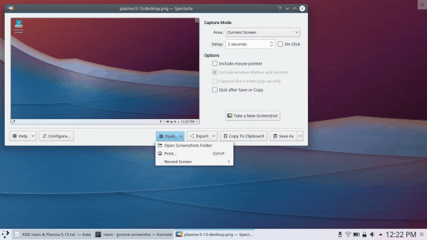
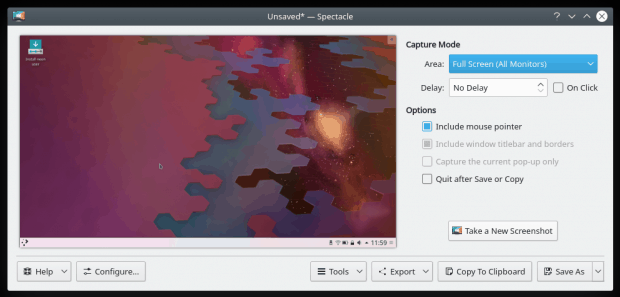
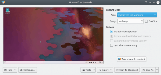
Spectacle
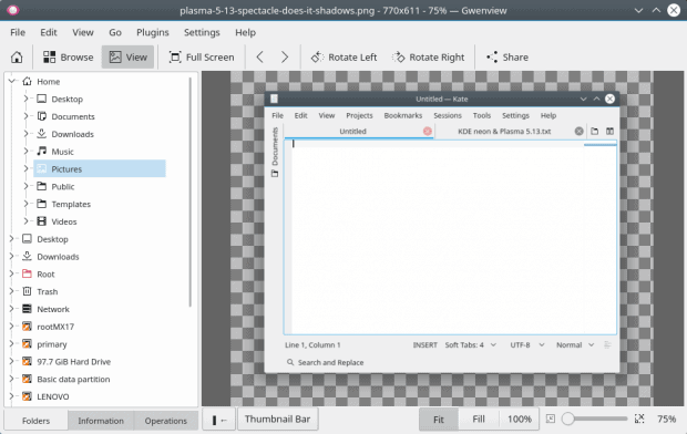
As a software tester, one of the first programs I need is a screenshot tool, so I can document my games. Well, Spectacle has improved dramatically in the 5.13 release. It has a separate settings and image save buttons now, yay! It still creates windowed images with a huge alpha border. That’s quite unnecessary, because there’s a reason why people want to take screenshots of just a particular app window. The alpha border is at least symmetric now, with identical left and right margins.
Spectacle also has the option to record your screen – lovely jubbly – but this is just a stub, because you need to install one of the several popular desktop recording software available in Linux. However, the attempt to integrate and combine the two modes is very commendable.
I can see your heartbeat, coming from the shadows. Seriously, toggle on, toggle off. Plasma Kid.
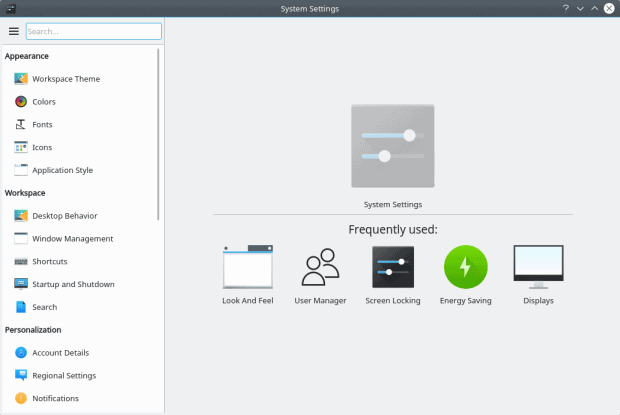
System settings
Better than before. More streamlined. The categories make sense, the visual hierarchy makes more sense, and there’s an overall workflow redesign, which should make it easier for ordinary people to find what they need. As always, you have the option to change the visual layout – you can use the classic KDE layout from the olden days, the tree view or the icons view, which gives you something similar to the Ubuntu Unity settings menu.
The fonts are pretty good in Plasma 5.13 – and improving. The default systems settings are reasonable, but now, you have more control over the font system than before. If you leave the anti-aliasing settings with Vendor Default, you won’t have the option to change the sub-pixel rendering and the hinting. But if you set the dropdown to Enabled, you can make changes.
There’s a little typo there – it reads djust All Fonts instead of Adjust All Fonts.
This is sweet on several levels – better sub-pixel rendering control than before PLUS you can actually see how different choices affect the font look. There are notable differences between RGB and BGR and whatnot. Seriously notable differences. The combo of RGB plus slight hinting gives the best results. The effect is immediate and immense. It’s like someone cleaned my eyes with the purest coconut water.
The name of the game: integration. Plasma 5.13 is working hard on making your desktop experience a unified one. Smooth and seamless. Part of this mission is giving you full control over browser actions the same way you get over your media. In essence, the media control widgets becomes a browser control widget, too, and you can pause, resume or cancel downloads or media playback in your browser windows. Both Firefox and Chromium-based browsers are supported. This looks cool, and the teaser images are really neat.
Unfortunately, at the moment, the execution still isn’t perfect – I hope things will click into order with the official release. First, there’s not enough information around HOW you can actually get this working. It just says you need to enable Plasma Browser Integration, but there’s no widget for this, or a package in the system repos.
The process is two-fold – not unlike Gnome extensions, and this is NOT what users want or need. I had to install a browser addon from the Mozilla Firefox online repository first. After I did that, the system complained that it could not connect to the native host – this is the same type of ‘host connector’ error like the chrome-gnome-extension nonsense. But then, the problem is even bigger, because the Stable dev branch of KDE neon does NOT have the necessary package. I had to manually grab it from the Unstable repo and install it. There was a compounded problem with Discover here, so I used dpkg on the command line. Eventually it was all in order, but it’s a high toll for getting the functionality to actually, um, function.
Now, once I had the package in place and Firefox started without any errors, it was really neat and impressive. The ability to control your browser actions from the system area in a transparent and consistent way, similar to other ‘media’ applications, is a great thing.
Playing online media – of all kinds – will show in the system applet like any other music or video.
KDE Connect
We talked about this nifty program in the past. And it’s just gotten better. The integration mission, remember. This utility lets you connect your Android devices to your Plasma desktop and manage them seamlessly, including audio, video, volume, Bluetooth, plus some rather exotic things like notifications, mail, news feeds, and more. You do need to install the app from the Play Store, and both devices need to be on the same network, but once paired, it’s all good. Moreover, you do need to allow KDE Connect to access your phone notifications, though. Hopefully, some day, iOS and Windows Phone apps will be added, too.
If you switch your system menu to the dashboard-type menu, you’ll have a full screen overview menu not unlike Unity or Gnome to some extent. In the past, I’ve always felt this was a bit cheap, with icons that are too large, and not enough detail or precision. Plasma 5.13 does a better job of putting things together, although there’s still room for additional visual improvements. You can separately access categories, favorites and search inline for either apps or widgets. Neat.
The KDE terminal emulator has also been facelifted. By default, it shows no tabs, but you can change that in the program settings. Once again, you have the full power of customization, if you fancy it. I believe the default gray-on-black color scheme should be changed to white-on-black or black-on-white for best visual effect. The one thing that confused me is the ZModem option – I found this in the menu and clicked happily. Not sure what it does, and from the error message, I’m not really sure I need it. But the error message itself is unnecessary. Why not have the package in the first place? Or tuck this deeper into the settings, just like tabs, which are far more valuable and useful, and yet, they are not shown by default.
My eight-boot mixed Windows-and-Linux setup on the G50 laptop also includes a KDE neon instance, at the time of this writing and BEFORE the update, running Plasma 5.12.4. I updated the system, and half an hour later, I had the beta framework gracing my desktop. This is still with Xenial (16.04) as the baseline, and the same is true of the live image actually. It’s not using the new 18.04 distro, but that’s something we will probably see in the coming weeks or months.
Things were looking even nicer here than in the live session, as my box has already been pimped to beauty, with extra decorations, a nice wallpaper, and a combo of Breeze workspace theme with the Breeze Dark desktop theme. The media control applet has been redesigned, and it’s more posh than before. Elegant touches everywhere. Me likey.
This is a big one. Plasma is fast. Lean and fast. The system was tolling only about 450 MB on idle, and this is at least x2 and often easily x3 less than contemporary Gnome-based systems, and comparable if not better than mission-focused lightweight MATE and Xfce desktops. Instant response, even with compositing turned on, you get smooth transitions and fast multitasking. I only have praise for the efficiency of code and the end product.
Now, Plasma 5.12.90 being beta, there were issues. Of course. These actually look and feel like pure dev problems, so I’m actually not too concerned. I am more worried about actual UI functionality issues, because those require fundamental logical changes. Most of what I encountered in this test was packaging chaos and ongoing work. Indeed, there were no less than two sets of updates available in the span of less than one day, bringing in dozens of updated Qt libraries and such.
The big one – Discover does not work. Like at all. I tried to run the program, and it just wouldn’t start. From the command line, the errors are more meaningful, if just as ugly. I’ve found half a dozen references to this on Arch Linux and KDE forums, a lonely bug report from six months ago, and several suggestions on missing packages, all of which were present and accounted for in KDE neon, to no avail. Discover is no-go. And this also complicated my browser integration package installation. Most likely, by the time you’ve read this article, it will all have been fixed.
plasma-discover
QQmlApplicationEngine failed to load component
qrc:/qml/DiscoverWindow.qml:162 Cannot assign to non-existent property "showCloseButton"

Errors when loading the GUI
invalid kns backend! "/etc/xdg/ksysguard.knsrc" because: "Config group not found! Check your KNS3 installation."
invalid kns backend! "/etc/xdg/servicemenu.knsrc" because: "Config group not found! Check your KNS3 installation."
Discarding invalid backend "ksysguard.knsrc"
Discarding invalid backend "servicemenu.knsrc"
setting currentApplicationBackend PackageKitBackend(0x1031d00)
Another problem is – there are two programs with the name discover. One, called just that, and I don’t know what it does. The other, plasma-discover, which is what we – or users – need. Worth figuring if there’s a name clash here.
There were also a few other issues that might not be fully fixed in the official 5.13 release. Kate always moves the ‘active’ document tab to the far left, and this is confusing if you rely on spatial memory to place your documents. This really becomes messy if you have dozens of text files open, like I normally do.
The laptop was hot during testing, even though Plasma is a frugal beast, but we will discuss that more when I review KDE neon separately. I’ve also noticed long boot times, both in KDE neon and the recent Kubuntu, so I’m still not sure what this is about, but again, something to discuss and troubleshoot at a later date.
The touchpad was jittery. I had to tweak it before I could use the system with wild abandon. Mouse settings were also tricky. The option to choose single or double click is no longer available. Instead, the functionality is located under Workspace configuration.
This is not intuitive, because those two are separate, and people may actually launch the mouse applet individually, through the menu and not through the system settings tool. Moreover, there’s some visual difference between the complete bundle and standalone utilities. This isn’t a big inconsistency, but it’s worth figuring out if there should be both, or if they should differ in looks.
This is not the logical location for mouse control. The big hint is in the name: mouse clicks.
The biggest problem with my test was that a certain library related to Kirigami was missing, whatever it may be, and this made half the settings in the settings menu unavailable. There were no workspace or desktop themes, no icon themes, no wallpaper, no option to edit the screen lock settings, and no option to install any new decorative packages. This feels like a pure beta bug, though.
There’s also a small visual bug with Vault – the new Vault button is positioned too far down and left, if we look at the top of the popup interface. Either it needs to move, or the word Vault needs to move, or the Dolphin file manager icon needs to be re-positioned. Not a biggie though, but the Devil is in the details.
And I guess that would be all. Now, what’s the number of screenshots I decided to use for this article? 42. Which only makes sense in the grander scheme of things. Right.
Conclusion
Plasma 5.13 is (going to be) a very nice release. It builds on the solid foundation that is the LTS edition, and adds cool, smart touches. The emphasis is on seamless integration of elements, which is what separates professionals from amateurs. It’s all around how the WHOLE desktop behaves, and not individual programs in isolation. And Plasma is making great strides, offering a polished version of an already mature and handsome product, with extra focus on fonts, media and browser connectivity and good performance.
There are some rough patches. Apart from the obvious beta issues, those goes without saying, KDE Connect ought to be a true multi-phone product, the network stack really needs to be spotless, and that means full Microsoft Windows inter-operability, Spectacle should allow for configurable shadows and alpha channel, and I want to see if the decorative backend has been cleaned up, i.e. can you search and install new themes and icons without encountering useless errors and inconsistencies.
But all in all, I’m quite impressed. The changes are big and noticeable, and above all, meaningful. You don’t just get features for the sake of it, you get things that improve the quality and consistency of the desktop, that maximize fun and productivity, and there’s deep thought in orchestrating it all together. It ain’t just a random bunch of options that happen to work. I like seeing patterns in things, and I’m happy when there’s functional harmony. This spring season of distro testing hasn’t been fun, and Plasma 5.13 is balm for my weary wrists, so hurting from all that angry typing. More than worth a spin, and highly recommended. Full steam on, Tuxers.
I like being surprised. I like being impressed. I like seeing quality, forethought, vision, and innovation embedded in software products. I like seeing pride and passion woven into the fabric of digital code. And when a nice piece of code walks in, I get sprung.
A few days ago, I reviewed Plasma 5.13 and liked it a fair bit. Then, if you recall, I also wrote about nifty tricks in Ubuntu MATE, and then I thought, well, there ought to be an article on all the good things in Plasma, too. After all, it’s a fun, consistent and highly innovative desktop environment, and you need to get pumped.
1. Three of everything
People say Plasma is too customizable. And in a way, they are right. However, that’s not a bad thing, because you can choose to completely ignore the customization side if you don’t like fiddling. Moreover, the default layout is accessible, friendly and practical. On other other hand, you can tweak anything you want in this desktop environment, and you don’t need any special tools or the command line. You have an unobtrusive, progressive UI that lets you explore its secrets at leisure.
The moment you start playing, you will discover the wealth of choice (or freedom) in making the desktop work for you just the way you want it or like it. Take the system menu for instance. Right-click on it, then choose Alternatives. You have three different layouts available, including the classic category-based, deep-hierarchy menu like in the old days (say KDE 3.5 or Windows XP), the more modern app menu that you see by default (similar to say Windows 7 or Windows 10), and then you can also use a full-screen overlay dashboard. Whatever style you fancy, you can have it.
The task manager is another gem. If you want the classic quicklaunch + list of open windows, you can have that too. But then, if you’re short on horizontal space and you like less detail, you can use the icons-only task manager, which features textless icon indicators with a powerful right-click context menu. Or you can use the Windows list, which means no pinned widgets. The last can be useful if you have more than one panel, and you want to reserve one for active windows only. In essence, you can use the last combo to recreate the Gnome looks.
Then, you also have Activities, and you can move the panel about, and you can add more panels, and the desktop has multiple view modes, and all of that gives you an infinite amount of permutations as to how you want your system to look and behave.
The Plasma desktop has always had a fairly advanced font management system. This means two things: 1) you can adjust your fonts for best clarity 2) you can install and remove fonts using a friendly frontend. So let’s talk about this some more, shall we.
As I’ve shown you in the Plasma 5.13 review, you can override the default system settings for anti-aliasing and use one of the several available presets. Best thing, the font wizard actually shows you the actual effect of the intended change live, and you can SEE what different options do. RGB is different from BGR is different from Vertical BGR. You can also tweak the hinting. Best thing, you know instantly what you’re getting. You do not need to restart applications and wonder.
Then, you can add and remove fonts with a simple and powerful GUI tool. You have the system fonts, and you can add your own personal ones, stored in your home directory. You can preview each font too, again, which helps achieve the best visual result. This sounds like a given, and something that every desktop should have, but you’ll be amazed how overlooked this topic really is. Plasma’s got you covered, though.
Copy … pasta! Plasma features the most handsome and useful clipboard of all operating systems, and I mean all, not just Linux. It’s a multi-entry thing, extremely highly configurable, and it’s pretty, too. You can also individually edit or delete each entry, create a barcode, and a few other tricks. Very convenient and practical. And also potentially embarrassing, so make sure you don’t show your clipboard with people around, as it has a looong history. But then, Plasma allows you to create desktop activities and configure per-app tracking (including none) for each one separately. The tweak is your oyster.
Plasma is normally a traditional desktop – bottom panel, standard menu desktop icons and whatnot. But you may just fancy a completely different layout. Long time ago, we talked about Plasma Search and Launch and Plasma Active. Good stuff, right? Well, you still have the option to make your desktop look any which way you like, including the more Mac-like or Unity feel.
Plasma allows you to add a menu button to your application titlebar – so you have better use of vertical space. But you can also add a separate application menu panel – this one will automatically have the Global menu widget embedded in it (although you can position it anywhere you like).
Just drag & drop whatever commands you want onto the titlebar, and re-arrange them however you see fit. Notice the asterisk in the window title, which basically tells you that you have made settings changes but not yet applied them.
At the moment, it does not work too well with Gnome/Gtk programs, but this ought to be remedied soon. And then, going back to our power of three, you can perhaps use a full-screen dashboard alongside the global menu (or just beneath one), and the possibilities are limitless.
5. KDE Connect
Seamless integration across devices has become more important with the boom of mobile devices. Pretty much every product – and every application – features some kind of online integration, offering account sync and data sharing. In most cases, this is done individually. The Plasma desktop seeks to offer a unified experience, and KDE Connect is part of that goal.
This application allows you to pair your Android phones with the desktop, and then control them remotely, if you need, or at least, just share information. Browse the device data, tweak the volume, get notifications and emails. Very elegant and very easy to set up. And hopefully, additional devices will be added, allowing for a complete mastery of the domain.
More integration. Plasma has the option to hook up your various online accounts into the desktop space. In this regard, it does the job only reasonably well – and there’s more room for improvement, including adding a few other popular accounts – Facebook, Live, Yahoo, and possibly deprecating some of the older, less popular ones, to name a few. Still, it’s a nice and useful thing.
Encryption has become more popular recently, especially with the explosion of mobile devices. Lots of hardware and software vendors offer full-disk encryption. Linux has had home directory encryption for a long while now, but this isn’t the most trivial of setups. Plasma ups the game with Vault – a mechanism that lets you create encrypted data containers. You do not need to worry about size or filesystem format. Create a vault, mount it (with the correct passphrase), and it will be presented through the Dolphin file manager as yet another ordinary folder where you can keep your more sensitive stuff. The containers grows on the fly, so if you have sufficient disk space, you’re all set. You can have as many vaults as you like, and the whole functionality integrates nicely and seamlessly into the system area. A really cool and powerful thing.
I have a need … a need for speed! KDE used to be a “heavy” desktop environment, and this perception remains, even though it’s been two full major and dozens of minor revisions since the attribute was first associated with KDE. Over the years, KDE and then Plasma, especially Plasma (KDE 5 if you will) has slowly, gradually, inexorably become more and more efficient, taking fewer resources, both memory pages and CPU cycles.
Among the many available desktop environments out there, Plasma is currently the most efficient and frugal offering, all combined, with excellent multi-tasking, full compositing, a whole range of suave desktop effects, and fairly reasonable battery life. Individual distributions and specific implementations do tend to make a big difference, which is why testing and evaluating a desktop in isolation is hard. However, Plasma is fighting its old reputation hard and true, and it is high time the old stereotype was put to rest.
Typically, on a mid-range mid-recent laptop, like my 2015 Lenovo G50, the memory usage will be less than 500 MB and the CPU will normally use less than 2-3% on idle. More importantly, the smooth and lag-free experience persists even when you ramp up the utilization. Start doing several things in parallel, and Plasma will remain a quiet, silent background participant, giving you the necessary environment to be productive and to have fun.
9. Power management
Plasma has the most detailed, accurate and useful power management utility of all Linux desktops. You have the option to tweak anything you want. It’s very handy, and it makes the Plasma desktop really well suited for battery-powered devices.
If you haven’t really figured that out just yet, Plasma is CUSTOMIZABLE. You can edit anything any which way. Sounds overwhelming, and it can occasionally be, but in general the system tools at your disposal are simple, elegant, practical and powerful. Most importantly, consistent. So when you set about changing one thing, you know how to do that the next time.
You can also customize desktop mouse actions – invoke different things using mouse clicks or special key combos, and tweak the look of Gnome/Gtk applications. Very handy and practical.
But this is just the tip of the iceberg. We’ve talked about Plasma goodness time and time again. Activities, for instance. A great, often overlooked feature. Krunner, the omnipotent launcher that lets you search online ans offline, perform calculations and even manage the system and applications. And still more:
The Plasma desktop is fun. Rich, detailed, with loads of goodies to explore and discover and play with. I haven’t really gotten bored with it even after a couple of years of rigorous daily testing. There’s always something new and exciting and useful to do, and you constantly come across fresh, handy aspects of desktop usage you haven’t really thought about. The discovery is progressive, which also helps navigate the Plasma environment, without getting a sensory overload of too many choices.
This article showcases only a small portion of what Plasma can do. But the best part about it is: you can completely ignore all of the above and just use it like a traditional desktop. On a day you feel adventurous, it will welcome you into its fold and uncover its many cool facets. In general, the desktop should be a background thing, a canvas to let you get things done. But it does not have to be boring. In this regard, Plasma proves that practicality and functionality do not have to come at the price of fun. You do not need to sacrifice. On the contrary. It’s one giant basket of Easter eggs. Happy hunting.
Tonight, on PIMP My GIMP: Tuxy McGnu, the infamous explorer of all things free and open, goes about testing the latest edition of GIMP, the cross-platform raster graphics editor. Rather pleased with the available capabilities, options, filters, and plugins he’s discovered in earlier episodes, and the single-windows view mode in Episode 8, Tuxy is keen on learning about new things and features in the program.
Tuxy’s journey has been eventful. Not that long ago, he contested with Krita, another specimen of the OSS Race, and found it interesting and useful if somewhat less practical when it comes to pure image editing. Will GIMP deliver more of the same, or will GIMP be a surprise? And if so, will it be a good surprise?
This … and more, in tonight’s episode, on PIMP My GIMP!
Grab GIMP 2.10
So yeah, you might be thinking, Dedo be tripping. Maybe just a little. Anyway, GIMP 2.10 has been released, so I decided to go about testing it. I actually decided to conduct two separate experiments. One, with a Flatpak package in CentOS 7.4, which makes for an interesting test of its own. Two, in Kubuntu 18.04 with the program installed from an (official) PPA. The new version, at the time of this writing, is still not available in the standard repo channels.
The Flatpak setup was … somewhat complicated. Nothing to do with GIMP itself. I downloaded the GIMP package reference file from FlatHub, and then tried to run it. This did not work through Gnome Software, and I had to use the command line, with a somewhat less-than-intuitive syntax, to get the job done.
The Kubuntu setup was somewhat easier. It was just the matter of adding the PPA, refreshing the repos, and installing the program. We can now begin the testing in earnest.
One major difference between GIMP 2.10 and older versions is that it comes with a new, somewhat flat-ified UI, with a dark theme and symbolic icons. This is a drastic visual change for people used to GIMP being of light color and using happy if outdated color icons. True, most image manipulation programs nowadays incline toward darker or dark themes (supposedly to minimize visual distractions, although I do not see that), and it seems that GIMP follows suit. Moreover, the use of symbolic icons is also controversial, because for people somewhat less savvy in the game (i.e. they don’t know all the keyboard shortcuts), it is more difficult to visually distinguish among different tools.
GIMP 2.10, default look: dark theme, symbolic icons.
Luckily, it is possible to change this relatively easily. The program preferences menu is rich and detailed, and it allows you to change both the theme and the icons, separately, so you can have the program use its legacy skin, or go with the new modern layout.
GIMP 2.10 with classic looks; light theme and colored icons.
Usin’ & cruisin’
If you’ve used GIMP before, this version retains the familiar workflow. I found it easier to manipulate images than with Krita. We’re talking layers and layer masks, filters, various effects, the G’MIC toolbox. In general, it was relatively easy to figure out what and where, to work on the imported images and make relevant changes, like realistic grain and blur, cartoon feel, RGB noise with individual channel control, and more.
The actual changes are mostly under the hood, and they will appeal to people with serious image processing needs. Casual, occasional users will not see much difference. The documentation is still patchy. For instance, there’s this new thing called Goat Exercise. I mean I love goats as the next guy, but I sure have no idea what this function is and what it does. Well, it looks pretty, though.
GIMP 2.10 seems to efficiently use the system resources, spreading its workload over multiple cores. I observed the CPU utilization going anywhere between 30% and 350% while working. The downside of this is that you may feel other programs slightly starved for resources, because image manipulation is a greedy, intense procedure. Some older plugins are single-thread only, so they will max. individual cores but not use more than that.
You gain speed – but as I’ve mentioned, ’tis a double-edged sword. Running some of the filters brought the program to a standstill. It would literally freeze, and even the keyboard would not respond, as GIMP ate cycles and did its computations, but then things would go back to normal after a few seconds. For instance, tone mapping using Mantiuk 2006 did a wonderful job of testing my system resources to the max.
You can also use hardware acceleration. This is another big step in getting faster render times, especially if you have a powerful, discrete card. By default, the functionality is not enabled.
This is something that I’ve always struggled with in GIMP – automating repetitive tasks and batch processing. Indeed, you can use something like BIMP (which we will review separately), but this one failed to compile with GIMP 2.10 – works splendidly with the older GIMP 2.8. But then, plugins aside, the native functionality is quite limited. There’s no button for recording macros like in Krita, but you do have something called Python Console, where you can write GIMP commands using Python syntax, if I’m not mistaken. Either way, I cannot think of a less fun way to automate tasks, especially if you’re an ordinary user.
It wasn’t all smooth sailing. There was also some of that TV drama suspense.
Now the choice of your package will also dictate your experience, unfortunately. I noticed that the Flatpak version takes a tad longer to open, but then given the differences between CentOS and Kubuntu, although both run with a new kernel (4.15 or higher), and the use of Gnome and Plasma desktops, respectively, we can expert some small performance difference in startup times. The actual usage is pretty much identical, and that’s what matters.
Another difference – availability of tools and plugins. GIMP allows you to install FX-Foundry, G’MIC and several other extras, which can help enrich your experience. In CentOS, version 2.8 from the repos (this would be RPM Fusion, an unofficial channel of its own), had all of these available. The Flatpak version did not, and it did not integrate with the extras. In Kubuntu, the PPA did offer various extras and G’MIC but not the FX-Foundry package. From a pure functionality perspective, among the two, the PPA offers you the most for version 2.10, but it is still the official repo that gives you 100% on all things GIMP, for the price of using an older edition of the program for the time being.
In Plasma, the UI does not render perfectly. I noticed that some buttons do not show. More precisely, they show but their borders are not clearly outlined. I don’t know the specific reasons for this, and I haven’t played with trying to adjust the viewability of Gnome apps under Plasma. Something to be aware of.
Niggles and issues aside, I was having a decent amount of fun and enjoyment working with GIMP 2.10. The workflow is consistent. There were no cardinal issues, none of the old, familiar stuff seems to have been removed or arbitrarily changed, and you can customize the UI back to the old scheme, if you like. The program, both versions, were quite stable, and there were no crashes. Nice.
GIMP 2.10 is a steady, incremental update to a very solid and mature baseline. GIMP works well, and it offers the familiar tools of the trade to its users. New features come in small chunks, and you don’t need to fight the program. It works with you. I am less keen on the dark-theme modernization, but that’s something you can easily change. Performance is good, you can use hardware acceleration, and you have the rich, colorful range of filters and plugins, although this – mind – depends on the specific version of the program. Different installation methods will lead to slightly different results, but this is an implementation-specific issue and not something inherent that we can blame on GIMP.
There are still problems, regardless. For instance, the macro functionality is virtually non-existent. And some things remain stubbornly difficult, whereas I’d expect them to be simple, trivial and accessible. Like creating paths. Very frustrating. Why not just offer pre-formatted SVG shapes, like speech balloons or traffic signs or whatever? Why do I need so many steps to make trivial objects? This is definitely an area that GIMP can improve. At the moment, it’s mostly intended for advanced users, and some options truly require a twist of mind that most people just do not possess. It would be nice to see GIMP offer more newb-friendly methods of image manipulation.
In general, if you’re looking for a free and powerful image manipulation program, with an intermediate level of learning curve difficulty, a wealth of options and extensible features, and a reasonable workflow, GIMP 2.10 is a good choice. You won’t become a pro overnight, but you just might make your photos a little prettier. Worth testing, especially since version 2.10 only makes the good better. Take care.
The concept of running Windows software on top of Linux is a tricky one. First, it defies the intended usage. Second, it requires some significant digital acrobatics in order to marry two incompatible layers, the Linux system and Windows applications.
Over the years, the primary effort trying to reconcile the almost impossible yet tantalizing wedlock has been through WINE, a compatibility framework that translates Windows API into POSIX calls. Easier said than done, and if you’ve read my reviews on this topic, you will have noticed that: 1) not too many programs can run well in this fashion 2) few common, popular programs that Windows folks use fall into the previous category 3) the quality of abstraction has been going down over the years. Top that with the inherent nerdy nature of WINE, which requires a fair deal of manual labor, and the end result is not a satisfactory one. But now, a new challenger has appeared. It’s called Winepak.
Flat, flat wine
If you search for Winepak, don’t be surprised if the first few search engine hits turn out to be entirely related to consuming alcohol with style. Winepak is a new project, and it tries to blend several ideas in a clever combo. You have WINE – but you don’t give it to users directly. Nope. Instead, you wrap WINE and associated Windows programs (already wrapped in WINE) in Flatpaks! Hence the name.
Now, you may be wondering, flatpaks? Ah, well.
The world of Linux is undergoing an abstraction journey – for better and worse, usually the latter. Software is becoming exceedingly complex (for no good reason), and so simplified management mechanisms are created to manage complex software. For example, systemd. Or any cloud platform.
But … when done right, abstraction can be good. You do not want people to see the gory details. Actually, you do, provided they are professionals and experts who MAINTAIN the infrastructure. But if they are only ordinary USERS, you want to hide the difficult pieces behind an elegant and transparent framework with a minimal set of functions that users see and interact with.
The excessive multitude of package manager in Linux – and the growing complexity of how applications and their dependencies are managed in Linux – led to the birth of several package management abstraction layers. We’ve all of them on OCS-Mag before – Snapd, Appimage and Flatpak. They are trying to bring the simple click-and-play simplicity (that people normally associate with Windows) into Linux, so that common users need not worry about dependencies, broken shared libraries or anything alike.
Flatpak is indeed the chosen one (not Neo) that the Winepak people selected for their project. They decided to use the Flatpak mechanism to bundle Windows applications – through Wine – into simple standalone packages that you install without any great fuss.
In other words, you do not need to worry about manually satisfying confusing WINE dependencies like mono, gecko, various Windows runtime libraries, or alike. You let Winepak install programs, and the ugly bits and pieces are auto-magically sorted. This is a great concept – if not 100% original. There was Winetricks, which should have helped you install various dependencies. PlayOnLinux also tried this before, and it had a very fancy frontend, nice pictures and descriptions, but ultimately, it did not lead to any great adoption or increased success in how Linux folks consume Windows apps. I believe the main reason is because PlayOnLinux did not fully manage to abstractize the WINE backend.
So the big question is, does Winepack actually work? Well, let’s check.
Winepak setup
To get this working, you need Flatpak installed. In most distros, the setup is a one-liner from the official repos. Once you have flatpak in place, you can use it to install/configure the Winepak repo, and then pull software from it.
Once this is done, the next step is to install some Winepaks. And here you hit a snag.
The weakest hyperlink
At the moment, all abstraction package managers have the same problem – weak integration with the native system package management tools. If you want to install snaps or flatpaks, you will usually have to resort to doing it from the command line. You can’t reliably use frontends like Gnome Software or Discover, for instance. Many other package managers do not support these frameworks yet. Moreover, flatpak installations are somewhat interactive, i.e. they will ask questions, so this is best done on the command line, otherwise, even if the package manager frontend supposedly support these frameworks, installations will often fail.
Then, you don’t really have any truly official repos for snaps or flatpaks. In time, the current online stores may attain such status, but we’re not there yet. Finally, the command line interface that these abstraction tools utilize is not very friendly – the result of the modern, trendy development that has taken much away from the UNIX/Linux simplicity. This is not a Winepak problem per se, but it manifests here.
So how do you grab Winepaks? How does one even find them?
You can search online – the GitHub project page has the list of supported applications, or use the command line to query the global repo space or the specific (Winepak) repo. For instance, if you search using the string internet, you will get:
flatpak search internet
Application ID                     Version Branch Remotes Description
org.gnome.Polari                   3.28.0  stable flathub An Internet Relay Chat Client for GNOME
de.haeckerfelix.gradio             7.1     stable flathub Find and listen to internet radio stations
org.gnome.Epiphany                         stable flathub Web browser for GNOME
com.github.muriloventuroso.easyssh 1.2.1   stable flathub SSH Connection Manager
org.tuxfamily.XMoto                        stable flathub 2D motocross platform game
org.megaglest.MegaGlest                    stable flathub Real time strategy game (RTS)
org.gnome.Weather.Application              stable flathub Show weather conditions and forecast
org.gnome.Rhythmbox3                       stable flathub Play and organize your music collection
org.gnome.Devhelp                          stable flathub A developer tool for browsing and searching API documentation
org.frozen_bubble.frozen-bubble    2.213   stable flathub An addictive game about frozen bubbles
io.github.quodlibet.QuodLibet      4.1.0   stable flathub Listen to, browse, or edit your audio collection
io.github.jkozera.ZevDocs          0.1.0   stable flathub A developer tool for browsing and searching API documentation
Why and how is XMoto related in any way to the search phrase? Or MegaGlest? Then, if you just check what the Winepak repo has (the list slightly differs from the GitHub information), you get different information still.
And now, we need to actually install software. Pay attention to the flatpak syntax – hopefully, one day, none of this will be necessary, and ordinary users will be able to install software completely seamlessly, using a frontend and never worrying about any command line.
flatpak install winepak com.worldoftanks.Client
Installing: com.worldoftanks.Client/x86_64/stable from winepak
[####################] 1 delta parts, 1 loose fetched; 435 KiB transferred in 2 seconds
Installing: org.winepak.Platform.Extension.d3dx9/x86_64/3.0 from winepak
[####################] Downloading: 100.3 MB/100.3 MB (1.9 MB/s)
Installing: org.winepak.Platform.Wine/x86_64/3.9-staging from winepak
[####################] 7 delta parts, 121 loose fetched; 121342 KiB transferred in 34 seconds
Installing: org.winepak.Platform.Wine.Compat32/x86_64/3.9-staging from winepak
[####################] 6 delta parts, 106 loose fetched; 110135 KiB transferred in 34 seconds
I decided to try Notepad++ (which I already use and I know runs well under WINE) and a second, more complicated usecase, a 20-30GB game called World of Tanks. Indeed, Steam notwithstanding, games are one of the major reasons that stops Windows people from moving to Linux. If Winepak can fix that, then we have a powerful market force at play.
Test results!
Notepad++ was an easy one. The program runs well. You can’t pin a WINE icon in Plasma, but there’s a neat workaround for that, of course. The program also runs with admin privileges by default. But overall, there were no issues. The text editor installed just fine, with Flatpak installing various dependencies and packages it needs. As you would expect. Let the software – and the professionals making it – do all the hard work. At the moment, the one snag still remaining is that running flatpaks takes the non-intuitive form of:
flatpak run org.notepad_plus_plus.Notepad-plus-plus
World of Tanks was a more complex test case – but it worked just fine. The game does eat bandwidth like crazy, and setting it up took a good hour or so what with all the downloads, but it does not matter. The whole point is that it works! Ignoring the command line, ordinary people just execute a command or double-click something, and it installs and runs.
It’s the real deal – this is a Windows game, and it has an option to configure the Windows firewall and all.
The other interesting observations here are – flatpaks are apps, like any other, so they also show in the system menu. Very neat and useful. The downside of this method – this also affects the other abstraction tools – is that the downloads tend to be quite large. Notepad++ setup took about 700MB worth of data, which is understandable in a way, because you need a lot of Windows-Linux stuff to make it all work. But if you’re installing lots of small programs, the disk cost can be significant. With the other test case, the WINE side of things was a non-issue, being dwarfed by the actual game data.
But other than the disk gluttony and the cumbersome hax0r way of doing flatpaks, there were no issues really. Things were running fairly smoothly, and even though the current collection seems small, it works. And I find this is a better approach than advertising 10,000 apps, most of which fail miserably. The one thing I was missing is Internet Explorer 8. It shows in the GitHub list, but it’s not in the repo for some reason. I was looking forward to this test.
Winepak is an excellent idea. It blends some clever technology and pulls off a decent demonstration. These early results are very promising. I know that software bundling and re-distribution will always be a big problem when it comes to proprietary software, but if the framework proves robust enough, it might make a big difference. Hopefully, this won’t be a one-hit wonder that quietly disappears after a while. After all, I have every reason to be skeptic. Virtually every single fork, spoon and derivative of WINE, except an odd commercial project, has withered away.
But we’re not there. We’re here, in the happy zone. Winepak hides the nerdy stuff from the user, and that’s a great thing, and it’s the right approach to winning converts. The bigger issue remains around how Flatpak works. There must be a GUI way of doing it, and one should never need to use the command line to query repos, list software or anything like that. I believe this ought to be the easy part in this equation. Anyway, I am quite pleased with this project, and I’ll be watching it. Meanwhile, I have some games to play, right. Take care.
Kdenlive is my video editor de jour since the dawn of civilization, or rather, as far back as my video editing attempts go. Pretty much all of the clips I uploaded to my Youtube channel were made using Kdenlive, with only some extra work in other programs. Kdenlive is powerful, flexible, useful, and now there’s a new beta that promises many good things and delights.
The 18.08 version can be found under the label Refactoring Branch – sounds like an avantguard field of mathematics – and it is distributed as a self-contained AppImage, meaning you just need to make the file executable and then run it (single- or double-click). Which is exactly what I did. Follow me.
Starting up
The first few minutes were a bit odd. Kdenlive kept asking me about color theme changes, and this requires a restart. I’m not sure why or how, but it felt odd. By default, the program uses a dark theme, similar to what we’ve seen with Krita and GIMP recently. I find this less optimal, both because I find dark themes harder on the eye, and also because my desktop uses a light theme, so I’d expect the program to launch with something that matches the desktop setup. Much like Krita, you have the option to change this easily. Which I did, and I was asked to restart the program again. Kdenlive re-launched, and my theme change was not preserved. Next time, I simply did not restart the program, kept it running for a while, and when I did eventually launch it again, the light theme remained in place.
My next step was to import an existing project – fully aware that this Beta may corrupt kdenlive project files created in older versions – so I could actually start playing and testing. I didn’t want to just go through the UI for the sake of it, I wanted a real-life scenario.
I grabbed several of my bundles, including my Under Siege remix and my Risitas & Firefox parody. With the former, Kdenlive 18.08 had trouble loading the project file correctly. First, it complained about the language locale (my test laptop didn’t have the specific locale installed, which was used on the machine where the project was originally created). This sounds more alarming than it is.
Second, it created an automatic backup of my original project, which is good, so even if something goes bust, you have the backup to fall back to – well, most of the time, as this didn’t quite always work. Two out of three, I guess.
Not all project file upgrades and backups worked seamlessly.
Third, it complained about missing clips – project files have hard-coded references to hard disk locations for clips used in the final render, but you can skip those or recursively search for them. Fourth, and most importantly, Kdenlive Beta did not display video and audio tracks correctly. They were there, just invisible. Playing the project preview rendered nothing.
Wondering if something was wrong with my project, I downloaded the non-beta Kdenlive 18.04 and opened the file there. The project showed up without any problems (save a few missing clips due to disk paths, but that’s trivial).
Kdenlive 18.04 loaded the “complex” project without any issues.
No matter what I did, 18.08 would not properly load this particular project. Eventually I was able to load an older, smaller version of the project (which had half the clips missing and wasn’t really render ready).
Large project loaded (eventually) with errors – missing clips; it never displayed fully and correctly.
I had more luck with the Risitas & Firefox project. It is a smaller and less complex creation, with only a single clip across the entire video track (with embedded subtitles) and no sound, and a second identical clip used as an audio source, plus the opening and closing credits – single images displayed for a few seconds with some basic fade transitions.
Even here, though, it wasn’t all perfect. I had to load the project a couple of times before it was showing correctly. Once, the program had the word INVALID placed over clips that were actually there and NOT missing from my project folder. I was able to play the content, see the preview, everything, so this is a bogus message.
The start wasn’t too promising – and neither were the next fifteen minutes. I did some rudimentary re-positioning of clips, and I tried to delete empty video and audio tracks. Almost every time, Kdenlive crashed. It’s 95% reproducible. In the bottom-half track view, right click and (try to) delete the empty tracks. Kdenlive 18.08 Beta will most likely crash at this point. I ran the program from the command line, to see what gives. Overall, two types of errors kept cropping up:
Changing selection to () trackIndex -1 isMultitrack false
terminate called after throwing an instance of 'std::out_of_range'
what(): _Map_base::at
/tmp/.mount_uiyGHD/AppRun: line 56: 13631 Aborted (core dumped) kdenlive --config kdenlive-appimagerc $@
I didn’t explore this in too much detail. I’m not sure about how symbols and dev packages fit into the world of AppImage containers, and I also didn’t want to spend too much time troubleshooting these errors. Kdenlive crashes are not a new thing. In fact, over the years, pretty much every single version of the program would occasionally segfault itself. The frequency of the issue was bigger with this beta, but it wasn’t exclusive or surprising.
The one promising thing is that the auto-recovery functionality seems to work reasonably well.
Then, I settled into the familiar rhythm. Barring the crashes, errors and hiccups – some of these purely beta, some of these quintessentially Kdenlive, I was able to make quick, easy progress. The UI has not dramatically changed, so you won’t feel like blazing new, frustrating ground. Most of it makes sense.
The plethora of goodies is there – you can add markers and guides, you can use the razor to splice tracks, use the spacer tool, and you also have the option to paste not just clips but effects as well, so this should save time. For Kdenlive veterans, this is old school stuff.
In a way, like most plugins frameworks across the wider Linux world, this is somewhat broken. You get a lot of effects, but they don’t quite work as you expect. One, there’s a difference between what you get through the UI file menu (Timeline) and what you have in the embedded dock. Some effects were showing in the former, but not in the mater. It turns out, the dock does some basic validity checks, and if the effect is corrupt, it won’t show, whereas the Timeline menu will, but if you try to apply them, nothing will happen. Speed is a good example – unless, it can be applied as a right-click option to the tracks but not through the dock and the Timeline option is broken, which makes it the most convoluted way of doing things. But I doubt that was the intention, and I don’t think the effect and the track option are the same thing – speed control is a new and unrelated improvement in this version.
Discrepancy: Motion speed effect does not show in the list in the embedded dock.
Two, you can download new effects – this didn’t work at all, somewhat reminiscent of my attempts to grab visual add-ons for the Plasma desktop, with broken themes, icons and similar. I had the same situation here.
Three, some of the effects would supposedly be applied, but they did nothing, sometimes Kdenlive crashed as a consequence (segfault and such), and sometimes, even though the effects were supposedly correctly applied, things went wrong as a consequence. Cartoon would blot out half the playback. Charcoal looks nice, but then the audio is gone. You don’t have an option to type in actual values, and you need to use the mouse to scroll up and down. This is, in my opinion, a functional regression compared to older versions of Kdenlive. It is faster and more precise just to write down how long you want effects or transitions to last.
Some effects work just fine, like the distort effect.
Extra stuff
Not all effects and filters are bundled in one place. There are lots of extras scattered through the program menu, I guess a legacy of development over many years, something this refactored branch does not solve on its own. You can generate content, like noise or counter, and you can also do all sorts of “clip jobs” – and these don’t count toward your effects list. I think everything should be bundled together, and the logical hierarchy improved.
Most importantly, on the track itself – in previous versions, you could right-click and apply any which effect, and I’d always do it this way, as it’s faster. Not so anymore. The right-click context only offers a small subset of function, albeit some rather useful ones. This might change as beta goes prod, I guess.
Now, this is an interesting one. Some great improvements and some issues. When setting up, you don’t get exact numeric fields like before, where you could type in the bitrate for video and audio. Instead, you get this scale, but it doesn’t really mean much (what’s video 23 and audio 6 quality, for instance). Editing render profiles is currently disabled.
Now, if you go multi-threaded, it works! In the past, Kdenlive struggled with using more than a single core. It would usually stay capped at 100% CPU (one core), and if you tried to use more than that, it’d often leak memory until the system froze, or it would crash after a while. In 18.08, the functionality finally does what it’s supposed to. I had the melt process utilize 250% CPU, and while this does not map to four cores, it was still roughly 2.5x faster than what you get with a single threat. Nice. The render was successful, too, which feels like a miracle after all the crashes earlier.
At the moment, the new render wizard does not allow you to input precise numerical values for your desired AV bitrate, and you cannot edit selected render profiles – but you can use multiple threads and it works just fine.
There were a few other niggles. Sometimes, the Project Monitor would only show a black screen and not play the file. Sometimes, it would take a few seconds for Kdenlive to catch up and show the correct content in there, plus effects. You do get a rather nasty audio distortion when playing and pausing the track now and then.
Opening more than one file in a row would also often trigger crashes. There were lots of errors on the command line, but I’m not sure what they actually mean – and if and how they affect the project:
[mov,mp4,m4a,3gp,3g2,mj2 @ 0x7f01ec68b020] Could not find codec parameters for stream 0 (Audio: none (mp3 / 0x2033706D), 8000 Hz, 2 channels, 64 kb/s): unknown codec
Consider increasing the value for the 'analyzeduration' and 'probesize' options
[h264 @ 0x7f01ec683e60] A non-intra slice in an IDR NAL unit.
[h264 @ 0x7f01ec683e60] decode_slice_header error
Since you get no numerical values in the render wizard, you don’t really know what your complete project looks like. Yes, technically, it’s declared in the title (like 1080p 30fps or similar), but still, it would be nice to offer or show clip properties. I actually had to use ffprobe to see if my rendered project was behaving:
There is still NO support for subtitles – this is something that would greatly enhance Kdenlive. Lastly, the UI with its plethora of docked elements does look cramped on smaller screens. One may argue that you should not be doing video editing on a laptop or screens smaller than 24 inches and resolution of 1080p, but then, if the program can run on these smaller devices, there should be a way to dynamically rearrange the UI. This can only help users.
Conclusion
Kdenlive 18.08 Beta seems to be a natural continuation of this video editor. I’m not sure about the bold statement on refactoring, because I don’t know how it comes to bear on the end user. From my perspective, the UI remains largely unchanged, with some bugs and oddities. You get the dark theme, no numerical fields, some chaos around where effects, jobs and generators should be placed, discrepancy between different lists, and a separate track right-click behavior.
The big problem is, it’s not stable yet – not enough. The crashes are too frequent, and loading old files is a hit-and-miss game of chance. Then, even if you do successfully load an older project, nothing guarantees it will work as you expect. I would like to see immense, visible improvements in this space. Kdenlive needs to be stable like a rock. On the other hand, rendering is a pleasant surprise, and you do get much better multi-threaded support than in the past.
All in all, this beta is exactly what the name says – a moving target, rife with bugs and problems. There’s a lot more Kdenlive can do, with primary focus on UI consistency and stability, making sure the effects all do as intended, and then slowly adding and improving features. The release date is soon, so this is am ambitions and aggressive expectation, but hopefully, we shall see all that neatly wrapped in the official version. Anyway, this will remain my video editor de jour, I see no reason not to like 18.08, I just want it to be robust and elegant, and allow me to continue doing my non-funny videos as I’ve been doing for many years. Take care.
Linux gaming news are always a good thing. An exciting and important thing. The more legitimacy, popularity and quality the Linux world gets, the higher the chances of the Linux operating system, desktop in particular, making it big with the crowds. Even for myself, one of the primary reasons for using Windows is the ability to play various games.
Now, there’s a brand new and rather ambitious attempt by Steam to take the Linux gaming scene up a few notches. Several years ago, Steam really made the huge difference by creating an official version of their client software for Linux, and since there’s been a healthy influx of new titles to the Steam platform, all capable of running natively on the penguin-powered systems. This is still a drop in the sea compared to what Windows has to offer, and so there’s a new effort now. Improved Steam Play for Linux that can run Windows games through a compatibility layer.
Stoke up the boilers
In a nutshell, this is what gives. Steam is offering a new beta version of its client for Linux users. The new software uses a modified compatibility tool called Proton to run Windows titles. This is similar to WINE, and under the hood, it is WINE! Proton is a joint effort by Valve and CodeWeavers, designed to offer seamless Windows games experience. Some of the touted improvements include DX11 and DX12 implementation, multi-threaded performance, full-screen quality and game controller support.
Sounds rather ambitious … but does it work?
Fire up
Since I cannot let announcements rest at their face value [sic], I decided I had to check this myself. To wit, I grabbed my Lenovo G50 machine, booted into the Kubuntu Beaver instance, among its lovely eight-boot repertoire, updated the system, updated Steam, and started tweaking and testing.
There are several steps you need to do before you can actually test the compatibility layer and Windows games. First, you need to use (opt-in) the beta client for Linux. This is available under Steam settings.
Now, maybe it is my perception, but the new beta version actually feels faster. The client interface is sprightlier, and responds more readily. This could be an illusion, but it’s a pleasant one. However, this is only the first step in the pre-setup setup.
The next step is to enable the Proton compatibility layer. In my case, it was already automatically selected, so maybe this is the default for all Linux Steam beta client installations. There might be other compatibility tools available in the future. You should check all the boxes on the Steam Play tab – so that you get all the relevant suggestions. Tick, tick. Done.
At the moment, officially, there are only 27 Windows titles available for testing – although there’s roughly a thousand games undergoing testing, with various levels of stability, somewhat similar to the Gold/Silver/Bronze rating used by WINE. I focused on the whitelisted set, as written in the official announcement.
However, for me, the list presented with a conundrum. Most of the games actually cost money. Maybe not a lot, but still. Now, I would expect these games to be offered for free, even if only specifically through the beta-Proton version of the client and for a limited time like three or seven days. There should not be any payment for testing something that might not actually work, especially if you’re not that keen on the particular titles.
I was interested in some of the shooters, but they all had their price tag. Some of the games were also rather old (circa 2007 or so), which I’m not sure best represent the current state of gaming, system requirements and complexity, as well as simple down-to-earth popularity. I’m the last person to attribute value to arbitrary age, size or star rating to game titles, and I still happily play 1990s DOS-era games, but there probably should be a wider, more accessible range of newer games for the early testing and awareness. Perhaps.
There were only three free titles. Google Earth VR is one of them, but it comes with hefty system requirements that my humble laptop did not even remotely meet, plus you need a VR set, like HTC Vive or Oculus Rift. That meant this was a no-go.
The second free option was a psychological horror game called Doki Doki Literature Club! – you’re warned before the title is displayed, and even then, it looked morbid. I wasn’t comfortable testing this, even for the sake of the review. Again, that begs the question of the initial selection – perhaps it makes sense as it covers all gaming angles and tastes, but it does make quick & dirty testing difficult.
That left me with the third choice – Fallout Shelter by Bethesda. Now here, I was supposedly in for a win-win situation, both in terms of game vendor and game reputation, plus the fact the system requirements were fairly modest if decidedly Windows. For that matter, Quake has a native build for Linux, if I’m not mistaken, so I’m not sure why it’s on this list, but okay.
The installation was a simple affair – like any other Steam game. Soon enough, I had Fallout Shelter in my games list under my test account. Then I hit Play and waited.
While Steam was doing its computation in the background, I checked the resource usage with top, to see what kind of processes were running and whatnot. You can see the WINE server running, you can see Fallout, and various other WINE tasks. Quite interesting – apart from the D state for the game binary.
I decided to invest a little of energy and troubleshoot the issue, to figure out why and how this crash occurred. First, the actual message is not very informative, as it says the crash report has been saved next to the game executable, but it does not mention where this executable is located. It is not a trivial location, and you have to burrow inside a hidden folder in your home directory, e.g.:
Looking at the crash log, I couldn’t see anything significant that would raise any red flags right away. The last part in the log had some error-like entries, but nothing that would help me understand what might have gone wrong.
System information:
Wine build: wine-3.7
Platform: x86_64
Version: Windows 7
Host system: Linux
Host version: 4.15.0-30-generic
pid 8819 != 8818, skipping destruction (fork without exec?)
Game removed: AppID 588430 "", ProcID 8813
No cached sticky mapping in ActivateActionSet.
Well then, there’s also the actual crash core called crash.dmp. I tried opening this file inside gdb, but it does not seem to be a format that gdb can read. So we have a crash core that probably requires Windows tools to debug, which would make sense, but it doesn’t help in this particular case.
file crash.dmp
crash.dmp: Mini DuMP crash report, 8 streams, Thu Aug 23 12:09:47 2018, 0x0 type
Reading symbols from ./FalloutShelter.exe...(no debugging symbols found)...done.
Illegal process-id: 2018-08-23_130946/crash.dmp.
"/home/roger/.steam/steam/steamapps/common/Fallout Shelter/2018-08-23_130946/crash.dmp" is not a core dump: File format not recognized
At this point, I felt somewhat disappointed but not overly surprised. All my past experiences with WINE have been rather rough. Whether I tested the compatibility functionality directly or through a nice and friendly frontend like PlayOnLinux, I was never really able to run too many games successfully. Most recently, I tried the rather avant-garde effort that blends the self-contained Flatpak app framework with WINE, known as Winepak, and this showed reasonable promise. But there was no seamless functionality, ever.
I am sure that Steam folks will be able to iron out the issues, offer more games and better support over time, and that they stand probably the highest chance of doing this right. But the sense of being robbed of childish hope that the initial announcement evoked in me is also there, along with the deepening skepticism toward the whole Windows on Linux thing.
Conclusion
When it comes to doing things right, it is obvious that Steam is a good few light years ahead of all other gaming efforts in the Linux world. They have the platform, the power, the money, and the ambition to execute. Steam Play is the most serious effort in bridging the gaming gap between the Linux and Windows domains. But that gap is quite wide, and early results show it’s far from trivial running non-native titles through a compatibility layer.
This is of course full-on nerd territory. You need to go through several steps before you’ll ever get to see the Windows titles. The current choice is limited (and a bit expensive), so I’d hope for a temporary payment restriction for beta testing – this is in everyone’s interest I believe. More games means more testing, more confidence. There will be bugs. Oh, there will be many bugs. My test session was short and it didn’t yield any promising results yet. But I was also restricted by hardware and monetary constraints as well as pure and simple taste.
Needless to say, I will be monitoring this project closely, and keep on testing Steam Play beta every now and then. Remember, the label beta means nothing is guaranteed. Moreover, this is still early stuff, and it’s bound to change a lot. I am quite certain we will see good progress. What I don’t know is how much narrower will the bridge between the two gaming worlds get. But it’s going to be a tough journey, and I shall be the adrenaline junkie war reporter fighting in the digital trenches. Or something. For now, very rough, very early beta, don’t expect too much. But don’t let that deter you. Take care.
File system conversion is not an everyday thing. For that matter, it’s not even an every year thing. But when you do need to convert from one format to another, the operation is usually long, tedious and sometimes destructive. Most often, you would copy files to a backup location, re-format the partition, then copy the data back. The notion of being able to do a seamless, live conversion sounds like a cool thing.
Fstranform is a tool designed to offer in-place file system conversions without a need for a backup. This program does its magic by mounting several loopback devices and uses them to shuffle bytes to and fro while it restructures the file system layout. The advantages – if proven successful, of course – are in that you do not need to worry about backup devices (could be many terabytes), and you could potentially save time. Sold! Let’s see how it works.
Before you begin
Of course, I must warn you. The naughty Byteman might come to bite your data. File system manipulation is never a trivial thing. You should always have data backups, whether you ever choose to convert any of your partitions or not. Backups are healthy, and they will protect you from data loss. This is doubly true when you start tinkering with a new tool that is going to significantly alter your partition structure.
Moreover, there are also some technical limitations to how fstransform works and what it does. First, there’s a list of supported file systems – ext2/3/4, jfs, xfs, and reiser. Then, there’s the list of unsupported file systems – btrfs, fat, exfat, and ntfs. The second category means you can use fstransform, but there’s no guarantee the conversion will work – or that your data won’t be irrecoverably lost.
Fstransform is also a command-line tool, so you need to be careful with the disk and partition notation. For safety reasons, fstransform will not work with the root partition or any mounted devices, and there has to be sufficient free space for the operation. The program will do all these checks for you, but still.
Lastly, ask yourselves why. Do you really need to convert your file system? This is not something most people will ever do. I can think of very few specific cases where this might be necessary, like the limitation on the number of files in a directory, the sub-directory max depth, path string length, corner cases with inodes and hard links, partition size, and possibly performance. Normally, this is data center stuff, rarely home stuff.
Now, fstransform should be available in the system repo distributions, so the setup is quite simple. Let’s see how this utility behaves, and whether you should consider it for your data.
Linux to Linux
Mandatory listening to music at this point – David Bowie’s Ashes to Ashes. So this is the easy part. You simply choose the device you want to convert (e.g. /dev/sdc4) and the filesystem to which you want to convert it (e.g. xfs). The typical syntax would be:
fstransform /dev/sdd5 ext3
My test was to transform ext4 to xfs. I let the command run and hit a snag. The program informed me that it could not find mkfs.xfs. Indeed, the default Ubuntu system (the test distro used) does not have xfsprogs installed by default. I had to add the package before proceeding.
17:40:50 fstransform: formatting loop device '/dev/loop4' with file-system type 'xfs'...
17:40:50 mkfs: failed to execute mkfs.xfs: No such file or directory
After that, fstransform does a whole set of checks – whether the partition is mounted or not, whether it’s writable, then it does a filesystem check, and a whole lot more. Then, it runs a simulation, and only then will it actually run the real conversion. You have two separate opportunities to abort the run. Finally, if the execution of the conversion process gets aborted, you will have the ability to resume manually. This should put you at ease before hitting Enter that one last time.
Fstransform completed the first few steps very quickly, including data move, simulation and all that. Then, it relocated the data without any problems, but the last step, the clearing of free space from the device took forever.
17:48:41 fsremap: analysis completed: 84.00 megabytes must be relocated
17:48:41 fsremap: allocated 84.00 megabytes RAM as memory buffer
17:48:41 fsremap: primary-storage is 11.00 megabytes, initialized and mmapped() to contiguous RAM
17:48:41 fsremap: (simulated) starting in-place remapping. this may take a LONG time ...
17:48:41 fsremap: (simulated) progress: 6.5% done, 84.0 megabytes still to relocate
17:48:41 fsremap: (simulated) clearing 14.83 gigabytes free-space from device ...
17:48:41 fsremap: (simulated) job completed.
17:48:41 fstransform: launching '/usr/sbin/fsremap' in REAL mode to perform in-place remapping.
 17:48:41 fsremap: starting job 3, persistence data and logs are in '/var/tmp/fstransform/fsremap.job.3'
 17:48:41 fsremap: if this job is interrupted, for example by a power failure,
 17:48:41 fsremap: you CAN RESUME it with: /usr/sbin/fsremap -q --resume-job=3 -- /dev/sdb1
I was not able to access the device while this command was running, and it seemed to be running awfully slow. But based on the earlier move performance, we’re talking something like 5 min per GB, so it can take a while, even for small thumb drives.
17:49:06 fsremap: starting in-place remapping. this may take a LONG time ...
17:49:08 fsremap: progress: 6.5% done, 84.0 megabytes still to relocate
17:49:34 fsremap: clearing 14.83 gigabytes free-space from device ...
Eventually, the command completed – successfully. As I expected, it took about 63 minutes to finish, which is an awful lot for roughly 15 GB worth of empty space. Indeed, fsremap barely uses CPU when running, so I guess the move buffers can be bigger. We’re not even approaching the thumb drive write speed limit, or the USB 2.0 port speed limit.
18:51:49 fstransform: running again '/sbin/fsck' (disk check) on device '/dev/sdb1'
18:51:49 fsck: fsck from util-linux 2.31.1
18:51:49 fsck: /sbin/fsck.xfs: XFS file system.
18:51:49 fstransform: completed successfully. device '/dev/sdb1' now contains 'xfs' file-system
The command was successful – and the data was intact. All the files were there, and nothing was missing. No strange names, links, permissions, or anything of that sort. The conversion from Ext4 to xfs worked well, although it was painfully slow. Now, let’s make this a bit more challenging.
Unsupported file systems
This is a trickier use case, but also more interesting. If anything, for home users, the incentive for using fstransform will be the conversion from Windows file systems, so to speak, like FAT and NTFS to Linux formats.
I tested this twice, once converting from Ext4 to NTFS and then the other way around. I also tried with large devices, i.e. 250GB partition on an external hard disk, and then a more modest 16GB partition on a thumb drive. Like earlier, fstransform does a lot of safety checks. However, there are some notable differences.
13:27:11 fstransform: file-system type 'fuseblk' is a placeholder name for FUSE... ignoring it

13:27:11 ERROR! fstransform: failed to detect device current file system type

13:27:11 ERROR! fstransform: this program is tested ONLY on file systems: minix ext2 ext3 ext4 reiserfs jfs xfs

13:27:11 ERROR! fstransform: cowardly refusing to run. you can use option '--force-untested-file-systems' if you know what you are doing (DANGEROUS, you can LOSE your DATA)
You cannot run the tool against an unsupported file system without a force flag. This is yet another safety check to deter you from doing foolish things. Anyway, Ext4 to NTFS first. At first, everything seemed to be okay, and the tool went through the checks, and then started eating CPU cycles.
13:29:44 fstransform: moving '/dev/sdb1' contents into the loop file.
13:29:44 fstransform: this may take a long time, please be patient...
13:29:45 fsmove: move() skipped `/tmp/fstransform.mount.9892/.fstransform.loop.9892', matches exclude list
13:29:47 fsmove: progress: 5.0% done, 1.2 gigabytes still to move
13:29:47 fsmove: job completed.
13:29:55 fstransform: mounting again device '/dev/sdb1' read-only
13:29:55 fstransform: launching '/usr/sbin/fsremap' in simulated mode
13:29:55 fsremap: starting job 1, persistence data and logs are in '/var/tmp/fstransform/fsremap.job.1'
13:29:55 fsremap: if this job is interrupted, for example by a power failure,
13:29:55 fsremap: you CAN RESUME it with: /usr/sbin/fsremap -n -q --resume-job=1 -- /dev/sdb1
I let the program run for about half an hour before I decided to check logs – and do some online reading to figure out how fast fstransform is. Based on some of the tickets on the official page, fstransform needs something like 24-30 hours to convert 1 TB of data. This translates into roughly 700 MB per minute, which is relatively slow. This meant my 250GB partition would take some 4-6 hours.
Furthermore, I noticed in the logs that a certain mapping operation wasn’t supported, and that a fallback method was used. Again, the GitHub issues page for the project reveals several problems, like the size limitation with the FIBMAP operation and the very slow performance with NTFS->Ext procedure. Strace showed really slow data write, probably something like 10-20 blocks per second.
2018-08-23 13:29:55 INFO [io/io_posix.open_dev(154)] device length is 292.97 gigabytes
2018-08-23 13:29:55 INFO [remap.run(716)] analyzing device '/dev/sdb1', this may take some minutes ...
2018-08-23 13:29:55 DEBUG [io/extent_posix.ff_linux_fiemap_ioctl(185)] ioctl(7, FS_IOC_FIEMAP, extents[0]) failed (Operation not supported), falling back on ioctl(FIBMAP) ...
I decided to abort this and try the other way around: Ext4 to NTFS. I also toned down my ambition and went with a much smaller device. Again, there was a lot of verbose output from fstransform, which may look alarming, but it is designed to protect your data.
The operation started running, and the first part is moving data to the loopback device. The fsmove part was really slow, with approx. 20 MB copied every 4-5 seconds. This translates into only about 300 MB/min speed, which is probably due to the whole ntfs-3g to fuse to ext4 translation. The limitation is highlighted in the project notes.
13:57:12 fsmove: progress: 55.1% done, 173.0 megabytes still to move, estimated 10 seconds left
13:57:14 fsmove: progress: 60.1% done, 153.8 megabytes still to move, estimated 8 seconds left
13:57:18 fsmove: progress: 65.1% done, 134.5 megabytes still to move, estimated 7 seconds left
13:57:23 fsmove: progress: 70.1% done, 115.2 megabytes still to move, estimated 7 seconds left
13:57:24 fsmove: move() skipped `/tmp/fstransform.mount.9195/.fstransform.loop.9195', matches exclude list
13:57:24 fsmove: job completed.
But then, the operation seized on filesystem check. I let the command below run for a good ten minutes before invoking the power of strace. It showed incomplete system calls. I was unable to kill all the processes, and some of them were stuck in the D state, and had to actually reboot.
13:57:24 fstransform: unmounting and running '/sbin/ntfsresize' (disk check) on loop file '/tmp/fstransform.mount.9195/.fstransform.loop.9195'
The good thing about this? All my data was still intact!
Despite my rather unorthodox approach to the file system conversion and the fact I had aborted the operation with the kill signal and the reboot thereafter, the original Ext4 partition and all its contents were preserved without a hitch. Perhaps fstransform cannot do miracles when it comes to moving things to unsupported formats, but it sure can protect your data, and it does that beautifully.
For me, this is the highest testament to the stability and robustness of this program. The implementation of drivers and filesystem is an easy thing to solve. Making sure user data remains untouched is the real magic, and I only have utmost praise. I was purposefully being violent and rough with the thumb drive, the partition and the process running in the terminal window, and yet, the fstransform survived.
Conclusion
There are two ways you must look at fstransform and judge its worth. One, the quality of the file system conversion, with its associated workflow, accuracy, speed, and results. Two, the safety of the user’s data. On the first front, fstransform didn’t deliver a stellar performance. Even with supported file systems, the operations can take a very long time. With unsupported file systems, the speed is abysmal, and you should not expect a happy ending. There’s a good reason why the project author decided to disclaim and hide certain file systems.
However, when it comes to data – awesome. It really protects your stuff until the operation has completed successfully, and if it does not, which is often the case, then it will revert back to the old state, no harm done. You may lose time but you will not lose important, valuable information. This is by far the more cardinal element of this equation. Over time, I am more than certain that fstransform will make its workflow smoother, easier, faster, and whatnot. But without the data integrity element, none of that will ever matter.
Which is why, despite the snags I’ve encountered, I can recommend you take this program for a spin and see how well it works for you. You should not throw caution to the wind, but you can expect decent and sane behavior, and your data should not disappear. Worth checking and testing, and I am looking forward to see how this utility evolves and improves. At the moment, it’s very rough, and the results are not that good, so ’tis a domain of hardcore nerds and experts. But do take a look. Take care.
You like fonts, don’t you? Well, we all do. So what happens if you want to install a fresh new font in your Linux distribution, and that distribution happens to be running, say, a Gnome desktop environment? You will have probably noticed that the font management facility available in the system settings tool is rather limited.
First, there’s the actual issue of how to handle fonts in the first place – Gnome Tweak Tool – and then, you only have the ability to select from the existing range of fonts, but not really install any new ones. At the moment, it would seem, your one option is to manually copy font files into either the system or home directory fonts folder. Well, there’s a better way. Meet GTK+ Font Manager. Manager, meet your new user.
What gives?
GTK+ Font Manager is an unofficial utility designed to help ordinary users manage their fonts using a simple, friendly frontend. This tool is a stopgap measure for the lack of such a facility in the Gnome desktop. It also self-styles itself as a non-professional solution, but we shall be the judge of that. Anyway, Font Manager is available in a range of distributions, mostly through third-party repositories. I tested the program in Fedora 28, using the COPR repo. Previously, I tried this application in CentOS 7.4, but it requires a newer version of GTK+, hence the Fedora test. Should be cool, I say.
Installation & first use
The setup was trivial. Once launched, the program comes with a fairly detailed and rich interface. On the top bar, the default mode is Manage, which lets you, eh, manage your fonts. We’ll discuss the other modes soon. Then, plus for adding fonts and minus for removing them. If you start the program as your own user, font management will only work for the fonts installed in your home directory. You need sudo or root to manage system fonts, which is understandable. If you click on the little cogwheel, there’s a whole bunch of settings available, but we will discuss that later, too.
In the left pane, you have a list of all your fonts, with several filters slash categories you can use to narrow down your choices. For example, you can list only fonts with a certain slant or license or vendor. On the right side, the installed fonts and their variations will be listed alphabetically, and if you feel intimidated, you have a search box. You can expand each entry to see more details.
Just below, the fonts will be shown in a so-called waterfall view, with several sizes shown, illustrating what the font looks like and renders on the screen. This is quite helpful as you have a live preview of the fonts right there. The Properties tab is sort of self-explanatory.
License shows the actual license for the selected font, which can be really useful, and maybe even necessary if you intend to use the particular font for commercial purposes. There’s a whole magic around fonts, and it’s far from trivial.
The Characters tab is an odd one. It will show a long list of available characters, and what they look in the particular font. The left pane will also change, showing available character sets in different languages and/or encoding. You can then browse the characters categories and see what they draw on the screen. I guess this is mostly useful for non-English fonts, plus mathematical symbols, for instance.
Image may be NSFW. Clik here to view.
Feels like a lot, doesn’t it, and we’ve only just started exploring the interface and haven’t done any real font management yet, or even touched the settings. Okay, let’s do that.
Settings
There’s quite a lot happening in the settings, and it’s not all that obvious. Sources allows you to add non-standard locations where you keep your font files, allowing to check them. This is cool. You do not need to install the fonts, you can dry-run them. I haven’t tested this yet, but I wonder if network locations and/or online locations are possible.
Rendering threw me off. First, in Gnome Tweak Tool, I did select anti-aliasing and hinting, but this tool shows these to be set to off. I do not understand why the difference or if there’s one, how it affects the fonts shown on the screen or through the tool. Perhaps the setting only affects the internal display, i.e. how you see the fonts inside Font Manager but not how they are rendered in the desktop environment. I am not sure, and this requires clarifications.
There is a similar problem with the Display settings. You can change the scale factor and DPI, plus subhinting, but I’m not sure what effect they have on the Gnome Tweak Tool options. Maybe once you click Save, Font Manager writes this to a configuration file in your home directory? Is the restart of applications required, and will all these changes actually affect the desktop right away or not be visible until the next login?
Lastly, there’s the Interface section. You don’t get too many options here, but some problems with the UI are quite evident. For example, there are no window buttons. Not even the Close button. This goes against how my desktop is configured, and this application should obey the system configuration. Moreover, there are some visual glitches here and there, like the listing of fonts touching the interface borders due to insufficient padding and alike. Small things, but they sure can be easily and quickly improved.
Pray forgive the joke, I had to. Well, I started playing with the program, to see how it behaves. It’s very friendly, easy to use, and quite effective. This is a very good addition to the Gnome desktop, even if it’s not currently official. Browsing and exploring fonts is easy. And this brings me to the other two modes available in the program.
If you click on the three-dot menu (which by default reads Manage), you have the option to browse all your installed fonts, again using a very powerful filtering capability, and even more importantly, compare fonts.
What I liked the best is indeed the ability to compare font families. This is probably the most useful function, because sometimes you may want to use a certain type for your documents, or maybe a presentation, and nothing beats a side by side comparison. But rather than doing than in a file, messing up styles and whatnot, you can do this quite efficiently through Font Manager.
You can place multiple font families, change size and even background and foreground colors. This gives you a workspace canvas, plus all the convenience of searching for fonts, categorizing them, live preview, installation, and all that. This is something you don’t normally have in document-preparation programs, and you will only see things once you’ve applied a certain font type. But wait, there’s more.
Font Viewer & Nautilus extension
More goodies. A helper utility that gets installed alongside Font Manager is Font Viewer. In a way, this program is somewhat similar to the built-in utility, however it has more features. You can use it to view font files, like in a download folder, before choosing to install them, for instance. You still have the option to see detailed information about any which font. If you want, you can manage the selected font, too, in line with your permissions. The preview field is awesome, and the ability to increase or decrease font size also helps get the right impression. Really neat.
What I really liked – in theory – is the font preview on hover. Now, you may have noticed that if you place a mouse cursor over a music file (say MP3), Nautilus (the file manager in Gnome) will actually start playing the song, and stop if you move the cursor away. This is part of the extended functionality available in Nautilus, provided through its extensions framework. Various extensions – similar to Dolphin plugins – allow you to achieve more things within the context menu in the file manager, like launch a console, check a file hash and similar. Not to be confused with Gnome extensions.
Font Manager comes with a Font Viewer extension, which you can setup and install in your system, if you want to be able to preview fonts without actually selecting them. This is the one piece of the whole thing that did not work for me. I copied the Python file into both the system folder and the home dir extensions folder, even logged out and logged back in with a new session, but this did not yield the desired results.
/usr/share/nautilus-python/extensions/
~/.local/share/nautilus-python/extensions/
I even tried compiling, following the online documentation, but there was no change in the Nautilus behavior.
But again, this did nothing. Maybe I am missing something crucial, or perhaps the instructions are not clear, but given how simple and straightforward Font Manager was so far, I think there might be a little glitch in here somewhere.
Now, speaking of extensions, a right-click option to install fonts (as user and as root) would be a good thing, because that means seamless functionality. Now, if this is already what the extension is supposed to do, then all good, it just needs to work.
Conclusion
GTK+ Font Viewer is an impressive piece of software, for many reasons. On a conceptual level, it shows that Gnome desktop applications can retain their relatively abstract look & feel but still provide a wealth of useful functionality. When it comes to functionality, the program really has everything: easy management, the ability to browse fonts, the kickass comparison feature, flexible and powerful filtering, detailed information, and more. Font Viewer adds bonus points, and truly offers a mighty combo.
On the negative side, so to speak, there can be some improvements. The layout can be streamlined, with better padding and margins so that no element is hidden, and the window controls need to conform to the desktop settings. I wasn’t sure what the anti-aliasing and hinting configurations do, and if they only apply to the view port inside the program or actually tweak the desktop, in which case there’s a discrepancy between what I’ve already set and configured and what the program displayed. Lastly, the Font Viewer extension did not work, or it worked but I failed to understand what it does. Either way, that can be improved.
I believe GTK+ Font Manager should be integrated into the Gnome desktop, as it offers a refreshing, powerful experience and simplifies font management in an elegant and fun way. Quoting the author, the program isn’t just for Gnome but anything that gee tee kays. A pleasant surprise, and definitely worth testing. Take care.
Linux is much like the stock market. Moments of happiness broken by crises. Or is the other way around? Never mind. Today shall hopefully be a day of joy, for I am about to test Plasma 5.14, the latest version of this neat desktop environment. Recently, I’ve had a nice streak of good energy with Linux, mostly thanks to my experience with Slimbook Pro2, which I configured with Kubuntu Beaver. Let’s see if we can keep the momentum.
Now, before we begin, there are more good news woven into this announcement. As you can imagine, you do need some kind of demonstrator to test the new desktop. Usually, it’s KDE neon, which offers a clean, lean, mean KDE-focused testing environment. You can boot into the live session, try the desktop, and if you like it, you can even install it. Indeed, neon is an integral part of my eight-boot setup on the Lenovo G50 machine. But what makes things really interesting is that neon has also switched to the latest Ubuntu LTS base. It now comes aligned to the 18.04 family, adorned with this brand new Plasma. Proceed.
Trailblazin’
There were no issues getting neon – Plasma – to run. The distro booted fine, with a clean splash, without any text messages or errors or artifacts of any kind. Plasma 5.14 comes with a new wallpaper featuring cool colors, blue and purple and rusty red, which lend the distro an added edge of suave. If you feel like I’m gushing, feel free to skip a paragraph or two. The system looks nice, there’s good visual clarity. The fonts are reasonably crisp.
This is not Plasma specific – but then, it is. You will like to know that all the hardware was properly detected and initialized. But there’s more. Plasma 5.14 comes with improved audio management. You get more logical, more streamlined controls, and a slightly cleaner view than before. But there’s a nice little extra surprise, too. If you recall my distro tests on this laptop, I’ve complained that the internal microphone is often muted or set to a really odd, super-low level, which makes any sort of recording (or speech) difficult if not outright impossible. I’ve outlined this many times over the years, and most distros failed to provide a GUI-based tool – I’m not talking about command line hackery – to remedy the default settings.
Plasma 5.14 is the first system to actually highlight the problem in the visual way and offer the necessary fix. You just need to move the slider to the desired microphone volume position, boom, done. Previously, this often didn’t render the desired results. I am quite pleased that this has finally been implemented in a sane, pro way. Noice [sic].
Still kind of hardware related. And this is a big one. If you recall my Plasma & HD scaling article, I talked about the scaling issues I encountered using my Slimbook Pro2, Namely, things render too small on its 14-inch laptop with the full 1920x1080px resolution display. I tried using the built-in scaling, but this resulted in really odd artifacts, and had to solve the problem through manual font changes and lots of special overrides for the browsers, Gnome/Gtk applications and such. My woes with this still aren’t done, and we will talk about this at length in my Slimbook testing & usage follow-up reports.
Plasma 5.14 improves things – on all sides. Better display management, more control over non-Plasma software, fewer artifacts when scaling the display up. This is a major incentive to move to this release, although I will wait a little to see how Kubuntu 18.04 handles this, and if/when we will see this version land in the standard LTS channels, because running what is essentially a tech-demo distro in a production environment isn’t the best choice. But I’m really pleased with this.
The default screenshot tool, Spectacle has been improved. It’s got a more logical layout, closer to what the good ole KSnapshot used to have. The Save As button now stands out. There’s a new capture option called Window under cursor, which can be quite helpful without switching context. In general, this is a much better, cleaner solution, and makes for faster use, although the most optimal way forward would be to also include the file name right away to save an extra click.
However, there are still some issues. The mouse pointer is selected by default, and the shadows are still there. They can make images look quite odd. For example, the About window from earlier renders like this without any manipulation:
You gain an extra few hundred pixels of unnecessarily gradiented background, rounded edges, which go against the Plasma stackenblochen philosophy, and you also have to work hard to flush images to the left. This means if I want to work fast and save myself time editing screenshots, I still need to use non-native programs like Gnome screenshot in KDE. Well, hopefully, there will be a simple decorations on/off toggle one day. Wax on, wax off, Mr. Miagi and The Plasma Kid.
Browser integration
Overall, Plasma 5.14 is a better system than with its predecessor. This shows all over, mostly in tiny, subtle improvements, in fine detail. I don’t like the whole continuous development nonsense, but I do like when things are made smarter and better, especially if they aid productivity and fun. The browser integration is a good example.
We did see this before, but it’s gotten better. Fewer errors, more fun. You still need to open a browser and install an extension (the Firefox one has 10K users and an almost solid 5.0 star rating), but once that’s done, you will have contextual control of your browser media through the system media widget.
Again, this can be made ever better – show the actual content (for any video), add more playback controls, display the full address, and a few other tweaks like that. Still, this is a right step in the right direction.
Discover
The one aspect of Plasma that has really improved – the graphical package manager. I’ve never found use for Discover in the past. It was slow, clunky, buggy, imprecise, it would often stall, show inconsistent results, the settings were all messed up, and it offered no advantage whatsoever over the command line interface. Which is bad, because ordinary people don’t want to muck with apt-get.
The new Discover comes with a more consistent interface. It’s also faster. Much faster. It responds to clicks and actually does things. Not without fault though. The settings all showed invalid entries (undefined), as though the program could not read the repo management files under /etc. Once or twice, I did see a few lines of text flash before they disappeared. I think this was in reference to the new packaging mechanisms supported under Discover, but I can’t say for sure. Twiddling with this also triggered a crash.
So Discover is not quite there yet. The side scrollbar changes when you use it (gets thicker), and this feels inconsistent. The thin, gray one also looks out of place. The settings remain the Achilles’ Heel of the whole thing. On the other hand, you can actually now manage system themes and decorations through Discover, and I believe this will eventually replace the system addons facility, which, by the way, remains broken, with all sorts of odd errors, no matter which way you go about it.
A nicer, cleaner way of managing Plasma Addons; there are still some visual glitches here and there, like the ‘Still working’ overlay at the bottom of the interface and the inconsistent (thin) scrollbars, which change size when used, becoming blue and thick, and always seem to cover parts of the interface, like the logo in the top left corner.
Launching a program, which is linked by at least half a dozen sub-panels in the system settings menu, and then to have it not work, replete with ugly errors, is really counterproductive to a good Plasma experience.
System monitor
The system monitor also gains some in this release. There’s a new Tools option, which allows you to launch some additional utilities or perform some basic actions. Most of this caters to new users, as techies have their ways of doing it anyway. A nice gesture in the right direction. On a side note, the naming convention is a bit confusing, as the program is actually known as KSysGuard, and that’s not intuitive. Process Monitor, Process Manager, Task Manager, System Monitor, all these are better options.
The encrypted storage mechanism in Plasma has also been facelifted. You get more control and fewer bugs, win win. I did not find an easy way to do any sort of import, as the release notes say, so it would be helpful to clarify that. On the other hand, you gain things like the ability to associate/limit Vault with specific desktop Activities (these need to be featured more prominently to make sense, though), and you can also go offline if you have Vaults with sensitive data that you do not want to expose online by accident.
I really have zero complaints when it comes to Plasma’s speed. This desktop environment is phenomenally well-optimized, and it runs slick and quick no matter what. On idle, the memory footprint is low and the CPU barely ticks. Applications open instantly, and there’s little to no lag when doing things.
Other things
I found the mouse cursor management to be neat, too. You can of course add new themes, but also dictate if the cursor is resolution-dependent. This probably won’t make you richer, but it might be helpful if you have some multi-display setup with screens of different sizes and with different resolutions.
There were some issues, of course. Functional and aesthetic. For example, the network settings window opens at less than full height, so there’s a scrollbar on the right. But the scrollbar also controls what is shown in the left pane, meaning the +/- buttons for adding and removing new networks (like VPN) are obscured from view, so you might think they are not there. I would expect the scrollbar not to hide what is largely an empty pane, unless populated with many known networks, and if then, there should be some separation between the UI functional elements and on-the-go content.
Take a look at this window: the left pane looks complete, and there’s no indication whatsoever that anything is missing here, or that you need to use the scrollbar – which is a waste of mouse action – to get to the bottom of the left panel, where you can add or remove networks.
The same interface with the full height shown and no scrollbar; the network buttons should always float and only the listed (known) networks should potentially be obscured if the vertical size of the window does not fit the complete list.
I also noticed that Online Accounts are sort of on the down low. I’d like to see this functionality re-introduced and featured, because it could give Plasma users even more fun and control of their stuff, especially if Plasma is ever going to make into the mobile world.
The display management screen is too big – you actually have a huge, empty white canvas, which can definitely be smaller, more compact. If you resize the window, the stuff gets pushed up, losing focus, so you need to use the scrollbar to get back to what you were doing, and this can be a little tedious, plus it is not consistent with how Plasma windows behave on resize.
The Dolphin sidebar still shows internal partitions in an odd fashion. The labels mean little. Safe removal of certain external devices should be an option, too. The users should have some ability to choose what type of external media to show or hide. Copying files to Samba shares through Dolphin resets their timestamp to the current time. Still.
Conclusion
I have to say I like what I’m seeing. Plasma is maturing nicely, and there are really intelligent improvements being added into the desktop. This is not a case of just piling up new stuff to showcase activity or look busy. We’re talking a tight feedback loop from the community, and a genuine attempt to improve the product and offer a high-quality setup for people to run their stuff and enjoy themselves, a holy mission that seems to have been abandoned in the Linux world in the past few years. Plasma is set to re-ignite the passion and fun, and I’m really happy that it’s showing steady, consistent, meaningful improvements over the past several releases.
Now, we may have reached the end of the article, but we’re not done. I will be commencing a second Plasma 5.14 test, but I’ll do this after upgrading my KDE neon instance. This will be a triple test: 1) see how well the neon upgrade process works, from the 16.04 to the 18.04 base 2) see how well the new neon behaves and what it does, especially when adorned with this new Plasma 3) additional desktop environment tests per se.
Anyway, until the next time – I’d recommend you grab yourself a KDE neon image, burn it to an external media, and do some testing of your own. I am confident you’ll be pleased. We shall continue, and keep those phasers on stun. Good stun, that is. Take care.
What is the one big advantage that Linux distributions have over Windows? If you ask me, that would be the fact that distributions come as complete bundles containing the kernel (i.e. operating system), the drivers, the desktop environment, and on top of that, a stack of applications that allow users to be productive from the first moment they power on the system.
The thing is, in Linux, the software bundles are aligned to desktop environments and NOT to the operating system. For instance, there’s more similarity between Kubuntu, Fedora KDE or openSUSE KDE than there is between Kubuntu and Ubuntu. And that is because the app stack differs so much between the two. As it happens, I’ve been having a lot of fun with Plasma lately – Slimbook Pro2 and Plasma 5.14 being some of the many examples. But the software I use isn’t necessarily pure KDE. Hence this article. I’d like to take a deeper look at the default and/or official Plasma applications and see how good and useful they are if you were to commit yourself to a 100% Plasma experience.
Browser
This is the most important application on the desktop. In this modern age, online connectivity is a must, and Web browsers are a portal into this big, chaotic online world. The default KDE browser is, depending on the interpretation, most likely, either Konqueror or Falkon. However you choose, it’s an nth incarnation of an idea that never quite caught on. Konqueror, rekonq, Qupzilla, Falkon, you name it. At some point in time, you must have seen or used some or all of these, alongside other browsers, and it’s quite likely you went with the more mainstream choice. in fact, KDE neon, Kubuntu, openSUSE and several other KDE desktops all ship Firefox as the default browser.
Falkon is a reasonable product, but it’s sort of odd. There’s something about it that deters enthusiasm, and of course, it does not have any killer features over Firefox or Chrome. It feels like a mature product from an incomplete idea, or vice versa. It also does not have quite as much versatility as you’d expect from a Plasma product, and it doesn’t integrate as seamlessly into the desktop as either Firefox or Chrome do, both of which are non-native to the environment. Add plugins, extensions, overall speed and performance, plus stability, which was always odd for K browsers, and you get a game of diminishing returns.
This is a big one. For most people, desktop usage is synonymous with music and videos. The default offering, Dragon, is a sub-par player in this arena. It does have some neat points, and it integrates reasonably well into the system area. But the shortcomings exceed the goodies by a factor of ten.
It’s not pretty or stylish. If you play files from a network location, it will buffer them first – and this could take seconds or minutes. It does not show any nice art when you’re playing music. In fact, it’s completely unsuitable as a music player, but here, there’s a big gap in the Plasma stack.
Music wise, you can choose Amarok, which is a neglected offspring of this big family, or you can go with Clementine, a far more capable alternative, forked off the original 1.X branch of Amarok. Clementine has what it needs to be a superb jukebox, but it does not integrate well into Plasma when it comes to looks, because it’s based on a product that was alive in the KDE 3.5 era.
Cross-device and cross-service support also needs improvement, Dragon, Amarok and Clementine alike. If you want to integrate your streaming services (say Spotify or iTunes or Prime Music or whatever), there’s no foolproof way. Each program comes with its own set of available options, some outdated, some useless, some both. Smartphones present another challenge. You can’t necessarily access, browse or sync your phones through these programs. Worse, you may get errors or unexpected behavior – this extends to the wider support in the desktop, but it will mostly manifest in how users utilize media, and that would be through the media players.
All in all, Clementine is quite capable, Dragon is okay, but VLC does the whole package better, mostly because it can do all of the needed functionality, and then some. The problem is, it’s not a default Plasma application, but it’s definitely far more popular, and for anyone migrating to Plasma, it will be an obvious choice.
Office suite
This is a tricky one, but I’m splitting the classic office work from the enhanced standard that is used today, which normally refers to the usual office programs plus an email client. We’ll discuss the later in a few moments.
Anyway, the KDE office suite is called Calligra (formerly KOffice). The suite comes with a lot of components, including Words (word processor), Sheets (spreadsheets), Stage (presentations), Kexi (database program), Plan (project management tool), Braindump (notes), Flow (flowchart and diagram software), Karbon (vector graphics editor), Krita (raster graphics editor), and Author (e-book editing). Sounds majestic, but the reality is grimmer than the expectations. I tried this program last year and found it inadequate on many levels. It feels under-developed, maybe even abandoned.
The common trio that everyone expect to have feels … weird. The workflow is just wrong. In Words, you get a giant and busy side panel where you get tons of contextual options for managing your files, styles and other decorations. While the actual positioning can be argued against the classic horizontal toolbar layout, the abundance of options and functions is distracting. The performance is also bad, with the program lagging behind, and taking a lot of CPU cycles. Even adding images was quite difficult. I tested this again in the latest KDE neon.
Some programs are actively maintained – Krita for instance, which we will examine a bit later in the article. On the other, Karbon opens with a message that says the project is not actually maintained. That inspires zero confidence with potential users.
Overall, Caligra feels sorely neglected and it requires a massive overhaul, which might not actually be practical, as LibreOffice offers better, more streamlined functionality and far wider adoption. Calligra has never quite found its sweet spot, and today, it does not really have a place on a modern Plasma desktop. Probably the best evidence for this is that KDE neon, the de-facto Plasma demonstrator, offers LibreOffice and not Calligra in its default set of programs.
The second part of the office equation is the PDF software. Okular is a good application, better than the rest of the Linux bunch. Tabs, bookmarks, annotations and then some annoyances here and there that might compel you to think about third-party solutions. Still, on its own, it’s a robust solution, and one of the more resilient Plasma offerings. It’s also one of the more valuable applications in the Plasma deck.
I’m bundling these under a single umbrella, because this is what a typical Windows user would expect to see if they were to migrate – a single program that addresses all these in one elegant package. To wit, we’re talking KMail, KOrganizer and Kontacts.
I found these programs to be quite … difficult to use. One, they don’t really look and behave the same. I’d expect more commonality, in both looks and functionality. The consistency is sorely missing. Two, they feel neglected, and don’t work very well. The very first thing that happens when you launch KMail is you get an Akonadi error, and it can take a few frustrating attempts to clear that up. Why would this ever happen or be presented to the user is a mystery to me.
Then, there’s the issue of overall integration, with the desktop as well as other programs and among themselves. We will talk about this separately – in a future Slimbook & Kubuntu report, but the thing is, these three programs are independent and don’t really cooperate.
I set KOrganizer up with a Gmail account, and it never once prompted me, reminded or anything of that sort. There was no correlation with how you work with your emails and the meetings you have in your organizer program. Kontacts didn’t import any emails or users based on my mail client and organizer activity. Furthermore, if you try to work with online accounts, there are still more complications and bugs.
Image manipulation
Here we have Krita and GwenView, a raster graphics editor and image viewer, respectively. Krita is very similar to GIMP, except it has much less traction outside the Linux world, i.e. Windows users. Plus, it does not feel quite as accessible. GwenView works well, it’s pretty, it has plugins, but then, it lacks in some fundamental areas, mostly around quick ‘n’ dirty actions. That said, it’s probably more mature than most other Linux image viewers, most of which are very rudimentary and limited.
Krita also did not respect my system there – it set its own blue window borders, whereas my overall system theme is Breeze, with its decidedly dark gray color.
This is a hugely important aspect of desktop usage. How we interact with our files and folders will constitute a big chunk of our overall satisfaction level with the system. Dolphin does not disappoint – although it’s not without quirks. But let’s start with the goodies, first.
It looks the part, and it’s quite extensible. You get the expected: tabs, bookmarks, sidebar that can be changed to your liking. It integrates extremely well into the Plasma desktop – task manager and system area integration, copy progress bar animations, notifications, removable media management (including phones, cameras, SD cards and similar), and you can even access and interact with cloud drives like Google Drive directly from Dolphin. Overall, I think it is the most fully fledged and complete file manager in the entire Linux space. And it is one of the more mature Plasma programs out there.
On the negative side, if you copy files to Samba shares (i.e. Windows machines), the timestamps will be reset to the current date & time. There is a silly implementation reason for this, and as a user, you probably shouldn’t be interested or care. Then, hard drives and partitions can often be listed in a weird order, with insufficient information about their properties. Dolphin should also manage the safe removal of external devices in a more elegant manner.
Text editor
If you’re an ordinary user, text editors probably don’t serve much purpose in your life. You may be using them to keep notes. For nerds or developers, text editors are the bread and butter of their work, and the more capable the editor is the better (or butter, ha ha hi hi).
Plasma offers two choices – Kate and Kwrite. Kubuntu ships with Kate while KDE neon alternates between the two, settling on the latter more recently. Both have their advantages. Kate does tabs and plugins better, while KWrite has bookmarks and better syntax highlighting. And they both aren’t quite as good as they should be, even though they beat the rest of the Linux competition.
If you wonder what this means – I’m talking about zip files, rar files and all the other compressed bundles that you may use to store or share files. Even if you personally don’t really see the point, you will sometimes get stuff from other people (and even institutions and organizations) as zipped archives. So you need a nice and elegant program to manage those.
KDE offers you Ark. The program works well. It comes with a very rich and extensible wizard, allowing you to setup compression method, use passwords, split volumes, and more. It supports plugins, including most popular formats out there, so you shouldn’t really struggle with any type of archive. The one downside is that you need to choose the ‘auto detect sub-folder’ option when extracting files unless you want them extracted in the current directory, which can cause a bit of clutter. The progress bar notification is only available through the system area in the Plasma desktop, but otherwise, the tool works well. Peachy.
Now, we need to be realistic about this. To be fair, the default Windows zip manager is fairly rudimentary, and so are most other tools in other desktop environments. Instead, something like the non-default 7-Zip Manager is probably the best example in this family – handles every format and compression method, allows you to use passwords and encryption, and you can use multiple threads to speed up the process. So in this regard – comparing to other Linux desktops – Ark definitely has value and merit, and it’s one of the more useful official Plasma applications.
Command line
The name of the game: Konsole. I have to say, this is my favorite console/terminal program. There are many, and they can all be tweaked and tuned to suit every mind and need. But somehow, Konsole feels that much better than the rest. It comes with tabs, split window feature, bookmarks, color schemes, key binding, and it integrated well into the Plasma desktop, including the Dolphin file manager. It’s a good, robust and versatile terminal application.
Plasma’s system monitor AKA task manager AKA KSysGuard is one of the more useful tools in its family, Linux and Windows included. It comes with a simple layout, plus lots of nice extras and goodies that make it into a valuable administration tool. It’s also actively developed, and it’s getting new features and tools integration all the time. Definitely a keeper, and one of those Plasma programs that shine.
The Wild Wild West of the Linux world. There isn’t a perfect tool in the entire desktop space. At all. Each one comes with its tricks. Gnome Screenshot is simple but it lets you toggle shadows on and off. MATE screenshots also comes with the New button, so you can continue working without exiting. Spectacle has a lot of extra features, including export to external services, video recording, but then the workflow is a little clunky and inefficient, and you cannot turn background shadows off, the one feature that makes it the least useful, despite its many advantages. Ironically, it’s the older KDE tool KSnapshot that probably had it all in one nice package. Overall, Spectacle could be that program, but it needs rework. Personally, I use Gnome Screenshot, because I can’t be bothered with shadows.
Another element of chaos. At the moment, across the entire Linux world, there’s not a single package manager that does what it should, fully. The old Synaptic is unfriendly and yet robust. The Ubuntu Software Center was awesome, but it’s EOL. Gnome Software lacks integration. Boutique is very, very nice, but it also needs some extras, as it works with a limited set of applications in the repos.
Discover is Plasma’s answer to this question, and it’s an inadequate one. Lots of woes here: visual and functional inconsistencies, incomplete workflow, crashes, difficulties with software repo management, and a lack of integration with the desktop plus external sources. This is a big miss, because ordinary users expect a nice UI, which will let them do all their “shopping” in a simple, straightforward, coherent, consistent way. This means offline and online sync, free and paid software, third-party integration, online accounts, and more. Most of that isn’t there in Discover (or other package managers, to be fair), but that does not exonerate the Plasma desktop. This area needs a major overhaul.
A typical Windows user will be amazed, but mobile users have robust stores that give them exactly the kind of functionality that Linux tried to offer in 2010-2014, and then sort of faded away with the slowdown in the desktop popularity. Plasma’s package manager, alongside browser and office, forms the big three things that need heavy, instant improvement.
Education
Less than trivial, but definitely something where Plasma shines, big time. Marble, the world atlas and virtual globe software, is a great example. There are no real rivals to KDE in this category. A superb example where Plasma brings extra value, and overall, this is a pretty nice, rich program.
There’s more, of course, including some less common software. For example, I don’t have much experience with blogging tools or feed readers. Then, there’s digiKam, which is an awesome tool on its own, but is it really needed quite as much nowadays? The same can also be said of Kamoso, the Web camera tool. Any merit on its own?
The one area where Plasma be lacking is the instant messaging, chat and video conferencing. I don’t think there’s a good, mature KDE program for that. The Gnome folks have Pidgin, or you can go for a proprietary solution, but there’s nothing inherently Plasma that answers this particular need. And I think it’s a big miss, because a nice, integrated client would make a big difference. Think something that plugs seamlessly into the Facebook chat, Google chat, Skype, WhatsApp, and alike. Maybe something like Franz?
Plasma also has some kickass built-in tools that are a little harder to classify. But they are definitely the best in class, across the entire desktop stack. The Plasma clipboard is ahead of everything else. KRunner is among the most capable contextual launchers, although there are some rather cool solutions out there, like the old Unity HUD and the similar implementation in MATE. Let’s not forget KDEConnect, too.
It also comes with the most fully featured power management and font management among all Linux desktop environments. Then you get widgets and activities, again superlative compared to the rest. However, these are relatively niche and not something people will interpret as applications. Therefore, I’m leaving these in the ambiguous category.
Overall impression
Looking at the Plasma software, one can discern some common themes. The programs come with lots of features and options – some of these can be overwhelming for the average user, and others are just brilliant. The ability to switch the application language – PER application – is a superbly valuable and useful tweak.
That said, there’s a lot of inconsistency in the stack. Not all applications looks the same, nor behave the same, and I’m not talking about application specific stuff. I’m talking about the integration, the use of helpers and plugins, the cross-application support, the system-level notifications. Not all applications get the same level of development. Some are really actively maintained and get a lot of focus, others are neglected or even plain abandoned, and yet you can install them, and this creates a disjointed KDE experience.
Finally, there are a lot of non-KDE programs that do a better job. Arguably, VLC, GIMP and LibreOffice are more capable and accessible than Dragon, Krita or Calligra, for instance. People will gravitate to what they like, but this creates even more inconsistency, because the non-KDE programs aren’t designed to blend perfectly well into this desktop, so you end up with theming or scaling issues, to name a few.
I would like to see the Plasma desktop development aligned to a strict set of programs – be they KDE or not, and then make sure these work perfectly well. This so-called top ten would be tweaked to the highest level of integration, because ultimately, it’s the second and third and seventh order of functionality that are really going to impress the users. You configured Google Drive in Dolphin? Cool, but is it available in Ark or GwenView? You set up a new contact in your email – does it show consistently in all programs capable of using contacts or sending information this way? Do all programs have the exact same visual styling, including all the little buttons and options? This ain’t easy, but it will be worth it.
Conclusion
You may think I’m being negative. Far from it. To put things into perspective, pretty much EVERY operating system or distro stack comes with rather average default offerings. Windows has a rather meager default set, and I don’t think I use any of those programs except Windows Explorer – I always go for third-party solutions. Across Linux, Plasma comes with a more complete, more mature set than either Gnome or Xfce, for that matter. But being better than the competition does not mean you’re good. Merely better than something else.
And I think this needs to be the focus of where Plasma goes next. Creating a superb app space on top of a solid desktop environment. Everything needs to fit like clockwork. Integration on every level. Pure consistency. It would be nice if there was a hard decision on the golden set, and moving forward, those applications should receive all the attention, while some less popular or used programs need to be put away, cruel as it may seem. And in some cases, the answer may be non-KDE tools! That’s fine, as long as they are perfectly integrated into the desktop. Sure, that removes the uniqueness and independence of the desktop environment, but what’s the purpose of default tools if they are inferior and/or no one uses them? In the long run, it only makes the desktop environment look bad.
There’s no quick answer here, but it would be nice to see a desktop that comes with a smaller set of programs, but each one superbly developed, designed and inter-connected with the rest of the system. It’s not an easy task, nor can you compel projects and developers outside your sphere to cooperate, but if there was a broader agreement across the Linux desktop world, we might actually end up with a much higher quality of software, and things that work beautifully no matter what you do. So when it comes to KDE apps, there are some real gems there. But while the underlying desktop shell is cushty, the app space is still young and green and brittle. To be continued.
A couple of weeks ago, we talked about KDE apps. I went through the default stack of programs available in the desktop environment, and examined their suitability, maturity and fun for everyday use. The next logical step is to examine the Gnome desktop environment and its bundle from the same angle.
If I think about my Linux usage over the years, I can’t really say I’ve ever had a pure experience over the years. I started with KDE, used Gnome (mostly through Ubuntu) for a long while, sidelined KDE3 and largely ignored Gnome 3, sailed happily with Unity, and been having a lot of fun with Plasma recently. But my app stack was never either this or that. And today’s article, together with the KDE piece, should be an interesting examination of why that is. Follow me.
Browser
Without checking a wiki page, can you name the default Gnome browser? The thing is, it exists, and the other thing is, you probably cannot. The name of the game is Epiphany, and I’m not really sure when was the last time I encountered this thing. KDE folks are somewhat reluctant in promoting Falkon, and most Plasma distros ship with Firefox. This is even more evident with Gnome, whereby Epiphany isn’t even mentioned.
It works all right – seems to be based on Firefox (comes with Firefox sync), with a much more basic, stripped down interface. It’s almost like a combo of Edge and Firefox with the former’s looks and the latter’s engine. But the phrase ‘all right’ stops the moment you go searching for some extra flexibility or functionality. You do get the basics, but little else beyond that. No fancy extensions as far as I could discern.
Perhaps it’s a tech demonstrator, designed to keep the creative energy flowing, but I can’t really consider Epiphany a serious product. It would be nice to see more work here, because while there’s some chance people won’t necessarily be using other applications in the stack, there’s a 100% chance they will be using a browser of some sort. I also understand this is a tough one, given the popularity of Firefox and Chrome, but still.
Media player
There are several candidates here, but the most obvious and recognizable options are Rhythmbox for music and Videos for … music and videos. Rhythmbox has been around for a while, but over the years, this program seems to have lost its direction. Once upon a time, it did its job quite well, but all I can recall from the last few attempts is that whenever I’d double-click a file, it’d launch the player interface (with a long delay), list all the files it could found in the music folder, and then just stop there, without actually playing the selected file. It would also segfault trying to play music from smartphones, something that’s been around for at least two or three years.
Videos seems to work relatively well, although it’s quite rudimentary. It can play video files in multiple languages and use subtitles, but there’s none of the fancy, colorful functionality that you get in KDE apps. On one hand, this simplicity makes products feel rather bland and simplistic. On the other, there are fewer moving parts to go wrong, so when executed well, the minimalistic interface serves its purpose, although this often comes at the expense of actual functionality. That said, Videos works better than Dragon, especially with remote shares. And Rhythmbox has its foibles, but then Amarok hasn’t really been updated in a long time, either. In this regard, both desktop environments seem to be fairly equally disadvantaged.
There isn’t one. I am unable to find a single a-la LibreOffice suite that is wholly Gnome. Instead, Gnome comes with a selection of individual programs that offer some functionality, but it’s a far cry from any serious productivity software. You do not get a word processor, a spreadsheet program, or a slides applications of any kind. Then again, looking at KDE, Calligra is also a badly neglected product, and LibreOffice seems to be the one serious contender in this area.
On the PDF front, Evince works quite well. It’s a simple program, but it behaves reasonably, and I’ve never had any problems using it. It supports PDF, PostScript, DjVu, TIFF, XPS and DVI files, but not any e-book formats, for instance. Overall, it’s one of the more complete and durable Gnome applications.
Now, here’s an interesting twist. The mail client – Evolution – is a decent thing. Back in 2009, I tried using Evolution on SLED in a Microsoft-rich environment, and the program synced really nicely with Exchange servers, and I was able to use both mail and calendar/meeting functionality. Fast forward a decade, it’s still a pretty good program, although probably not as powerful or important as it used to be, since the rise of the webmail has delegated a lot of the mail clients to a secondary archiving role.
But Evolution comes with a lot of options and features, which do not fully align with Gnome’s simplicity philosophy. Indeed, there’s quite a bit of disparity in how it looks and behaves compared to some of the other programs in the stack. And the main reason for this is – it’s a pre-Gnome 3 product. With Plasma, most of the software is fairly consistent in their design and function. With Gnome, you get a curious mix of software designed in the Gnome 2 era – Evolution was actually Novell Evolution back in the day – and then the more recent applications. There is a distinct difference in how these two classes of programs look and behave.
Calendar is a very basic, straightforward program. Aligns with the simplicity mantra – less broken stuff when you try to do something unusual, and when things work, they work, even though you might not really be awed by what you get – or even use the software due to missing functionality in the first place. Contacts isn’t much different. You get a simple interface, and you can feed it with details. Unless, of course, you have an existing database of people you’d like to import.
I often test the online accounts functionality in distro reviews, and I’ve found Gnome to be well ahead of KDE in this regard. More options, better integration. Now, recently, I decided to expose this framework to an even more rigorous test regime, with both desktops. On the Plasma front, we will talk about this in one of the future Slimbook reports. Gnome wise, online accounts work (still better than Plasma) – but not as good as I would like, which ties into mail, calendar, contacts and the rest.
To make things interesting, I configured a Microsoft account with a throwaway Yahoo address in Gnome – no issues, and this is even correctly reflected through Documents – a simple Documents application that’s part of the Gnome DE stack; not really worth mentioning in the larger scope of things, but useful in this regard. Now, I’m able to see the documents, but not any calendar events or contacts. Evolution also couldn’t connect to the account as configured using the Online Accounts functionality, although the same email worked just fine with a manual configuration. I am aware that Gnome dropped support for Yahoo in 2015, which is somewhat odd, given the size of this network, whatever you may think of its value and such.
But I had actually configured a Microsoft account – so this should have worked, regardless of what address is used in the background for the service. Then, calendar sync wouldn’t work because Gnome’s Online Accounts thing only supports documents and mail, but not contacts or calendar. This explains why I couldn’t see any of my online stuff in the other two programs. All in all, it feels a bit clunky and not fully worked out, and there are more bugs than perks. That said, even with all these issues, the Online Accounts in Gnome STILL work somewhat better than in KDE.
Finally, we should also not forget Orca – a screen-reader program. I’m not aware of any equivalents in the other desktop environments. Accessibility in Linux is rather bad overall, with very few attempts to accommodate people with disabilities. For that matter, even ordinary people have to suffer poor ergonomic choices and less than ideal fonts, for instance, which makes Orca gem. It’s also a pre-Gnome 3 product.
Image manipulation
For simple stuff – Image Viewer, for complex stuff – GIMP. And GIMP is probably the darling application of the Gnome desktop. It’s one of the old workhorses, which reflects its awesomeness. The program comes with tons of features and options, endless plugins, filters, brushes, and scripts, and it’s got a very complex and detailed interface – too detailed, in fact. It’s decidedly not like the rest of the desktop, and it’s much more akin to a typical Plasma program than a Gnome product. But again, it’s one of those pre-Gnome 3 applications. I like it better than Krita, and I use it on pretty much any system I have.
Image Viewer is a simple program. You can tick a few options here and there, but it is still just a viewer. In comparison, KDE’s GwenView is a much more capable tool, and it actually lets you make changes to your images, plus it comes loaded with plugins. Image Viewer is nothing more than a tool to show you your photos and screenshots, and even then, it doesn’t always do a stellar job. It won’t show pictures saved on smartphones, for some reason. In this regard, the program reminds me of how Microsoft used to do their application stack in Windows, offering really basic stuff, almost forcing you to go with third-party software for most of your needs. They have recently realized that people want more, so they started making more serious stuff (some), which is critical if you want to have a fully self-contained offering. For Gnome, this could be important if this desktop environment ever finds itself on a mobile platform of some kind. Given its simple UI, it would actually make sense.
Now this is an interesting one. A long, convoluted and somewhat sad saga. The official Gnome file manager is called Nautilus, and it’s always been a rather capable product (it’s one of the old guard). Very similar to Dolphin in both look and feel. Then, come Gnome 3, the program underwent significant UI changes, which continue to this day, making Nautilus more abstract and more difficult to use. This has led to a split in the program development, including the creation of forks, like Nemo and Caja, and deliberate use of older Gnome desktop environment versions in some distributions (like Ubuntu), in order to retain some of the old functionality.
Nautilus has some advantages over Dolphin, like better bookmarks management and better Samba support. If you copy files to a Windows share, the timestamp will not be reset to the time of the action, for instance. But it is also decidedly more difficult to use in later versions, and lots of options are hidden from the user. Nautilus feels like a program torn between the old and the new world of Gnome. For most home users, the program is adequate, but it’s lost some of its completeness over the years.
Text editor
Gedit sits somewhere in between super-simple and complicated programs. It offers tabs, a document sidebar that is very easy to toggle – and whose sibling counterpart (Kate) takes 7-9 clicks to enable in KDE – bookmarks, highlights, statistics, spelling, and themes. That’s where it stops, and until this point, it’s a very reasonably choice for text editing, notes, and some code writing. You do need more serious applications if you’re a developer.
I found this to be one of the big gaps in the Gnome desktop environment. Ark in Plasma is a serious tool, with lots of features and options, including encryption. I’m not sure if Gnome can do the same, other than offer one of three possible archive formats. It feels just too simple.
Gnome terminal is a solid product. It’s hard to go wrong here, but it’s also easy to miss important features. This program delivers, including multiple profiles, shortcuts, tabs, text color, URL detection, and more. Smartly designed and quite robust.
Simple and adequate. It has a mission, and it does it reasonably well. The program comes with several tabs, allowing you to examine the process table, system resources, and disk usage. It does not have any super-advanced options, but it delivers on what it should.
In the KDE apps article, I mentioned this to be a really wild part of the Linux world. Indeed, there isn’t a perfect screenshot tool out there. But Gnome screenshot is THE one tool I use, even on Plasma desktops, because it delivers on the simple premise of grabbing pixels off your screen. The UI is quite basic, but it still comes with some neat options, and you can choose whether to use decorations and shadows, something that Spectacle in Plasma won’t let you do.
Gnome Software is an odd piece of … software, especially since it’s had a rather uneasy co-existence with Ubuntu Software Center. Until the creation – or rather growth – of proper application stores, most Linux users had to rely on the command line or distro-specific programs to manage their software. There was Synaptic, but it wasn’t specific to Gnome in any way. The KDE world also underwent a similar identity crisis, with half a dozen incarnations of package managers, culminating in today’s less-than-perfect Discover.
Gnome Software suffers from similar issues – imprecise searches compared to the command line, although this bug has been largely resolved. The configuration and use of various third-party sources can be problematic, especially since it’s distro-dependent, so you don’t get a consistent experience. The program is also somewhat slow and laggy, and it does not have the visual appeal of some of the other stores like the old Ubuntu Software Center or the new and fancy Boutique in Ubuntu MATE – probably the most mature and elegant graphical package manager in the Linux world today.
Gnome Software is slowly improving – adding support for additional packaging formats and store sign-in, plus it’s more stable and robust than Discover, but it is still not good enough to give the Gnome desktop a distinct advantage over Plasma. Again, this is a shame, because much like the browser – and the office suite – the store is another big selling point. A cohesive, smooth, fun experience with software management can go a long way in attracting users, retaining users, and growing the popularity of programs they use, all tightly hand in hand. Not there, I’m afraid.
Education
Gnome – KDE 0:1. I am not aware of any Marble-like alternative in Gnome. That said, Gnome does come with Maps, a program that lets you search for places, plan routes and similar, and it will even work with a GPS sensor if you have one or enable locations in your desktop (again, a not so subtle nod toward the mobile world). The program is okay if a bit clunky. Searches are quite tricky. For instance, I tried searching for Spa-Francorchamps (one of my favorite places in the world), and the results you get depend on how much of the text you actually write. Significantly different results that is.
Gnome – KDE 1:1. Aha. This is the one area where Gnome completely rules over Plasma. It has not one but two complete IM/VoIP programs, named Pidgin (formerly GAIM) and Geary. The second one is more obscure, and indeed, it didn’t really work for me. I tried configuring it with a Yahoo account, and nothing happened, even though officially, this program DOES support the Yahoo network accounts, which creates some inconsistency in the desktop.
Pidgin is probably the go-to Linux IM tool (maybe because it’s the only one that really works), and it’s one of the oldest programs of this nature around. There are dozens more, all in different states of neglect, whereas Pidgin continues to be actively developed and maintained. Like GIMP, it’s one of the stronger offerings in the bunch, and not surprisingly, it’s also one of the veterans before the Gnome 3 time.
I used Pidgin in a corporate environment with Skype and Lync plugins back in the day, and I still use it for IRC and some other protocols. It works reliably well, even though it has a somewhat outdated interface, and over the years, it has reduced support for some of the many protocols it had, with a slimmer, more conservative list now. Pidgin does not really have the modern Gnome 3 look – it feels decidedly out of place, and I’m sure most people won’t really care as they will be inclined to use more modern solutions, like native desktop clients for chat and video from the likes of WhatsApp, Facebook, Google and alike, or use Franz as a multi-protocol alternative. Well, for that, one might consider it Pidgin 2.0 in spirit, even though it has nothing to do with Gnome.
I believe Gnome should invest energy making its own IM/VoIP client, which will seamlessly interface with the Online Accounts functionality, and this way give the users everything they need chat and nonsense wise without having to install a dozen other programs. This could be the big killer feature, and uniquely Gnome. Moreover, this desktop stack is best positioned to actually meet that requirement, as there are few or no viable options out there.
Other software
Much like KDE, the list of tools runs long. But some of these are odd choices, some abandonware, and some software that I wasn’t sure whether to include due to their overall merit and appeal in the general case. For instance, Cheese the web camera application. Works fine, but it never integrates well into the desktop, as it always comes with a dark theme, no matter what you choose on your system. Then, I am not aware of any programs that rival digiKam or KDE Connect.
The list of programs that need developers and are currently not being developed is alarmingly long. There are also too many programs designed to meet the same functional bucket. People often think KDE goes overboard with its list of K stuff, but Gnome has a pretty long arsenal of obscure items, too.
Conclusion
Strangely, if we look at the Gnome desktop applications, it comes short, but not that much more than KDE, albeit for very different reasons. Gnome does a few areas really well, like accessibility, image editing, instant messaging, mail, and screenshots. But all these happen to be applications designed before Gnome 3, which makes for a curious pitch. In other areas, the desktop environment is severely lacking, like the office suite, browser and education. Much like Plasma, it also struggles with media and package management.
Again, you may think I’m being negative. Nope. My overall usage arsenal is a mix between Gnome and Plasma, which shows that neither of these desktop environments fully satisfies my needs, and I’m sure the same is true for the needs of many other users. The Gnome desktop environment has lost a big part of its popularity and edge recently, whereby visual minimalism also impacts functionality. This would be fine if there was a range of excellent, complete programs to compensate for the desktop shell changes, but this is not the case. In turn, this makes Gnome 3 feel fragmented, bland and with sub-par software that does not really excite. Except the hardy veterans that still march on, years and years later, a testament of smart, elegant design and wicked functionality.
Much like KDE – in fact more so – Gnome comes with a lot of small, single-purpose programs that are just inadequate, so you’re most likely to just ignore them. All in all, the Gnome application stack is need of some serious revamp. Most of the new programs aren’t that exciting or useful, the old ones are pretty robust and just need some visual realignment, but the rest of the stuff is unnecessary. Also, Gnome needs to work hard in creating content in some of the categories, as it does not exist today, making the whole desktop experience rather disjointed.
The solution would be to unite all the different desktops and projects, eliminate all the overhead of developing the same thing nine times over, and create an ultimate punch that has everything, alas this is not likely to happen any time soon. Which means that most people will end up using curious recipes, with something like 30% Plasma, 15% Gnome, and 55% third-party stuff. That’s fine, but that’s also 55% missed opportunity to create a unique and lasting identity with the users. One can dream, though.
The current calendar year is slowly converging toward its end. That means one thing! Well, two things. Festivities and liver stress testing for most people (that’s one thing), and Linux distro evaluation. Indeed, the past almost-year has gone by with many an ISO etched and booted. Following the tradition from the previous few years, we shall examine the annual landscape and do some awards, and the first desktop environment to undergo the verbal treatment shall be Xfce.
Before we begin, please remember. This is an entirely subjective article. It is also an article with a limited scope, because there are so many distros and only so few Dedoimedos – Highlander style, there be only one. Hence, I will focus on the systems I’ve tested and tried. If you don’t see your favorite Linux here, don’t go all crusading on me right away. Instead, comment down your own experience, and perhaps next year, I may choose those over and among the many samplings and delights out there. Now, let us peacefully and civilly proceed.
Candidate 1: MX Linux MX-17 Horizon
Over the last few years, MX Linux has become a rather consistent player in a turbulent market. This Debian-based distro seemed to have found its sweet spot around 2015, after several wild and less than glamorous incarnations, and since, it’s been slowly, steadily improving while retaining its humble, no-nonsense approach.
This year’s edition is no exception. In fact, it’s better than its predecessor in every way. MX-16 was quite reasonable, with a few rather original streaks, but it still had glitches and bugs. Most of these have been resolved in the 2018 offering. The visual side of things is far more elegant than before, the MX Tools pack is more refined and practical than before. You also get a friendly experience out of the box, including the import of the live session data into your installed system, something that very few distros bother to do.
I ran the first test with MX-17 on an old laptop – which is going to be a full decade old next year – with its Nvidia card, and this was a pleasant, trouble-free experience. And here’s another strong selling point of MX Linux – exceptional performance. Frugal, light, lithe. For those looking to ease themselves into the somewhat harsh world of Linux at home, MX-17 is a smart, unique choice.
I was so pleased with MX Linux that I extended my testing to another box, which proved and reaffirmed the good findings. Running on a newer system also revealed even more blazing performance and exceptional battery life. MX Linux had almost everything one needs to have fun – solid looks, all the goodies out of the box, it was stable and fast, and I’m most impressed with the momentum and consistency, because many a distro fail to keep up with their own growth, and a vicious cycle of regressions sets in. For a third year straight, MX Linux marches on like a pro.
A friendly, frugal, Arch-based distro running Xfce, loaded with modern goodies and looks that reflect modernity. That’s probably the best way to sum the mission statement of SwagArch, a small, niche distro based on the one system that makes the noobs shake in terror.
My experience was less than perfect. The distro has some nice points, but it felt too scattered. There were problems with networking and fonts, Steam installation, package dependencies, and a few other issues. I was pleased with the Nvidia drivers setup and overall performance, but the combined impression was one of inconsistency, with some rather brilliant and some rather odd and even disappointing elements. SwagArch didn’t have the critical mass of basics one needs and expects to decide to put up with some of the less pressing papercuts.
Perhaps over time, SwagArch will settle in and grow. After all, most distros rarely make it on the first go. I was quite negative about both MX Linux (and its predecessors) and Xubuntu for many years, and look where we are now. For the time being, for me, this was one of the less successful examples of the Xfce desktop recently.
Manjaro and I have a forbidden relationship. Like Romeo and Juliet, except neither one of us is human, what. This is also an Arch-based distro, and it tries to hide all the difficult bits from the user. In 2018, I ran several tests with Manjaro, but we’re talking Xfce, so that’s the one I’m going to focus on right now.
In my test, Hakoila delivered some superb points – like the integration of Microsoft Office Online, for example, which is one of the best applications to land in the Linux desktop recently. Yes, ’tis only a wrapper for a Web app, but then, it’s the first time anyone ever bothered giving Linux users proper access to the most popular office suite out there, and it’s a very positive side of how Manjaro perceives and treats its audience. But then the network side of things was less than ideal, there were tons of bugs, plus the experience was largely inconsistent with the rest of the Manjaro family.
Lastly, Hakoila was ever so slightly less successful than Gellivara, which we’ve seen last year. This is the crucial moment, and we’ve seen this with MX Linux and Xubuntu. It’s hard keeping the edge, especially when the overall Linux desktop scene is stagnant. Still, it’s not all negative, far from it. Manjaro 17.1.6 is a pretty decent distro. It’s a rolling release, too, so once you install it, you get all the updates going forward.
I had really big expectations of Xubuntu 18.04, for ’tis an LTS. At this time, I was also contemplating a new operating system for my production systems (those that run Linux), and this was one of my potential choices. You probably know how that story went, and if not, we shall talk about it when we discuss the best Plasma distro, hint hint. Anyway, I was really looking forward to enjoying Bionic Xfce, especially since Xubuntu seems to have hit a somewhat rough patch lately, struggling to up its game and continue innovating.
Alas, Xubuntu 18.04 was less than perfect. Not bad. Just not fabulous. It was decent, sticking to the safe, middle ground. Reasonable functionality, covers and ticks all the boxes, kind of, but not daring to risk it, or provide any real edge over its competition. It sure didn’t match my expectations for an LTS, and there was nothing new Xfce-wise to show for, something that MX Linux managed to do with flair.
When it comes to technical details, it’s a very fast distro but with less-than-ideal battery life, solid media and phone support, so-so network support, pretty bad fonts, and bland default looks that take a lot of work to enliven, accompanied by a headwind of bugs and glitches that sap enthusiasm. Not bad, but we’ve seen much better.
Another Xubuntu, and it’s this season’s edition. Typically, Ubuntu family releases in between the big LTS milestones are somewhat rough, designed to be tech demonstrators, with a short lifespan and bugs to be expected. Now and then you get a real gem, like the spectacular Zesty.
Overall, Cosmic was rather consistent – very similar to Bionic, which isn’t the best thing, because the former had bugs, and the latter does too. The looks are bland, the connectivity is there, but then you need to spend energy making the desktop presentable, with visual bugs that just won’t go away. There were also some crashes now and then, and in the end, I had a standard, functional and love-less distro in my hands, which simply doesn’t excite in any way. It’s like it’s trying to be a gray man, an invisible figure in the crowd. Xubuntu Cosmic was okay, but it embodies the wider enthusiasm problem in the Xfce community. This is partly understandable, because a fair deal of energy went into the MATE desktop, very similar and yet different. But there have been some rather cool development in that field. A different story, though.
MX Linux once again. I did pay more love and attention to Xfce this year than last year, but the sentiment remains. The Xfce desktop seems to have stalled, and it’s in some odd limbo state, in between leading and following. MX Linux seems to be an exception to this rule. It’s a small distro, but it carries proudly, and comes with lots of goodies. MX Tools and the session save are among the many useful, practical facets, and you don’t get to see these often elsewhere.
Year after year, MX Linux is improving, becoming nicer, friendlier, more stable, more logical, more everything. MX-17 Horizon keeps the good bits, and then improves on its looks, overall cohesion and its tool set. If you’re looking for something light, fast, robust, and with all the fun stuff that ordinary people need out of the box, this is a superb choice. With one disclaimer – it’s too small to own the ocean.
Looking forward, MX Linux can evolve, of course. It’s a typical classic desktop, which means it’s entirely local, and does not have any “out there” facing features. I’m talking about online connectivity and cross-system integration tools that could make it more appealing to Windows users. This is very hard to achieve with small distros, but that could be the big differentiating factor. Like having an LTS edition, and being able to support a bigger set of unique tools. Well, given the current trend and positive results, this might be rather feasible. For the time being, it’s the probably the one big point against wider MX Linux adoption.
Conclusion
I like doing these compilations. They help me introspect and try to recognize patterns in the Linux world. We still haven’t done the Gnome and Plasma articles – those are coming soon – but on the Xfce side, we seem to have hit the plateau, the old players are in a standby mode, and some smaller projects are trying to burst through and make it. A few do this exceptionally well, others not so much. MX Linux seems to be holding the crown.
Manjaro is another solid candidate. With Xubuntu as the third option, these Three Amigo offers a reasonable non-mainstream experience for Linux folks. But Xfce does need an urgent refresh. It’s a desktop as desktop was back in the early-mid 2000s. I love that, but I am also cognizant of the more modern needs out there, and Xfce should catch up. It’s not defeat or selling out or anything – it’s acknowledging there are new facets of technology that people need, and if they can have them as an integrated part of the desktop experience, then everyone is a winner. At the moment, MX Linux seems to be the favorite candidate. Honest, unique, fast and elegant. Thus ended the article. Sequels to follow shortly.
Let us Plasma. A few days ago, we talked about the bestest Xfce distro of 2018. It was an interesting but also somewhat predictable experiment, as things haven’t changed that much on the Xfce scene, with most distros slowly moving along, well set in their grooves, some oiled, some rusty. Now, we need to examine another desktop environment, and the choice de jour is KDE.
Looking back at yesteryear, there was a flurry of activity including the more than solid 17.04 Zesty, which turned out to be a turning point [sic], one of the most refreshing and complete operating systems to hit the Tux market in a long while. Then, I also wrote, perhaps with mild prophetic genius, that KDE seems to be on the right path, and that good things ought to continue into the future. And today, that future is our past. And explore and judge we must.
KaOS 2017.11
Technically, this distro was released in late 2017, but like a few other system (MX Linux being a good example), I only got to test it a few months later. This was a rather unfulfilling experience overall. Shame, because KaOS is a very interesting beast. It’s inspired by Arch, but built independently. It also aims to bridge the gulf of noobiety that gapes wide and deep between Arch and ordinary folks. Like many other of its ilk, it’s a rolling system, so once you get it working, it should continue doing so.
My big problem was that I never got KaOS into a stable enough state to enjoy. The distro was buggy, with severe hardware and performance issues, a very unorthodox choice of visual layout and theme, and broken tools. KaOS did have one redeeming fact – it offered Nvidia drivers in the installed system from the very beginning. Alas, it wasn’t a very promising start for KDE.
Things got better with neon. Bringing the much anticipated Plasma LTS stack, neon touted a modern, polished, improved desktop environment. But progress comes at a cost, and there were issues that degraded a stellar feel to an adequate one, with hardware support being less than perfect, lots of theming mess, a thin software arsenal, and a rather developy edge, hence the problems.
Comparing to the rest of the Linux world, which was sort of slumbering at this point, or struggling with an identity crisis, neon did have that noble brightness about it, and it did give me hope that perhaps later in the year, there might be good things coming, especially since I had started looking for ways to deploy Plasma in my production environment, ever since the fabulous debut by Zesty Zapata. But on its own, neon 5.12 was average plus, with a phenomenal desktop environment, cobbled and welded with bugs.
I do have a soft spot for unique projects, because true innovation is quite rare. Trying to balance its Archy heritage with a soft approach to the masses, Manjaro juggles a spiky ball of problems, quality and some really awesome features. This version had brilliance and utter disappointment blended into a fiery combo. It was elegant, robust, with Nvidia support out of the box, and Microsoft Office Online as part of the desktop repertoire, w00t, and yet, the network and smartphone side were quite bad, and the fonts made me want to slam my eyeballs with a spoon.
Normally, I would test Xfce editions of Manjaro, and so I was surprised by the overall maturity and slickness of this version. But the chaos still remains, and this is something that smaller project teams often struggle with, especially when they support multiple desktop environments, which takes a huge amount of time. So maybe it’s worth slimming down to a more modern, tailored offering. Plasma wise, ’twas good but incomplete. Like my holiday season shopping wish list. Hint.
I have a very complex relationship with Kubuntu Beaver. I tested and tried this distro more than any other throughout the year. The first test was somewhat mediocre, and I shall always compare and look back with wonder at Zesty. Several months later, the initial bugs were largely resolved, and having retested Bionic, I was convinced that the distro had matured enough to attempt using in a more serious fashion. Goes back to my five-year plan (not really, but sounds impressive) of using Plasma in my production setup.
The rite of passage came by in early autumn, when I bought a Slimbook Pro2 machine and installed Kubuntu on it. I bit the bullet, and decided to give it a proper go, and see whether modern distros warrant prolonged, sustained, serious use for everyday life needs and demands. The fine details of that escapade are a separate (yet related) story. Now, if you’re wondering, I do have the old and loyal Ubuntu Trusty on one of my real-life systems, for it was truly a magnificent release, but since, there hasn’t really been a long-term version that would tickle my proverbial glands of joy. So I embraced Kubuntu Beaver, and it did get consistently better over the past few months, but it wasn’t love at first sight.
All in all, Kubuntu 18.04 started lukewarm – with good performance, media and phone support – but it was plagued with crashes and freezes, and the visual side of things was just as messy as in neon. A couple of months later, the issues were gone. And come the Slimbook, I have a speedy, very elegant distro that does most of the household chores with diligence. It’s pretty, super fast, with great hardware support, good fonts, and solid ergonomics. Something to remember for when we do the whole winner announcement thingie.
This is another distro with a sweet spot in me heart. After all, speaking of love at first sight, SUSE was that distro. And for many years, it was my loyal buddy, running true and precise. I’ve done all sorts of magic with SUSE, editions 9.X through 11.X, and then things stalled and have never been quite the same since. And every single time, I’m hopeful.
Leap 15 was quite bad overall, carrying over most of the bugs from Leap 42.3, and then adding some of its own. The distro required a lot of effort to make presentable and usable. I had package management problems and conflicts, the media stack was broken, the fonts were inadequate, and the system was crashy. Hardly what I hoped for. There were tons of inconsistencies and bugs, and in the end, I was forced to put Leap 15 aside. It was definitely one of the more underwhelming Plasma releases of the year.
Overall, this one of my least successful tests, SUSE included. The Gnome version of the desktop bears separate scrutiny, and we will do that in a follow up article, but I did decide to sample both flavors. From the starts, there were problems, many and big. The KDE edition felt neglected compared to the default Gnome one, with a badly stitched presentation layer, sub-optimal network and phone support, and finally, I ended up with an unbootable machine after installing proprietary graphics drivers, a procedure that went smoothly in Fedora 27. This particular KDE incarnation really had no redeeming features.
I decided to go back to openSUSE. But not just the stock distro – a derivative. GeckoLinux is unto openSUSE what Mint is unto Ubuntu. No, that’s not a fair comparison, because GeckoLinux does much more. It tries to make SUSE friendly and accessible out of the box, with dozens of important tweaks and changes to the baseline, including codecs, fonts, extra apps, and then some. Unfortunately, this particular version was unable to overcome the problems we saw in Leap 15. Somewhat similar to Fedora 28 KDE, the test experience ended in a mighty crash, with no desktop after Nvidia drivers install. Up to that point, I was also struggling with multimedia playback, visual glitches, performance issues that I did not expect in Plasma, and many other niggles. It seems there was no hope to be had with SUSE this year, and not even a spin release managed to overcome the inherent bugs and complexities.
Now, I have to apologize for using non-standard versioning for neon. I’m not sure if it’s related to the underlying operating system base, i.e. Ubuntu 16.04 or 18.04, or to the Plasma stack. Whatever the case, after a heavy slump with Plasma in the middle of the year, I was buoyed by my Slimbook testing, and it got even better with neon, with a smooth upgrade to a slick, fast, elegant desktop featuring the latest bits and pieces, both on the system level and the desktop level. The upgrade process was utterly robust, and neon was working well – performance, stability, media, hardware, you name it. This definitely turned out to be one of the fresher of the 2018 KDE offerings.
My latest guinea pig ere this article was written was Kubuntu 18.10. All’s well that ends well, they say, and in this regard, Cosmic delivered reasonably well, building on the fixes and improvements introduced to Bionic after the initial release. And staying there. In the good zone. Perhaps 18.10 didn’t bring any new, revolutionary stuff to the table, but it did keep up with its predecessor, without falling into the regressions trap. However, there were some papercuts, and I did need to massage the distro into submission, but in the end, it behaved. My impression is that Plasma started the year on the wrong foot, and then pulled itself together and improved. Goes back to the whole overstretched resources, insufficient QA, karma, whatnot.
A very difficult choice. Because it’s a compromise. Like a default win where 7/8 runners get disqualified, and the only win to finish the race gets the gold. There were some reasonable choices this year, but no distro really stands out in their brilliance and quality. Not on its own and not on the first try. This is true for both Kubuntu and neon, both of which had lukewarm debuts and then improved over time.
Technically speaking, Kubuntu 18.04 Bionic Beaver is the winner. Eventually I rated it a respectable 9, but this is after a few months of massage and love and olive oil and extra apps and bug fixing. I also selected it for my production setup, and so far it has no disappointed. Far from it, I am really happy with how Beaver is performing on the Slimbook.
Neon takes the second place in this regard, and then there’s Manjaro. Much like the Xfce choice, it’s consistently up there, but never quite daring to take the first place. At least not just yet, but this is a distro with potential and good momentum. Overall though, Kubuntu 18.04 is the favorite choice – Cosmic is good but the differences are too small, so you might as well use the LTS. But the peril in this victory is that if I had slightly less patience or perseverance, I might have tossed the distro away and went using something else – or nothing at all. I guess that’s a lesson for next year. Bottom line, Kubuntu Bionic is a great system, especially now, as the bugs and woes I had to face are gone now, and if you decide to use this system, you will most likely get a very cool, calm, smooth experience.
Conclusion
All in all, Plasma is doing well. But if you look at my test palette, the actual results go from good to bad with very little in between. ‘Tis a funny one. Almost a binary choice. You will either get a real decent distro or a disaster. Perhaps it’s better that way, as you don’t get sucked into the comfortable mediocrity. Then again, it’s a sign of trouble, in that Linux is still struggling to maintain consistency. The desktop remains a turbulent, wild arena, and you can’t really sit down and enjoy a predictable, steady experience. The cadence is measured in months not decades as one would expect.
That said, a pattern is emerging. I think Plasma has found its groove – it took a while, the whole KDE4 was part of that painful journey, and now, it has been the most complete desktop environment in the Linux world these past two years. Kubuntu remains the top choice, but you do need to be careful, and avoid using the distro for the first month or two after releases, let brave volunteers like myself be your sherpas unto goodness. That’s all for today. Next week, in the final piece of this trilogy, we will discuss Gnome. Take care.